I knew I wanted my designs to have a serious message, but I didn't want them to have too much of a serious tone. I wanted my posters to have a hand crafted feel to them, making them look almost like a child could have drawn them.
To me trolling is incredibly childish and pathetic. In addition trolls are also closely associated with storytelling and children's fairy tales. Therefore I knew that I wanted the posters to feel aesthetically young and have a child-like quality to them.
I researched various artists and designers who’s work is unconventional and daring and can be viewed as post-modern in a way. Their work is witty, playful and fun. I looked at James Victore, who likes to think of design as a mace. He knocks his viewer over with an idea or criticism that’s one part aesthetics and one part logic. One of his most successful pieces of work for me is 'Use a Condom'. Use a Condom’ was originally created for an AIDS awareness campaign in 1997 and presents two of nature’s most famous sex fiends in that most intimate embrace. The message in this poster is brutishly clear yet his approach is humble. I was really inspired by his sketchy style, great use of minimal layout and choice of colour. Above are perfect examples of his kinetic, socially-engaged style—within his work it is clear that he has love and appreciation of the Polish Poster School.
The Polish Poster School
Background:
The Polish film poster has a unique place in the world. The circumstances of modern Polish history have conspired to create an environment where the advertising of cultural events was able to dominate the popular visual culture of the post-war period.
The annexation of Poland by the Soviet Union, in the aftermath of the second world war and after the brutal period of German occupation, condemned the country to a further period of totalitarian dictatorship. The command economy imposed by the Soviets was unable, or unwilling, to deliver the material surpluses which might have raised living standards and supported the beginnings of consumer culture and advertising. In the event, Polish graphic designers were faced with little option but to work for the state.
Beginning in the 1950's and through to the 1980's, the Polish School of Posters combined the aesthetics of painting with the succinctness and simple metaphor of the poster. It developed characteristics such as painterly gesture, linear quality, and vibrant colours, as well as a sense of individual personality, humour, and fantasy. It was in this way that the Polish poster was able to make the distinction between designer and artist less apparent, which I find fascinating. Polish Film Posters are particularly known for: simple form using a smart, often a full of humour and fantasy metaphor or illusion as well as its high artistic standards: pictorialness, linearity, live colours. In contrast to Western posters, based on photographs and movie stills, Polish projects were more graphical, structured, and clear. They were based on a principle of subtracting rather than adding. It is difficult to imagine today how abstract were the situations the graphic artists have found themselves in at the time. The processes, concepts and ideologies that the Polish Poster School promote really inspires me and my practice, and directly informed my work for this brief. Below are some examples of work associated with the Polish Poster School
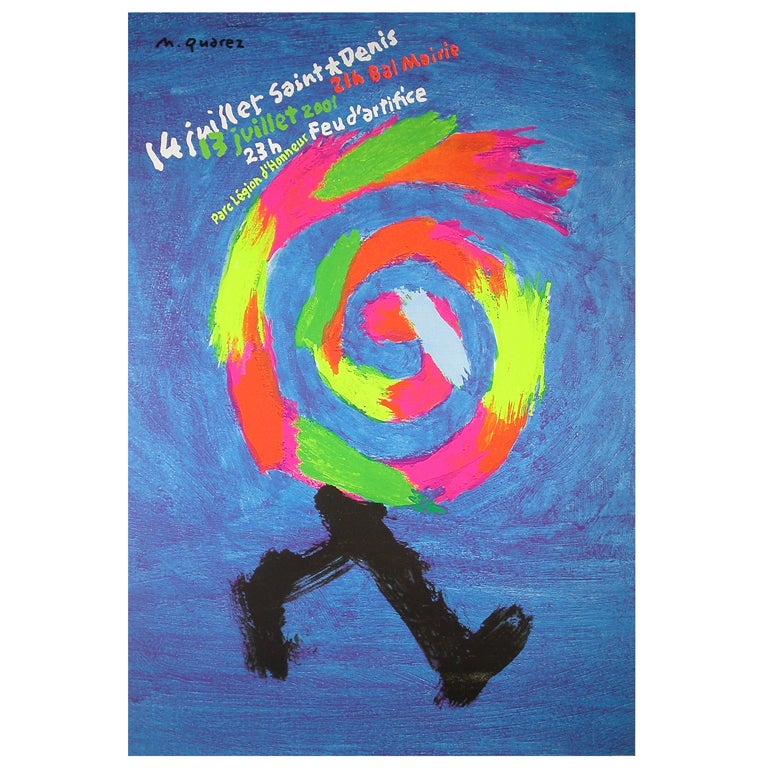
Michel Quarez is a visual artist and designer. His style is very simple, you could call it naive but I really enjoy it. His massive block like brush strokes remind me a lot of children's artwork and this is something I really want to explore in my own experimentation. I really like his colour choice as well. His style is unique and full of energy.

Henryk Tomaszewski is another visual artist/designer that I
discovered through my research. His style is brilliant. Full of colour and
mixed media. He is experimental with his approach to shape and layout and often
uses script or hand drawn fonts in his work.
Other designers which inspired me were Paul Bacon, who designed the book cover for the novel ‘Catch 22’. His big book look caught my eye and reminded me of children's collages.
Pierre Bernard's work also massively inspired me throughout this brief. Although his poster designs are in French, I can still read them thanks to his use of wonderful visual communication. Similarly to other artists and designers that I have looked at throughout this module, Bernard's style is post-modern, loose, full of energy and individuality. He tackles serious issues within his works but the tone is not depressing or authoritative, which is what I really enjoy.


No comments:
Post a Comment