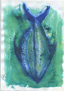
Today we spent a couple of hours experimenting with various mediums including brusho powdered inks, gouache, paper collage, pen and ink and paint. We decided to do this because we were stuck for aesthetic ideas, and saw this as a great way of getting our creative juices flowing as a collective. The existing branding for the Saucy Fish Co. is highly distinctive, clean, minimal and high impact. It uses very bright, punchy contrasting colours and a lot of black, giving it a premium feel. We all agreed in the first few meetings that we perhaps wanted to steer away from designing packaging and collateral that emulates the existing branding. This meant that we needed to move away from using black, block colours and geometric shapes.
This was a beneficial exercise, because we all were struggling to think of what to do to get the ball rolling with this brief. We all re-read the brief to see if we missed anything big. We all began to realise that this brief is actually a lot harder than what we initially thought, due to its highly open nature. The brief is asking us to do things that are slightly out of our current creative skill sets, which is a positive challenge. Packaing is not a strong area of design for myself. I would have preferred if this bried was asking to re-brand the packaging, logo and identity, but it isn't. We are going to need to continue researching materials and structural packaging solutions, as we are not that well informed on these areas. We decided to have a session of doing what we do best, experimenting with materials and trying out various methods. This definitely got out creative juices flowing.
We all agreed that we should adopt an illustrative. fluid and abstract approach to the initial experimentation. Each of us did illustrations of fish, water and anything else associated with the products. It was very productive and beneficial to just get some initial ideas down on paper.


No comments:
Post a Comment