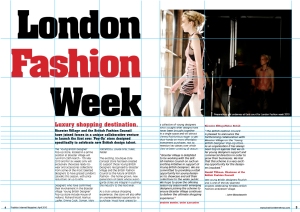
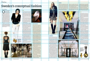
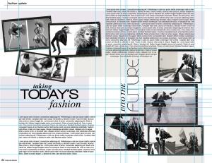
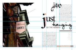
I did some research into various grid systems used in layout design. In my publication, the focus will be on imagery and type rather than body text, but its still important to know the conventions of body text layout. I don't think I will use column grids, as there will not be enough content to fill the columns. I may use a modular or hierarchical grid.


The two examples below are most inspiring for me in relation to this brief. The text is presented in blocks aligned to the tops and bottoms of the pages and the imagery dominates the spread.


No comments:
Post a Comment