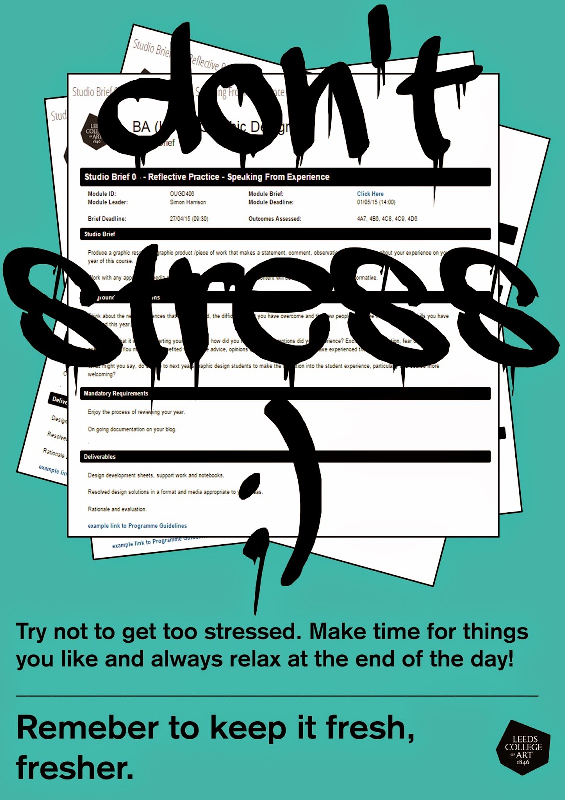
The least successful part about my idea is my language choice. People said that conceptually, its all there, but in terms of the language choice and how this relates to the target audience, I need to consider this more closely. Its true that when people say 'don't worry' or 'try not to stress' of course we naturally want to stress even more, so I need to consider the language I use, to make it more reassuring and relate-able for my target audience who are graphic design freshers.
One thing that I needed to consider was my use of language, so Simon suggested that I looked at poster design which uses only type but sensible use of language. The interim crit actually inspired me to abandon these ideas and to make something that really runs with the theme of keeping things fresh. I thought it would actually be more interesting if I produced a set of posters accompanied by a small zine full of do's and don't's.


No comments:
Post a Comment