When designing my publication for brief 03, I will need to consider carefully grid systems. The emphasis within this module is the design production, and constructing an effective grid system is a fundamental part of the design process and a key part of the production of any piece of editorial design/printed media. In the studio, we did a short workshop on canons of page constructions, recapping on what we learnt in the first year. We touched on the Golden Ratio and the Van De Graaff system, both are very effective and used commercially. The Van De Graaff approach makes the most sense to me and will help me to generate my layouts for this brief. It produces body copy that is very structured and uniform, something I need to achieve.

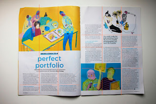
I scouted the college and my house to find some nice examples of free newspapers, magazine, zines and other independently published printed media. I looked through them, aiming to find some spreads that use strict grid systems, or just obvious grid methods. I discovered that the majority of the spreads employ a simple column grid system, in order to neatly format and organise the body copy content. The images are usually formatted within the same column structure. This results in a minimal aesthetic. It feels clean and organised and there isn't too much room for white space domination which I appreciate. The golden ration probably comes into play somewhere here, but for me, this grid system is too complicated and unnecessary in my view. The Van De Graaf system is also at play in a number of these spreads, but it is a very simplistic version of the model that is being incorporated. Below are examples of the spreads with very rough grids mocked up by me overlaid on top:
This very strict grid system is favoured by many free magazines/newspapers. This grid systems creates content that is very neatly organised, but its not necessarily the most exciting way of formatting body copy/graphic content. My publication is going to be very much focused on the photography, highlighting the abundance of typography that I looked at. I am not going to be including a large amount of body copy, so I will not really need to use a strict column grid system. However, for the purposes of research, I am glad I looked at these systems.
This grid system is certainly less strict. The body copy overlaps with the imagery. Rather than being in multiple columns the content spreads across the pages in a more randomised, free fashion. Some would say that this sort of grid system is quite post modernist because it is not as rigid or constrained as a modernist grid system. I like it a lot, it gives the double page spread a much more contemporary, trendy feel, something I will investigate in emulating in my editorial/layout design.
Further strict column grid systems:
Quite minimalist, chic editorial design. Here the photographic content takes centre stage, dominating large parts of the pages. White space is also used to balance out the ratio of text to image. It has the potential to feel quite bland or even boring, but due to the context of it being a fashion magazine it fits and works well as a double page spread.
Conducting primary visual research of this nature has been very beneficial in broadening my understanding of basic grid systems. I had some previous knowledge of how grids work and how important they are, but I needed reminding. I must remember the importance of them in editorial design and I think using a simplistic grid system in my publication design will be highly useful. I want my spreads to be simple yet make an impact on the reader, so I won't really need to use an overly complicated system such as the golden ratio.


No comments:
Post a Comment