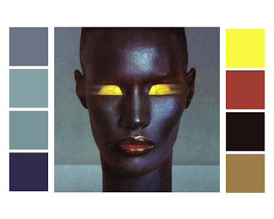
The range of colours and their tones seen in the original promotional imagery for the album are beautiful, they lend them selves to a number of possible design treatments. The tones are not incredibly diverse, but there are subtle variations which I really like. The album cover features a number of camel/beige tones, which sit well as a background colour. I have experimented with making the background of the homepage this colour, but in large blocks it tends to become a little dull. The homepage needs to be the most visually exciting and engaging in my opinion, so I will consider amping up the colour here. I am going to take the more vibrant shades, like the blues and pinks and enhance their hues. This way I am staying true to the 1980's aesthetic but I will be giving it a modern twist.
This image of Jones, shot by her partner Jean Paul Goude, has been influential in my design treatment so far. There are high levels of existing contrast in this image, for examples between the deep purple hues on her cheeks and electric yellow eye shadow. Blues and shades of yellow and orange are complimentary. I think that as a colour palette, this combination would work well for the website, running throughout the various pages in different tones/levels of saturation.


No comments:
Post a Comment