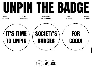
My initial designs for the website were focused on visually conveying the theme of pins, using a range of colours, circles and different sized typefaces. I hadn't really refined my colour decisions at this point, that is why there is a lot of black in the backgrounds. I also hadn't established a uniform combination of fonts that worked well together. I was trying to be as experimental and playful as possible with my font selections, which in hindsight looks a bit childish and unprofessional, I am glad I asked for feedback on these designs and improved on the layout, colour and font selection.


No comments:
Post a Comment