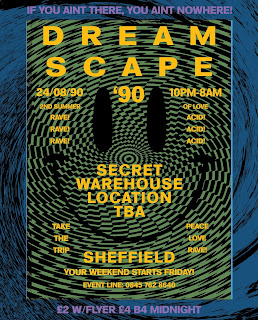
Over the summer of 2015, I decided it would be a good use of my time to enter a number of design competitions to keep my practice fresh and relevant. Summer is a long break from being in the college environment and I didn't want to become lazy or unproductive.
When I saw that Channel 4 were calling out to creative's to produce a conceptual poster for the upcoming release of This Is England 90', I got really excited and become really confident in my design abilities. The brief was pretty straight forward: design a fictional poster promoting a acid house rave in early 90's Britain. Design from this era really interests me, I really love the aesthetics, DIY feel and all the patterns and mixed use of type. I got stuck in, sketching and messing around with scans on Photoshop. I pushed my designs around a lot and asked for feedback from my course mates and friends who all seemed really positive about my ideas. I submitted my designs and checked out the competition online at TalentHouse.com. I was feeling confident, but unfortunately my design was not selected by the Channel 4 judges.
The winning entry was decent but I felt that it looked far too digital and didn't capture the essence of the make shift, DIY approach of those early rave promoters. I was a little disappointed, but it didn't knock my confidence too much.
I entered another poster design competition: Design Breda - What Do You Do?
This competition was all about graphic designers and how they define their individual practice and their insightful views on the creative industries. As I had barely been studying graphic design for a year and certainly didn't want to label myself as a graphic designer instantly, I thought it would be an interesting exercise to enter this competition. I looked to incorporate my portrait into the work, as well as experiment with colour, mixed typography and subtle use of language. The underlying message of the design was staying true to myself as a creative person. I think that this is incredibly important in everything I do. I believe graphic design should be representational of the designer. I should be able to express my personality and character through my visual output. That was the message I was aiming to communicate. Again, I submitted my work feeling very confident but I unfortunately didn't get selected to feature in the exhibition. It didn't stop me from being ambitious, infact, it only made me more determined to refine my practice and up my game.


No comments:
Post a Comment