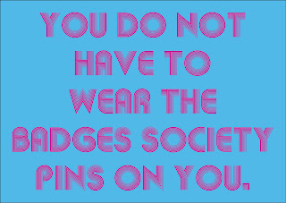
The brief required me to consider and produce AT LEAST one other supporting touch-point for this campaign, this could have been anything. They were encouraging me to think big, to produce something that really tied the whole campaign together. I thought, why not produce a small booklet/zine full of tips and advice on how to 'unpin the badges of society'.
I wanted the booklet to contain a lot of information that could be easily digested by a wide range of people within society. The way I saw myself achieving this was through simplistic typographic design. I began by designing some minimal double page spreads which contain punchy, one-off statements to catch the attention of the reader. I was mainly trying out various colour combinations that would be visually pleasing. At this stage, I am not entirely sure of the type combinations and the colour scheme that I am going to use across the campaign. I know that I want to use a range of typefaces which represent 70s influences, I am going to limit this to a range of 6 typefaces and 5 colours.
Below are images of spreads that I have experimented with. I am going to develop these much further, they are simply my initial ideas generated very quickly:


No comments:
Post a Comment