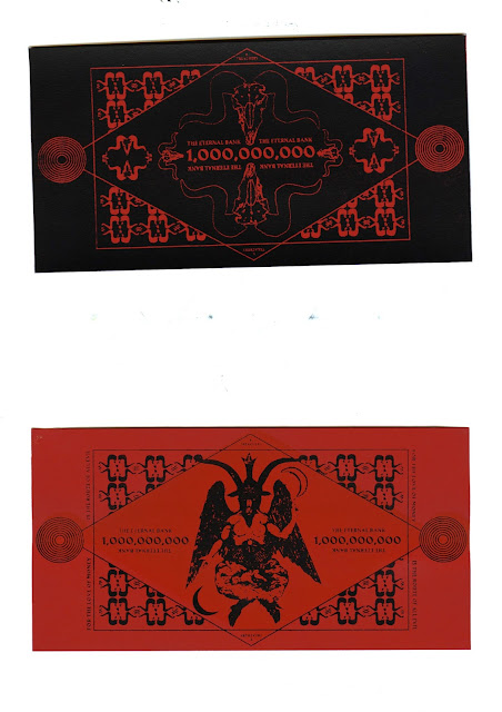
Here are scans of the final screen printed designs. I chose to screen print because I am familiar with the technique and am aware of the effects I can achieve with the inks. I was considering using mono printing or even lino prints, but this would not have allowed me to achieve the very thin, intricate links that screen printing offers. I chose to print black and orange inks onto coloured stock to allow the design to really pop and stand out off of the page. I experimented with a range of stocks; I feel that the print on the red stock is the most successful, and this will be the one I am going to submit to the exhibition. I also considered foiling the designs. I experimented briefly with adding triangles of gold foil to the corners, but this cheapened the overall aesthetic and detracted from the central design. Overall, I am really happy with the final prints. They communicate the messages I intended to communicate in a way that a digital print couldn't. I think the designs are bold, eye catching and make wonderful social, cultural and political statements. I have burrowed from tradition, whilst sticking to my guns in terms of aesthetic preferences. I think my creative style certainly shines in these designs and I also think they reflect contemporary trends in design. I have really enjoyed using this project to make a statement rather than just to reconsider existing currency designs. I feel I have really interrogated the problems that were posed to me in the brief and tackled them in a highly conceptual way. These designs have made for excellent portfolio pieces which I am really proud of.


No comments:
Post a Comment