OUGD403 has been an interesting module for me. I came onto the course with moderate knowledge of software such as Adobe Illustrator and InDesign, and throughout the four briefs I have definitely acquired new skills, understanding and knowledge of these programmes and the application of various design skills and processes. The summer brief was similar to Studio Briefs 1 and 2, in the sense that type was very much the focus of our work. I learnt about the anatomy of type and how making small and subtle modifications to a typeface can communicate conceptual ideas brilliantly. After Studio Briefs 1 & 2 I definitely felt slightly more confident in Illustrator, considering I had never used it before, I was pretty satisfied with my typeface that I had produced from scratch through extensive research and evaluation. I found the interim critique sessions very useful, and not daunting or nerve racking at all as I had experience of critique sessions from my foundation course.
Studio brief 3 was focused entirely on researching, both primary, secondary and visual. This was an interesting brief. I looked into issues surrounding cyber abuse and the act of 'trolling'. I feel I could have definitely put more effort into this brief. If I were to do this brief again I would definitely allocate more time to presenting my findings rather than creating a simple powerpoint presentation. I am pleased with the research I did carry out, but would have liked to delve deeper into the issues in the articles I read.
Studio brief 4 followed on directly from the previous brief. This was an exciting task, one which I enjoyed because it allowed for a lot of experimentation and exploration of various techniques and processes. I enjoy working in mixed media and for this project I combined painting, drawing, photography and digital skills to create my posters. Out of the four briefs this was my favourite.
Overall module one has been challenging but rewarding as it has introduced me to a number of new skills and processes. The workshops have been engaging and informative. I made sure to keep up with my blog posting and research and feel as if I worked well to the deadlines. I am looking forward to getting stuck into the next module and improve on areas in which I have fallen behind in this module.
Sunday 30 November 2014
OUGD403 - Brief 4 - Message & Delivery Final Poster Designs
Development of final ideas
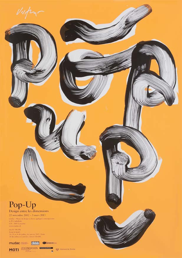
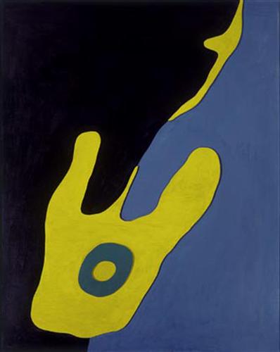
Concept behind final three designs: I wanted my posters to make an impact but keep the imagery and use of type minimal and simple. I modified drawings, sketches, painting and ink work that I had done by hand digitally using Photoshop and Illustrator. This produced some very pleasing effects. The paintings I had done in black have become transformed into vibrant liquefied graphic images. I like the contrasts I have created by opting for a solid black background.


Concept behind final three designs: I wanted my posters to make an impact but keep the imagery and use of type minimal and simple. I modified drawings, sketches, painting and ink work that I had done by hand digitally using Photoshop and Illustrator. This produced some very pleasing effects. The paintings I had done in black have become transformed into vibrant liquefied graphic images. I like the contrasts I have created by opting for a solid black background.
OUGD403 - Studio Brief 4 - Poster Development
Initial ideas and concepts
I ran behind with this brief, so once I had my initial concept, which was based around mythical trolls, I ran with it and didn't really venture too far from it. In some ways you could say I limited myself but I like to see an idea through and in the circumstances I found myself in I didn't really have much choice.
I began by pushing the ideas forward surrounding the Queen being mocked, drawing visual inspiration from my research. These designs were a bit rushed but I was jut pushing ideas around. The brief restricted me to using only two colours, so I looked at using complementing colours which create brilliant levels of contrast. I repeated the troll face over and over to create a 'background' for the initial poster designs. In hindsight this probably wasn't the best of ideas for a few reasons, the main one being recognisability. Not everyone is familiar with internet memes and therefore the message could be lost a bit in the context of the wider world. However for people that do know what trolling is and what the meme represents, the word play along with the imagery would make sense and hopefully drive home the message that trolling is out of order and wrong.
OUGD403 - Studio Brief 4 - Research
Research and Inspiration
I knew I wanted my designs to have a serious message, but I didn't want them to have too much of a serious tone. I wanted my posters to have a hand crafted feel to them, making them look almost like a child could have drawn them.
To me trolling is incredibly childish and pathetic. In addition trolls are also closely associated with storytelling and children's fairy tales. Therefore I knew that I wanted the posters to feel aesthetically young and have a child-like quality to them.
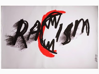
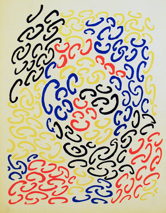
I researched various artists and designers who’s work is unconventional and daring and can be viewed as post-modern in a way. Their work is witty, playful and fun. I looked at James Victore, who likes to think of design as a mace. He knocks his viewer over with an idea or criticism that’s one part aesthetics and one part logic. One of his most successful pieces of work for me is 'Use a Condom'. Use a Condom’ was originally created for an AIDS awareness campaign in 1997 and presents two of nature’s most famous sex fiends in that most intimate embrace. The message in this poster is brutishly clear yet his approach is humble. I was really inspired by his sketchy style, great use of minimal layout and choice of colour. Above are perfect examples of his kinetic, socially-engaged style—within his work it is clear that he has love and appreciation of the Polish Poster School.


The Polish Poster School
Background:


 Pierre Bernard's work also massively inspired me throughout this brief. Although his poster designs are in French, I can still read them thanks to his use of wonderful visual communication. Similarly to other artists and designers that I have looked at throughout this module, Bernard's style is post-modern, loose, full of energy and individuality. He tackles serious issues within his works but the tone is not depressing or authoritative, which is what I really enjoy.


I knew I wanted my designs to have a serious message, but I didn't want them to have too much of a serious tone. I wanted my posters to have a hand crafted feel to them, making them look almost like a child could have drawn them.
To me trolling is incredibly childish and pathetic. In addition trolls are also closely associated with storytelling and children's fairy tales. Therefore I knew that I wanted the posters to feel aesthetically young and have a child-like quality to them.
I researched various artists and designers who’s work is unconventional and daring and can be viewed as post-modern in a way. Their work is witty, playful and fun. I looked at James Victore, who likes to think of design as a mace. He knocks his viewer over with an idea or criticism that’s one part aesthetics and one part logic. One of his most successful pieces of work for me is 'Use a Condom'. Use a Condom’ was originally created for an AIDS awareness campaign in 1997 and presents two of nature’s most famous sex fiends in that most intimate embrace. The message in this poster is brutishly clear yet his approach is humble. I was really inspired by his sketchy style, great use of minimal layout and choice of colour. Above are perfect examples of his kinetic, socially-engaged style—within his work it is clear that he has love and appreciation of the Polish Poster School.
The Polish Poster School
Background:
The Polish film poster has a unique place in the world. The circumstances of modern Polish history have conspired to create an environment where the advertising of cultural events was able to dominate the popular visual culture of the post-war period.
The annexation of Poland by the Soviet Union, in the aftermath of the second world war and after the brutal period of German occupation, condemned the country to a further period of totalitarian dictatorship. The command economy imposed by the Soviets was unable, or unwilling, to deliver the material surpluses which might have raised living standards and supported the beginnings of consumer culture and advertising. In the event, Polish graphic designers were faced with little option but to work for the state.
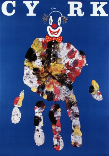
Beginning in the 1950's and through to the 1980's, the Polish School of Posters combined the aesthetics of painting with the succinctness and simple metaphor of the poster. It developed characteristics such as painterly gesture, linear quality, and vibrant colours, as well as a sense of individual personality, humour, and fantasy. It was in this way that the Polish poster was able to make the distinction between designer and artist less apparent, which I find fascinating. Polish Film Posters are particularly known for: simple form using a smart, often a full of humour and fantasy metaphor or illusion as well as its high artistic standards: pictorialness, linearity, live colours. In contrast to Western posters, based on photographs and movie stills, Polish projects were more graphical, structured, and clear. They were based on a principle of subtracting rather than adding. It is difficult to imagine today how abstract were the situations the graphic artists have found themselves in at the time. The processes, concepts and ideologies that the Polish Poster School promote really inspires me and my practice, and directly informed my work for this brief. Below are some examples of work associated with the Polish Poster School
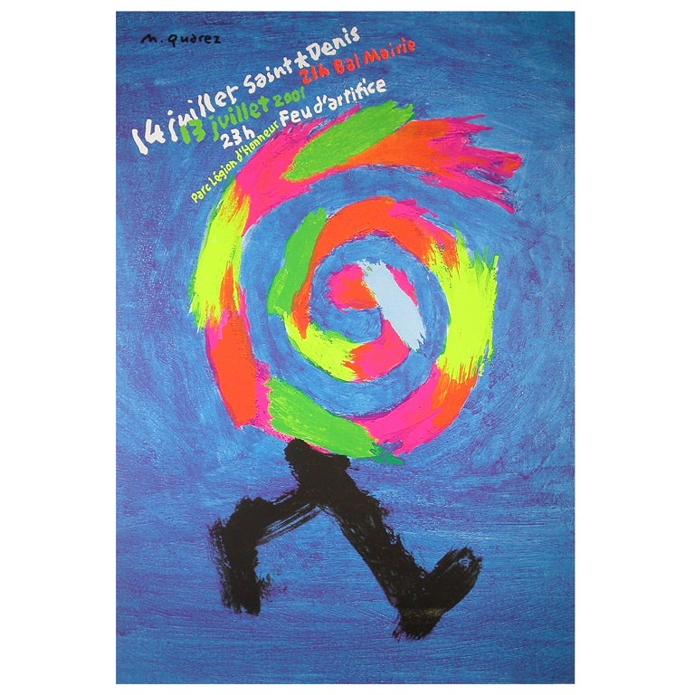
Michel Quarez is a visual artist and designer. His style is very simple, you could call it naive but I really enjoy it. His massive block like brush strokes remind me a lot of children's artwork and this is something I really want to explore in my own experimentation. I really like his colour choice as well. His style is unique and full of energy.
Henryk Tomaszewski is another visual artist/designer that I
discovered through my research. His style is brilliant. Full of colour and
mixed media. He is experimental with his approach to shape and layout and often
uses script or hand drawn fonts in his work.
Other designers which inspired me were Paul Bacon, who designed the book cover for the novel ‘Catch 22’. His big book look caught my eye and reminded me of children's collages.
OUGD403 - Studio Brief 4 - Message and Delivery - Delivery
Brief 4 is all about communicating a specific message taken from the research conducted for Studio Brief 3. I must produce
designs for a set of three high impact posters that deliver a personal
identified message derived from your research.
The three posters should work as a set or series
and be visually consistent. The first must be produced solely using type, the
second solely with image and the third a combination of both type and image.
Factors to consider:
- Focus on what you are trying to say and avoid generalisations and vague messages.
- Keep it simple and to the point.
- Are you making a statement, delivering facts or posing a question?
- You should consider and investigate a broad range of possible visual solutions before making your design decisions.
- Tone of Voice.
- Make it memorable, immediate high impact and clear.
- Challenging, potentially controversial but appropriate and not offensive.
- Factual, statistical, informed and specific.
Initial sketching and idea generation. I have mixed feelings when it comes to 'trolling'. I think in some cases it can be funny, witty and purely a joke. Just someone's way of winding someone up a little bit, not intended to be anything more. But at other times it is clear that the intention is malicious and directly cruel, so I wanted my posters to be communicating a message that is against trolling in general. The attacks made on Queen Elizabeth were vicious and completely unnecessary and very childish in my opinion.
With childish nature in mind, I did some initial research into mythical trolls in fairy tales. Fairy tales are closely associated with children so I saw this as a good source of inspiration and I generated a number of ideas from this. I ran with the idea that trolls belong under bridges and out of sight. I found a number of really nice illustrations on the internet which inspired me.


Research and Inspiration
,%20plate%201%20from%20the%20portfolio%20Merz%205.%207%20Arpaden%20von%20Hans%20Arp.%20Arp%20Mappe.%20Zweite%20Mappe%20des%20Merzverlages)
Moustache Hat - Jean Arp
Abstract Composition - Jean Arp
Composition 10 - Sonia Delaunay - 1930

"Taureaux" monotype on Japanese paper - Aurore De La Morinerie -2010


These paintings were made in the 1950s and are simple in design, yet complex in message. Made with acrylic paint on canvas and museum board paper, I admire Ruscha’s use of clean typography set against both abstract and mountainous backgrounds. The messages within his paintings aren't neccisarily relevent to this poster project but his composition and use of text and image is.

Gary Hume - Water Painting

Gary Hume - Twins

Patrick Caulfield - Coloured Still Life 1967
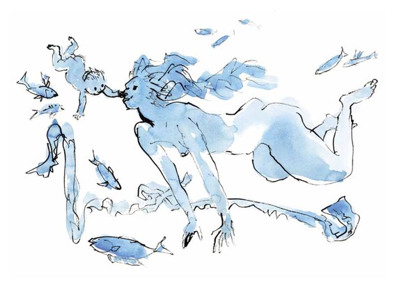
Quentin Blake's fluid style of illustration influences me a lot and I wanted to try and make these poster designs quite playful and illustrative in a way
Friday 7 November 2014
OUGD403 - Studio Brief Two Final Crit
Today we had our final crit for Studio Brief two 'Vector Type'. Unfortunately I wasn't able to present my work completely as the brief asked, as my digital print induction was not on during the week. However, I printed all of the work off that I had completed that were deliverables on the brief. The crit went well and people in my crit group were impressed with my final design, I spoke about the concept behind my final typeface design, and how it represents fading into the background and representations of shadows, all things that link to passivity in my eyes. Simon liked my design and
was impressed with the concept.Overall I am content with how the project went and I am really proud of my final design.


 My typeface in context. I believe it works well when accompanied with imagery and represents being passive in an effective way in the context in which I have placed it. The whole idea behind my final design was to make a typeface that is very subtle, very easy to ignore yet still recognisable and readable. Here I quoted myself: 'I don't want to be passive, but sometimes I can't help but be'. I placed the text over an image of myself as I felt that I needed to convey a personal message here. I feel I can relate to being passive in certain aspects of my life and enjoyed giving the typeface a personal twist

was impressed with the concept.Overall I am content with how the project went and I am really proud of my final design.
My final typeface in upper-case presented on a 4 x 7 grid:

My final typeface in lower-case:

Numbers and Symbols:

Final grid for the typeface: Something I struggled with and in the end kept simple. Futura at the end of the day is an extremely geometric and simplistic font to look at. It is in fact a highly complex typeface when looked at in more detail. I needed to devise a grid that I could use effectively. What I have done in my typeface design is simplify Futura even more by de-constructing the outlines of the letter forms and reducing their stroke weights. Therefore the final grid for the letter forms had to be simple. The grid accommodates the upper-case letters, and I am pleased with it.


I also looked at a quote to do with passivity from the English novelist Christopher Isherwood:
'I am a camera
with its
shutter open,
quite passive,
recording,
not thinking'
I really enjoy this quote and find it relevant to my self. I find it easy to relate to and I believe it would look fantastic presented in my typeface.
Subscribe to:
Posts (Atom)