Wednesday 29 October 2014

OUGD404 - Design Principles - Colour Theory

I was away from college for this studio task. But I was filled in on what happened. 

We were asked to bring in five different objects all of the same colour. The objects had to be one of the three primary colours. First the groups laid out all the objects they had collected on the studio tables in colour groups. Initially the objects weren't strategically organised in terms of tone, warmth, darkness or lightness, just grouped in terms of primary colours. 


The groups then sorted them in terms of tone, putting them in order from darker blues to light blues, demonstrating how there are always ranges of colour tones everywhere. Then the colours were grouped into cool and warm tones.


The objects were also arranged next to each other to show the differences between the primary colours. They were also arranged in terms of light/dark. 

Then all the groups converged to sort the colours out around the table on the patio.
The group then got to use Pantone cases to try and find exactly what Pantone colour each object was, this was really good as having the physical spectrum in front of them was helpful in spotting the subtle differences between each shade of blue, yellow or red. 

The groups then swapped around again to so see if we thought they had got any Pantone codes wrong, They found some were right and some wrong but it was hard to tell. Taking photos helped as it flattened them down, making it easier to distinguish between the various tones. 

In general I heard that everyone had a lot of fun on the task, it gave them a good introductory insight into colour theory and the relationships between the three primary colours. 

Sunday 26 October 2014

OUGD403 - Message & Delivery - Presenting Research

I presented my research surrounding my chosen news story using PowerPoint slides. I found it easier this way. I also experiemted with presenting my research in a more visual way as well as this quite simple way. Below are the screen shots from the presentation:


I then thought of ways that I could present my research in a visual way. I wanted to tackle the issue of mockery that is associated with trolling. In the case of the Queen, the trolling was malicious and disgusting but at the same time witty, playful and harmless. For example, the user that Tweeted 'F**k off and die' was completely out of order, and the press actually gave him way more publicity that he deserved, which is ultimately what a troll wants. Other tweets were less spiteful and were intended as jokes. For example an existing parody account for the Queen (@QueenUK) wrote: 'Can't believe someone's started a sodding parody account' Trolling can be light hearted, but in most cases its upsetting.  

Something that came to mind straight away was the iconic album artwork created for the Sex Pistols in the 1970s for their single 'God Save the Queen'. In late 1970's England, the Sex Pistols lead the blossoming punk rebellion. Artist Jamie Reid created many images for the band, including this one, the cover art for the Pistol's first single God Save The Queen. Released in 1977 to coincide with the Queen's Silver Jubilee Celebrations... the single was considered so shocking that it was officially banned from the English airwaves, yet despite this open censorship it became the number one song in Great Britain and helped launch the international punk rock movement.

In 2001, an English panel of judges composed of editors and artists gave their highest honour to the controversial artwork of Jamie Reid, calling it the "best record cover ever produced." The outrageous anti-monarchist image from the Pistols were intended to mock the Queen at the time, way before trolling began. The imagery is blatantly disrespectful but that was the point.The artwork is iconic for many reasons the main for me is how aesthetically brilliant it is to look at. 

I really like the subtle the graphic elements of this artwork. The Queen's face has become depersonalised as her eyes and mouth have been torn away and replaced with crude typography. The imagery is violent and shocking. When presenting my research I wanted to take quite a tongue and cheek approach so this is why the album artwork provided me with great inspiration.


The term trolling is an Internet slang term used to describe any Internet user behaviour that is meant to intentionally anger or frustrate someone else, though not to be confused with cyberbullying a form of online harassment targeting a specific individual or group in a deliberate and hostile manner, or pranking, which similarly involves playing jokes on strangers for one’s amusement, but typically implies more coordination and intent. 

Trolling memes are graphics used to portray emotions and facial expressions surrounding acts of trolling. Below are a selection of various 'troll face' memes.  


Trollface is a black and white drawing of a face with a large mischievous grin that is meant to portray the expression someone makes while trolling. Posting a Trollface image into a forum thread is often used to claim that someone was being fooled or intentionally angered. The original drawing was created by deviantArt user Whynne on September 19th, 2008 to illustrate the pointless nature of trolling on an online message board.


Drawing influences from the designs for the Sex Pistols, I combined two concepts by manipulating the 'troll face' to make it relevant to my research. I used Photoshop to create the graphics below. I experimented with a range of typefaces both Serif and Sans Serif. I also played around with adding textures, resembling the Pistols design even further

Final design idea: I did some research into the typefaces used on the original design for the pistols. Jamie Reid, the designer, used newspaper cuttings and assembled them together in a ransom note fashion. I went to fontspace.com and found a brilliant font named 'Got Heroin?'. I typed in the words I needed and it generated them. I then overlaid the type onto two strips covering the troll faces' mouth and eyes. 


Below is an example of a leaflet design presenting my research. Its very rough and would need a lot of things changing but as an initial idea I like it. 


Saturday 25 October 2014

OUGD403 - Studio Brief 3 - Message & Delivery - Research


Today I began work on Studio Brief Three; Message and Delivery. The brief asked me to create a body of research based on a story, issue or theme found in the news today (Saturday 25th of October 2014). I went to my newsagents and purchased three newspapers; The Times, The Daily Mail and The Daily Mirror. I wanted to select a varied range of newspapers to get a good overview of different publishing methods and practices, to help me gain a broader knowledge of editorial layout and design. 


The brief suggests that I use a variety of approaches in gathering the research, including editorial coverage in local, national and international press via both print and web. I should aim to observe the trends and differences between different formats of communication.  I looked at several news publishing websites both national and international to aid my research. 
After flicking through the three physical newspapers that I selected I came across a story in all three that I found interesting. On Friday the 24th of October, Queen Elizabeth II sent her first ever Tweet. This headline grabbed my attention as it wasn't too serious or depressing but quite entertaining and fascinating at the same time, The actions of the Queen have sparked aggressive and disrespectful reactions from members of the Twitter community. The Queen was the first member of the Royal family to send an email back in 1976, which was a milestone at the time. The fact that in 2014 she is engaging with the rapidly changing world of social media shows her willingness to go with the flow of technology and embrace modern society in all its connected glory. I think it is great that the Queen has apparently decided to use Twitter, its not gimmicky at all in my opinion, its in fact one of the most down to earth things someone like her majesty, with all the status and power she has, could do. 
Brief summary of the story, taken from the Daily Express Online: 
http://www.mirror.co.uk/news/uk-news/one-not-amused-trolls-attack-4501842


A very modern monarch: The Queen sends her FIRST ever tweet and makes history. The royal tweet read: "It is a pleasure to open the Information Age exhibition today at the @ScienceMuseum and I hope people will enjoy visiting. Elizabeth R."The Queen's tweet was retweeted more than 3,500 times within 45 minutes and the number of followers of the @BritishMonarchy account jumped from 722,000 to 731,000 in about the same space of time.
Her tweet was also beamed around the capital on the electronic message board on the BT Tower in London
The Daily Mail:  used a blue theme throughout the article which is clever yes and will draw in the attention of people who are familiar with Twitters branding and theme. To my eyes as a designer I find it a bit cheesy, but I can see how this would make the article more interesting to an unassuming reader. To me this decreases the formality to a certain degree, probably the most informal of the three. Uses the same image as the the Daily Mirror so this deceases its edge over the other publishers. The Times is the only one to use an image that is well balanced and well framed in my opinion. 
The Times:very formal in tone of voice, lots of writing that's in depth and gives plently of perspective to the story. I find this article a lot more opinionated and comprehensive. Not trashy like a tabloid. this is the reputation that the times has anyway. Stricter use of columns gives the article a much more formal tone of voice compared to the cluttered layouts of the other two newspapers. Overall serif feel makes it feel more formal (social context) longer sentences and less use of colloquial terms. All type used is very thin in weight, this decreases the informal tone.

 The Daily Mirror: probably the least formal of the three newspapers I looked at. The headline is in a sans serif. It's bold and quite informal. They have used a column grid to layout the article, but there is much less content compared to The Times. This article is my favourite, its concise and to the point. Its use of screen shots from Twitter as well as Twitters logo decrease the formality but the information is communicated effectively, I found it the easiest to relate to. The journalist who wrote the article, Victoria Murphy also wrote an online version of this story. Online the rules are completely different. The sentences are shorter and the information is communicated across much more concisely. The opening lines of the online article read:


"Trolls attacked the Queen almost immediately after she posted her first tweet.
She made the historic post, signing off as Elizabeth R, from London’s Science Museum as she opened an Information Age exhibition celebrating advancing technologies.
But Her Majesty’s account was immediately targeted by vicious trolls, who posted such vindictive comments as “F*** off and die”." The tone online is quite different, much more informal than in printed versions. 


Friday 24 October 2014

OUGD403 - Studio Brief 3 - Study Task 3 - Newspaper Layout


Today we were introduced to Studio Brief 3: Message & Delivery. We must create a body of visual research in response to a story, issue or theme found in the national press tomorrow, Saturday 25th October. The research must be in depth and presented in a way which is thoroughly thought out. There are many points to consider for this research task. 
The willingness and ability to formulate informed opinions about your subject matter is an essential skill for a graphic designer. In addition to being aware of events, concerns and the (un)popularly held opinions of the world around me, I also need to consider the tone of voice with which they are reported. It is important that I read the stories thoroughly and research issues that are raised fully before committing your self to a visual opinion. In my presentation of research I can be serious, humorous, questioning, opinionated, bold, or subtle.
I will need to use a variety of approaches to your gathering of research, including editorial coverage
 in local, national and international press via both print and web. I should aim to observe the trends 
and differences between different formats of communication. Be aware of and include in my research 
and documentation the tone of voice, the use of images, typography and layout/composition.
In the afternoon session we began work on Study Task 3. We were put into groups of five and were given a news story to research in depth. We had to make design decisions informed by the impact, the tone of voice, the word count and so on of the article. We had to reorganize and present the news story in a way which we saw fit, considering the layout, composition, colour, typography, etc. The brief stated that there are no limitations on how to produce the final outcome, but we were advised to start the process hand rendered. 
My group were given a new article surrounding profit loss at Tesco. We discussed a wide range of variables surrounding layout, audience, tone etc and decided that we wanted to create a news article designed to be displayed on mobile phones, specifically appearing in a news reading application on a smart phone. We found the article and subject matter pretty boring, and almost difficult to relate to, because at the end of the day we don't really care if Tesco are loosing profit, we're students, we can't afford to shop at Tesco's anyway. So we wanted to make the article concise, quick to read and adapt it to an app layout. I personally enjoy reading news that is short and sweet, to the point and condensed. We saw this as an opportunity to utilize an apps ability to communicate information quickly and efficiently. We wanted to create a design that people of a similar age can relate to. We then tried to think of a newspaper that we can relate. We didn't want to go for a a broadsheet so we went for the Metro, which we found easy to relate to.  
We looked at a few articles that appear on the Metro app and devised a basic grid using layout paper which I went on to digitize for ease: We found that the app uses combination of grid systems; on the 'home page' of the app hierarchical grids are used for layout to present the imagery, logos, headlines and links to other stories. two column grid systems are used on the articles themselves. For our design we opted to keep it simple and incorporate a two column grid.  


Below are a selection of ideas produced using Adobe Illustrator. The black boxes at the bottom of the designs represent links to other stories within the mobile app. We experimented with using a range of Serif and Sans Serif fonts. On the Metro App, Sans Serifs are used for the headlines and Serifs are used for the body text. We decided to use all Sans Serifs in our design to make it more appealing to a younger modern generation. In general people of my age respond more the Sans Serifs as they feel they are modern and sleek, Serifs are viewed as traditional and old fashioned in many contexts, yet they are used everywhere in the newspaper publishing industry.

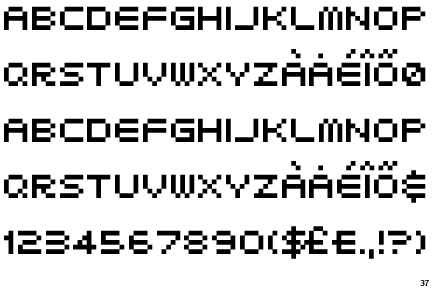
 I did some brief research on typefaces most commonly used in newspaper publishing. I found the most popular fonts used are:

These fonts are all Sans Serif. They are bold, clear to read and make an impact and are perfect for headline statements. Ideally we should have looked at employing these type faces into our designs. 
                                                       
Design idea one, we used serif fonts for both the headline and the body text. For me this is least successful design. If this were to appear on my smartphone I would be slightly confused and disappointed as it doesn't look very current. The serifs here would be better suited in a broadsheet newspaper such as the Guardian or The Times. The fonts used in this design do not suit the context of a mobile app. 
.  

Design idea two involved the use of a new image and all sans serif fonts. Again I don't really like the way this design turned out. The font used is not very sophisticated and it lowers the tone slightly. I also prefer the image used on the previous design. 
The final idea. Here we decided to use a sans serif type face which I was pleased about. We didn't use all caps in the headline which I was a bit unsure of, but it works. The final idea is crisp and clean and sticks well to the grid we devised as a group. I think the black boxes take up too much room, room which could be used for body text of the actual news article. 


I feel we worked well in a group, everyone contributed in the task, we generated ideas successfully and gave good opinions on what we thought of the news story its self and how relevant we found it. When it came to designing, it was a bit less collaborative, one person tended to do all the digital work on the computer and the rest of the group sat around giving opinions and ideas. This was quite an efficient way of work but I feel our final design suffered as a result. Other groups in the class were far more experimental and inventive when it came to layout, colour, imagery etc. We sort of copied exisiting design, imitating a layout and formula which is instantly recognizable and consumed by millions on a daily basis. If we were to do this task again I would like to go in a different direction, rather than creatiing an article for a mobile app perhaps design our own app layout or appropriate the information into a poster or something more interactive. We aimed to make the content more relatble to our generation, so we could have been a bit more experimental in our approach.

If we were to design the article again for the same mobile application, I would consider the following features in more detail to make it more successful:

Scroll bars
- Adding a scroll bar down the side to see more info – showing the article on two separate pages, just ‘further down’ the page.

Adverts
- Get rid of the advert boxes for other stories – apps don’t actually have these. Apps use hyperlinks to link the reader to related stories and articles. They are usually used for people to generally browse the app. Adverts are found usually on webpages and in other areas within applications

Less text
- Less text on the initial page would have been much better. With just the headline, image and maybe subheading – the main information – have a link or a scroll bar for the rest of the article to be on another page or further down. This is how apps work

Menu
- Not have the other story options on that story page – apps usually have a menu page with a list of stories/headlines and you select the one you want then it shows the full article on another page.


I wasn't present at the crit for this task, but I was filled in on the feedback received. A member from 
my group told me that after presenting our final article to another group it was agreed that our idea was good but some of the aspects just didn’t work. I agree with this. They thought it wasn't original, which is something I thought all along. The idea of designing an article for an app at the time seemed exciting, as no one else in the studio were doing this. I think our design intentions were good but we failed to do the idea justice. It just didn't turn out how it should have done.

However they did like the serif type, agreeing that it looked more like a newspaper, more traditional and readable unlike the apps that exist that are very plain and digital – quite off putting and boring to look at. The fact we experimented with a range of serifs and sans serif shows we intented to make it attention grabbing and relevant to our age group

Also they liked how the '92%' was larger than the rest of the text because it was the main thing and it caught your attention – it made you look at the article and want to read more to know what it was about


Although our final design did not work out quite how we would have liked, I think we worked really well as a group, discussing our ideas and possibilities and including everyone’s thoughts. I have learnt a lot from this task.Working in groups is always a challenge, but everyone contributed and some genuinely good concepts were discussed. 

If we were to do this task again, I would like to investigate a wider range of mobile apps to gain a more informed insight into their design, layout, colour use, image use, tone of voice etc. We did not do enough research into the app idea and so it ended up looking like a standard newspaper layout, with a grid that didn’t really work. Research is key in these sorts of task, something we need to work on.  

Despite a slightly disappointing outcome I did enjoy this task.

Sources used: 
http://www.newsdesigns.com/newspaper-design/typography/common-fonts-used-for-newspaper-design/

Thursday 23 October 2014

OUGD403 - Vector Type Development

Over the last two weeks I have attended several Adobe Illustrator induction workshops where I have been taught a few basic techniques and tricks. I taught myself the basics in Adobe Photoshop a few years a go but I have never actually worked properly with Illustrator so it is all entirely new. One of the deliverables for Studio Brief Two is to produce an A2 poster (4x7 grid) printed in the digital print resource of the complete set of 26 letters. The letter forms must be designed using Adobe Illustrator and they have to be vectors. Below is an example of what my typeface design is shaping up to look like. I created the alphabet using Adobe Illustrator, and found it initially quite challenging however the induction workshops have helped massively. 


I must also produce a bespoke grid as a basis for the final typeface design. I have been struggling so far to create a grid for this design that is based on shadow and lack of light. Futura is a bold and instantly recognisable font, and it is fairly straight forward to mock up a grid on the original Futura design. However because I have de-constructed Futura so much and taken away a lot of its form, I have made it difficult to create a grid that will accommodate each letter of the alphabet. However, nothing is impossible and as my design develops I will find a solution to the current grid issues.


Tuesday 21 October 2014

OUGD404 - Design Principles - Anamorphic Typography

The aim of today's task was to get us thinking about typography three dimensionally rather than two dimensionally. In preparation we were asked to bring in some cardboard for the task. Cardboard is a great material to mess around with and I had a lot of fun during today's activity. We chose a typeface to base our experimentation on. We went for 'Airlock', which is a typeface based on pixels. The upper case letter forms are 5 pixels high. We were interested in investigating depth and perception, we wanted to de-construct the letter X and look at using pieces of cardboard to represent the individual pixels.

We decided to construct our three dimensional letter form underneath a table. creating a box like installation. We were inspired by concepts of tunnels and vanishing points, almost like the pixels are disappearing and going into hyperspace. We chose to use an orange piece of card as a backdrop for our design as we thought it would make it stand out nicely and provide some much needed contrast with the brown cardboard. 

We installed a view finder made from a box and hung it at an appropriate distance away from the suspended letter form. This way viewers can see our design without the table legs etc being in the way. It depends on which angle the views looks at it which makes the experience of observing the letter form interactive. We did have some issues when trying to align the cardboard squares uniformly but we got around this by making the string more tense with cellotape. We discussed rounding the edges of pieces of suspended cardboard but if we had done that it would not represent 'Airlock' very successfully.


I found today's task enjoyable and it did allow us to think three-dimensionally more creatively. Typography obviously isn't always two dimensional . Typography is found everywhere and creating it three-dimensionally was challenging but really fun and interesting. It was great to working in a group and was brilliant combining collective ideas. I look forward to doing some more practical work of this nature soon. Below is the final outcome:
We chose to print the letter 'X' on the central piece of cardboard to create a visual vanishing point. In hindsight this probably wasn't the best creative decision but it does add to the effect of vanishing light etc. It creates something for the eye to focus on which is important, but it doesn't relate to the theme of pixillation and geometry which lets the design down slightly.  

Monday 20 October 2014

OUGD403 - Vector Type Interim Crit

Today we had an interim crit for Study Task 2: Vector Type. For the crit we were asked to select a design from the ten ideas generated from the previous study task. We had prepare our chosen design and present a minimum of three letter forms. I attempted to apply a grid to all four but it didn't go all too well. I ended up generating an individual grid for the upper case letters A,B,C and D. I will need to work on producing a grid that accommodates all letter 26 forms of the alphabet by the end of the task. 


Below are a few examples of grids that have been applied to the Futura family. I find them helpful in understanding the make up the typeface. Futura has an appearance of efficiency and forwardness. The typeface is derived from simple geometric forms (near-perfect circles, triangles and squares) and is based on strokes of near-even weight, which are low in contrast. In designing Futura, Renner avoided the decorative, eliminating non essential elements. I want to take the idea of 'eliminating the non essential elements' even further to create design that epitomises passiveness.

At the moment I have only designed upper case letter forms so I should really consider looking at lower case as well to broaden my design skills and create a dynamic typeface. Below is a digital mock up of my final design idea. I will look at refining it even further by reducing the weight even further and perhaps using half tone patterns and experiment with opacity. I think reducing the weight will improve the design massively.


Feedback: I received positive feed back on the design I had chosen to develop further, People admired the way I had de-constructed Futura's original form to create something that is subtle and makes less of an impact, but is still effective as a typeface. They said I had made Futura passive through my design process, which I was pleased about. I have been inspired by concepts of light and shadow and the group said I should look at shifting the angles of  the shadows and to experiment with different weights as well. They said they liked the original weight of the lines. 

After today's crit, I took the feedback on board and experimented with adjusting the weight of the design. Below is an example:
I really like how refined and subtle my design has become and I believe it can be taken a lot further to create a bespoke final outcome. Below further variations of what the final typeface could look like. 


Saturday 18 October 2014

OUGD404 - Design Principles - Grid, Layout & Composition

In preparation for Studio Brief 02 digital development and further studio briefs within OUGD403, we have been asked to undertake research into key theorists and systems used in the development and implementation of grids used within layouts and composition. We should aim to undertake primary and secondary research.


I will look to de-construct websites, newspapers, spreads etc to identify the use of grids and their purpose. I will look for links between use of typography and grid systems in context to the target audience and purpose of layout. Identify trends between column usage and word count.


What is a grid?
A grid subdivides a page vertically and horizontally into margins, columns, inter-column spaces, lines of type, and spaces between blocks of type and images. These subdivisions form the basis of a modular and systematic approach to the layout. The grid serves as an armature on which a designer can organise graphic elements (imagesglyphsparagraphs) in a rational, easy to absorb manner. A grid can be used to organise graphic elements in relation to a page, in relation to other graphic elements on the page, or relation to other parts of the same graphic element or shape.


There are several reasons why designers use girds. These epitomise the micro and macro concerns of graphic designers:


  • Grids are practical, particularly for producing multiple-page documents. They make production processes far more efficient and build a visual consistency into the design that should help the end user find their way around the page. 
  • Grids are fundamentally about a way of thinking. They bring structured thinking. Through the use of grids a designer is generally helping to make content accessible. 
  • Grids unite the practical with the aesthetic. They are about the organisation of objects in space and this involves making aesthetic decisions about proportion and scale.
  • The history of the grid's development is convoluted and complex. Modern graphic design, as we know it, is a young profession, but incidences of grid use pre-date the Romans and the Greeks. The grid that is used in Western graphic design evolved during the industrial revolution. The term 'grid' came into common use just after the Second World War. The engagement with a wider audience is a political act, and at the time, many designers saw their role in socio political terms and wanted to be instrumental in building a new better world, after all that is what good graphic design is about. The grid was seen as the answer to create a better world through better graphic design
  • There are of course even wider psychological considerations. Grids can been seen as metaphors for the human need to make sense of the world and to position ourselves in control of it. The straight lines of a grid have been criticised as symptomatic of a preoccupation with progress that is actually limiting and one-dimensional. Designers often mistrust this appropriation of this simple design tool, considering it irrelevant and pseudo-intellectual. 
  • Grid Terminology:
  • Flow-lines - alignments that break the space into horizontal bands
  • Format - the area in which the design sits. In a book or magazine the format is the page, on an internet browser the format is the browser window
  • Modules - individual units of space separated by regular intervals
  • Spatial zone - groups of modules banded together to form distinct fields
  • Markers - Placement indicators for subordinate or consistently appearing text
  • Columns - Vertical alignments of type that create horizontal divisions between the margins
  • Rows - the horizontal equivalents to columns 
  • Margin - Negative space between the format edge and the content

Various Types of Grid: 

    Manuscript grid
    Column grid
    Modular grid
  • There are many different types of grids used by graphic designers to create brilliant layout and composition. A grid doesn't necessarily  have to be straight lined, some grids can be curved or rounded. There are four main types of grids used:
  • Manuscript Grid: Sometimes called a block grid or single column grid, the manuscript grid is the simplest grid structure. It’s mainly a large rectangular area taking up most of the space inside a format. The primary structure is defined by large text blocks and margins, which position the block within the format. Its secondary structure defines the location and proportions of folios, footnotes, running headers, and other secondary information.Manuscript grids are good for extensive and continuous blocks of text. They’re used in books and long essays and perhaps lend themselves well to blog posts. They aren't limited to text, although images can be used to fill the block. They are simplistic but effective. Because of the simplicity of manuscript grids, typography plays an important role in creating visual interest. The choice of typeface, font-size, leading, measure, hierarchy, etc will make up most of the design choices.Hierarchical grid


Modular Grids: similar to column grids with the addition of horizontal divisions marked by rows. The columns and rows and the gutters between each create a matrix of cells or modules. These grids work well for complex projects that require more control than a column grid could offer. Image galleries use modular grids to display work. Google image search uses a modular grid system to display results. It's a brilliant way to display information. These grids lend themselves to the design of tabular information such as charts, forms, navigation, schedules and tables of data. They can help standardise the space in tables and help integrate tables with any surrounding text or images . 
Column Gridsthese grids are made up by placing multiple columns within the format.Column grids are good when discontinuous information needs to be presented. Columns can be dependent on each other, independent from each other, and crossed over by design elements. This leads to a large amount of flexibility when organising information on the page.  You can separate blocks of info by placing them in different columns and yet still show a connection between them. Perhaps text in one column and image in another with captions in different columns next to the text the image relates to. A column should be able to accommodate a comfortable measure for reading and avoid excessive hyphenation at the end of the lines. Too wide or narrow a column and reading becomes difficult. Flow lines can be used in column grids to help subordinate structure or to allow for unusual breaks in text and images. Hang-lines and baselines can help establish where different elements will be positioned vertically within the columns
Hierarchical Grid: these are commonly found on the internet. They're based more on an intuitive placement of elements which still conforms to the needs of the information. Customised proportions are typically used in hierarchical grids instead of regularly repeated intervals. Column widths tend to vary as do the location of flow-lines. They can be thought of as more organise and loose compared with quite strict constrained grids such as column or modular types. Development often begins by spontaneously placing design elements. Later a rational structure to coordinate those elements is determined. 
Each of the four grids have a different function as far as holding content and choosing the right grid to use should come down to the content for a specific project. Here is a brief summary of what each grid does:
     the simplest and they work well when presenting large continuous blocks of text or images.
  • Manuscript grids:
  • Column grids: work well when the information being presented is discontinuous and different types of information can be placed in different columns.
  • Modular grids: work best for more complex problems where columns alone don’t offer enough flexibility. The introduce horizontal spaces between blocks of content.
  • Hierarchical grids: can be used when none of the above grids will work to solve the problem. They tend to be created organically by first placing design elements on the page and then finding a rational structure for presenting those elements.

Golden ratio:

Van De Graaf grids:
Grids and Modernism: 
Grids in graphic design came of age during the the Modernist movement of the early 20th century. Swiss Graphic Designers such as Josef Muller Brockmann pioneered grid design. He worked meticulously within the grid and swore by its constraints. Brockmanns' minimalist approach to design is stunningly effective. 

"The grid system is an aid, not a guarantee. It permits a number of possible uses and each designer can look for a solution appropriate to his personal style. But one must learn how to use the grid; it is an art that requires practice. ”


Josef Müller-Brockmann
Breaking Out of the Grid:
Once the grid is established, it is up to the designer when and how to break out of it. Grid systems are there to maintain order, however rules are made to be broken. This doesn’t mean the grid system in graphic design will be completely ignored. Instead, elements may cross over from column to column, extend to the end of the page, or extend onto adjacent pages. Breaking out of the grid can lead to the most interesting page designs. David Carson is synonymous with breaking the rules. His 'grunge' designs of the 1990s are great examples of how disregard for grid systems can actually create really successful design. An example of Carson's work below demonstrates the concept of breaking out of the grid. His presentation of information is disjointed. Some would argue that this makes it harder to read or understand, but from a creative view point I think it is brilliant. This makes Carson's design truely 


Examples of grids in context: Grids are everywhere, without realising it or not, grids can be applied to a huge range things. I decided to grid up a mug shot of myself. It was fairly straight forward.  Features like the eyes and mouth align almost perfectly which was interesting to see. 


Social networking - many websites on the internet use hierarchal grids to represent information. Facebook profiles use these types of grid to create clean layouts. I took a screenshot of my own Facebook profile and mocked up a grid. Hierarchal grids work well here as profiles tend to be organic in nature but need some sort of structure. Personal data needs to be logically organised and Facebook have clearly realised that other grid systems would not accommodate their needs.

iPhones: Smart phones rely on grid systems to operate efficiently. Home screen layouts use modular layouts, with icons and folders occupying the various modules. Apple interfaces as well as Blackberry home screens are two of the best examples of where grids can be found to organise applications and folders. 


Instagram:This social networking application is probably one of the best examples of where grids come into their own. Instagram profiles use modular grid systems to display imagery. The use of modular systems allows the flood of photography on Instagram to be organised clearly and efficiently. I follow many artists and designers on Instagram, and one that stands out of me is 'HistoryOfDeath'. This visual artist has realised that he can use Instagram's grid system to his advantage to create pieces of digital art in their own right. He slices up his work so that it spans several modules within the grids columns and rows. When you view each module on their own they are interesting and great to look at, but when you view the profile format as a whole, it all comes together to create a united image. Instagram's grid layout is bespoke. Its sleek and subtle. The white space between each module is very thin, perhaps too thin, yet it works. Below are a few examples of how he utilises Instagram's grids:


Elsewhere:
Grids are everywhere, in nature, architecture, graphic design and in fine art. The world famous abstract and modernist painter Piet Mondrian is famous for his abstractions. Mondrian arrived at his mature style of 'pure' abstraction around 1920, while living in Paris. He shunned all references to nature, and restricted himself to squares or rectangles of primary colours, set in white fields and bounded by intersecting straight lines. His work expressed, he believed, the principles of 'plastic equivalence', or what he termed 'neoplasticism'. With planes of primary colour balancing planes of non-colour (white, grey or black) and vertical lines opposing horizontal lines, and both acting to define the planes, his works embodied, he thought, principles of balance and harmony, principles that are fundamental to graphic design. Mondrian has had an incredible impact on popular culture, fashion and design. He was a pioneer of abstract art, but his work to me has a distinct graphic feel and I really like it.


Sources used:
http://www.vanseodesign.com/web-design/grid-anatomy/
http://www.vanseodesign.com/web-design/grid-types/
'The Designer and the Grid' - L. Roberts, J. Thrift - RotoVisionhttp://guity-novin.blogspot.co.uk/2011/07/chapter-42-swiss-grade-style-and-dutch.html

http://www.graphics.com/article-old/brief-history-gridshttp://guity-novin.blogspot.co.uk/2011/07/chapter-42-swiss-grade-style-and-dutch.html#Two
http://retinart.net/graphic-design/secret-law-of-page-harmony/