Saturday 30 January 2016

OUGD503 - Brief 01 - Monotype - Additional Touch-point Concept

The brief specifies that I must produce at least one other touch-point to support the campaign. This could be digital or printed matter, or anything else I see appropriate in aiding the cause. I thought it would be interesting to produce a small booklet/zine that acts as a source of information and guidance for anyone looking to engage with Unpin The Badge, so I did a little bit of research into these styles of small publications.

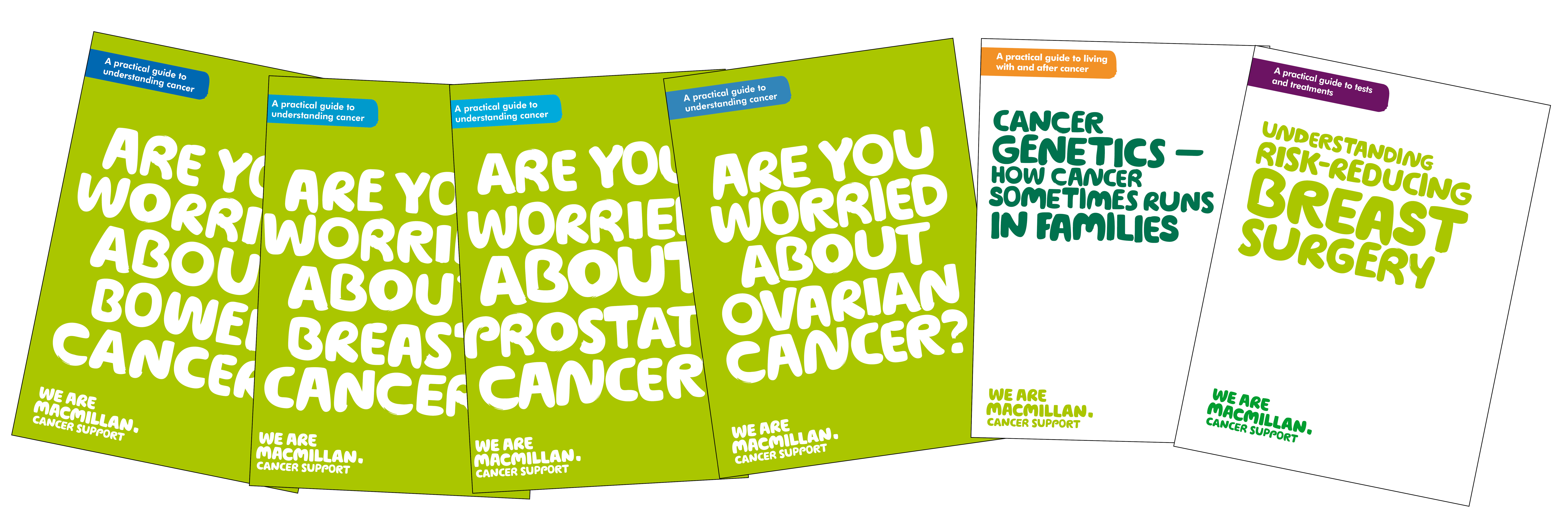
I was looking for designs that use mainly typography to communicate their messages, as well as great use of coloured stock. I came across a number of self help guides and information booklets provided by charities and health services which I found particularly inspiring within the context of this brief.


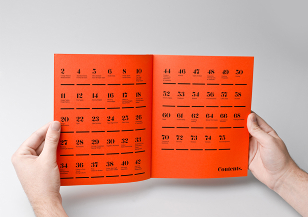
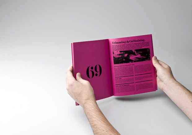
I also found a number of booklets which were designed using beautifully selected typefaces and gorgeous varieties of coloured stock. A number of them didn't use any coloured inks, simply black ink on coloured stock which I found striking and highly effective. 


bold graphic design book design inspiration

Wednesday 27 January 2016

OUGD503 - Brief 02 - Saucy Fish Co - Lean Personas

After conducting extensive primary research as a group in our first session, we came back to LCA and looked through a number of books on packaging. We came across some very interesting, complex structural packaging solutions. It was useful looking at them, however they were too ornate and wouldn't work well for this brief. One of the most essential things to this brief is functionality of the packaging. The packaging must:

-Protect the fish inside
-Display the product at all times
-Stack well on a shelf
-Use shelf space efficiently
-Stand out on the shelf
-Attract a range of younger customers

We conducted this secondary research to see exactly how packaging has changed through the years and if we could take some inspiration from the past and apply it to our own packaging designs. We were seeking imaginative and unique packaging solutions initially. We found the New Packaging Design book the most useful, as it contained a lot of clean cut and smart looking packaging which we believe Saucy Fish Co are looking for. This is the kind of aesthetic that we wanted to explore, using minimal colours, sophisticated type and unique, playful illustrations. This in my eyes, would appeal to the younger target audience a lot more. It will be important for us to remember that it isn't so much the branding and identity design that we are being asked to evaluate, it is really packaging itself that will be central to making the new products a success. 

The majority of the nets and templates we came across did not answer the needs of the brief, so we decided to put that on the back-burner for the time being. We used the rest of our time together to make some considerations for the target audience, who are at the centre of this brief. We introduced Amy, who studies Illustration, to the lean persona's exercise, which I have found very useful in the past.

Doing this exercise allows you to really get into the head of the consumer and identify exactly what their needs are.


Tuesday 26 January 2016

OUGD503 - Brief 02 - Saucy Fish Co - First Group Session

Our first group session was very much research orientated. We met as a group and decided that it would be worthwhile to go to a number of supermarkets in Leeds that stock The Saucy Fish Co. Products. This was very beneficial use of our time and acted as insightful primary research. The brief actually encouraged us to do this; we saw it as an excellent starting point. Our main aim was to examine how the supermarkets display their products. We looked at how the shelf space was used, the actual size of the packaging and what type of packaging is most popular. As well as evaluating the existing branding, identity and packaging that the Saucy Fish Co are currently employing, we wanted to see how other brands and the supermarkets have tackled the packaging of premium fresh fish products. We were looking for similarities and contrasts.

We visited Sainsbury’s and Waitrose first, as we knew we would find the products in there. 
We also paid a visit to Morison’s to size up the packaging competition. We noticed a lot of similar characteristics in the majority of the packaging we came across, including:


  •       Colour - A lot of dark tones, mainly dark blues, greys and black. Black connotes premium quality and luxury; it’s always chic, sophisticated and en vogue. It’s understandable why it is used across premium fish products. Other bold, punchy colours contrast well with black. The existing branding for the Saucy Fish Co used a lot of black. This is something we are either thinking of abandoning or keeping the same, undecided at this point

  •       Material - We noticed that a large percentage of the packaging used cardboard sleeves to contain the information about the product. These sleeves slide over the plastic tray containing the actual fish. The fish was either vacuum packed or had a plastic film encasing it. These sleeves are functional, but very simple and border on being boring. We all agreed that sleeves work well and we will probably look into using one for our packaging

  • -          Plastic- a lot of the packaging involves plastic. The brief is asking us to be environmentally aware as well as cost efficient, so we want to avoid using plastics that aren’t recycled or recyclable. We need our packaging solution to be oven safe and 100% recyclable. We would be able to achieve this quite easily through material selection and the use of soy based inks

  • -          Illustration – some of the less premium packaging features illustrations of the product, a feature that I personally prefer to food photography. I think having illustrative packaging feels far more premium and unique than pure photography. The Saucy Fish Co uses professional food photography on a range of its packaging, something to perhaps consider avoiding and moving away from in our designs. Our designs need to ‘pop’ on the shelves, I see illustrations or at least simplistic collages, painting, vector work offering those qualities

Friday 8 January 2016

OUGD504 - Module Evaluation

OUGD504 – Module Evaluation – Cameron James Wolfe

Design Production was overall, a positively challenging module for me. The individual briefs were diverse and varied greatly from one another, which was exciting and pushed my practice. Brief one was a great introductory project for the second year, allowing me to settle back into working to quick deadlines. Brief two required me to work outside of my comfort zone by designing a logo and collateral for a start-up business. I was in my element in brief three as editorial design is something I feel passionate about and have a strong interest in. Brief four again asked me to step outside of my comfort zone by designing for web, something I hadn’t attempted before in such detail.

After what felt like a very long summer, brief one was a great introductory project to allow me to settle back into the college and back into the swing of working to deadlines and within restrictions of a brief. This brief allowed me to fully realise my own personal creative process as well as understanding other peoples. Leaflet design was something I had little interest in before undertaking the brief, but I felt motivated after completing it to investigate this area of graphic design in more depth.

Brief two was a stimulating brief for me because it asked to enter an area of design which I lack experience in. I was a little anxious at the start, because other than the self branding brief for PPP last year, I had limited experience of designing a logo for a client/brand before. It was huge learning experience, especially in gaining knowledge of liaising with a client and defining specific brand requirements. Fortunately, this brief allowed me to be true to my artistic background, experimenting with media such as paint and ink and collaging to get my ideas flowing, which was refreshing.

Brief three offered me a number of opportunities to really develop my practice in editorial design. This is an area of graphic design that I am very much interested in entering into once I have graduated from the course, so I expected a lot from myself throughout this brief, setting myself high standards and goals, which I felt was necessary in order to produce work that really answered the brief in an original way. I really enjoyed the extended nature of brief three; it meant I had enough time to refine the aesthetic of the publication and take time to consider a number of design treatments, as well as putting good amounts of thought into the production considerations.

Brief four was very different to the rest of the briefs in this module, and for that reason, it was the most challenging for me. I hadn’t designed for web, so it was an exciting challenge. This brief opened my mind to the applications of screen based media, and definitely broadened my horizons in terms of areas of interest within this field of visual communication. Something I found very engaging and refreshing was the briefing by the visiting professionals from Only Studio. They briefed us in a way that I hadn’t experienced before. They helped me realise that the extremely open nature of this brief was a positive opportunity to really explore my web design potential.


I did find aspects of this module enjoyable and I feel that I completed each of the briefs to a standard that I am content with. However, on reflection, I know that there are areas that I would like to improve on, develop and push further in my personal design process and approach to tackling briefs in future projects. At the end of every module, I always reflect and contemplate on what I could have perhaps done slightly differently, which I think is a positive form of self development. For example, if I were to undertake brief three again, I would make much more informed stock decisions, use a more sophisticated binding method and make more considered editorial/layout decisions.  Similarly with brief four, I would allow myself more time to really research campaign website design and strive to embed a consistent theme/concept throughout the sites’ aesthetic.

 Design production has been a massive learning curve for me as a young designer. I have learnt a range of new skills and improved on existing ones. I feel my time management and engagement with feedback has progressed significantly since level four, something I aim to continue to improve on. 

Tuesday 5 January 2016

OUGD504 - Brief 04 - Production Considerations

Throughout this brief, it was important to consider the relationships I would have in a commercial context with other creatives such as web developers, other graphic designers and of course the record labels and the artist. One of the most important design production elements to take into consideration wireframing. Wireframes essentially act as a template or blue print for a website. They indicate to other designers and web developers where content is intended to appear on a website. They are also essential in communicating hierarchy of content, ultimately shaping the end users experience of the site. 

Another large consideration to take into account was type. A fair percentage of typefaces are not websafe, meaning they were not originally designed or intended to be viewed on a web browser. Web safe fonts are fonts that are pre-installed by many operating systems. While not all systems have the same fonts installed, you can use a web safe font stack to choose several fonts that look similar, and are installed on the various systems that you want to support. If you want to use fonts other than ones pre-installed, as of CSS3, you can use Web Fonts. The fonts I chose to use throughout my website are thankfully websafe, which I was really pleased about. 

Other very relevant production considerations that I took were:

-Screen dimensions - I looked at the most commonly used screen dimensions 
-Screen resolutions
-Colour space, RGB
-Various web browsers
-Mobile device dimensions


Monday 4 January 2016

OUGD504 - Brief 04 - Type Consideration

For this brief, it was important to consider the type choices and if they would be suitable to translate to web. Working with screen based media comes naturally to me, but this was a consideration that I didn't consciously think about until quite late on in the design process. So I checked whether to fonts I employed were 'websafe'.

The two type faces used throughout my website are Bebas Neue and DIN. Bebas Neue is a webfont and DIN is available as a webfont as FF DIN. I looked online for some brief information regarding webfonts. 


A desktop font is designed to be installed on your computer for use with applications such as Microsoft Word or Adobe Photoshop. Desktop fonts often have special OpenType features that give the user flexibility in designing with them. Importantly, a webfont is a specially tuned font for use on websites using the CSS @font-face declaration. The majority of webfonts have no OpenType features and often have extraneous glyphs removed.  A webfont comes in four flavors. A TrueType file, a WOFF file, an EOT file and an SVG file. Each one is designed to target different browsers. You need all four when using webfonts to build a website.