Saturday 27 February 2016

OUGD503 - Brief 01 - Secret 7 - Scans & Experimentation

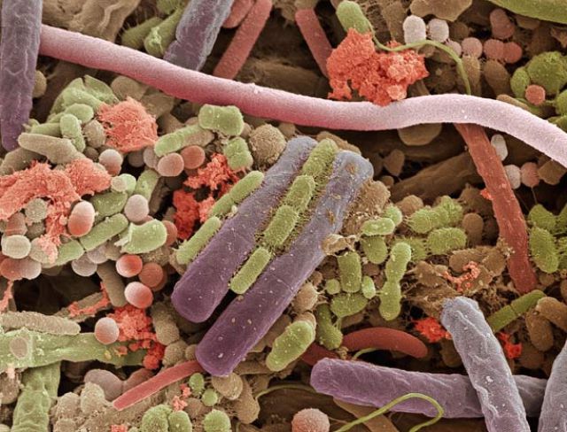
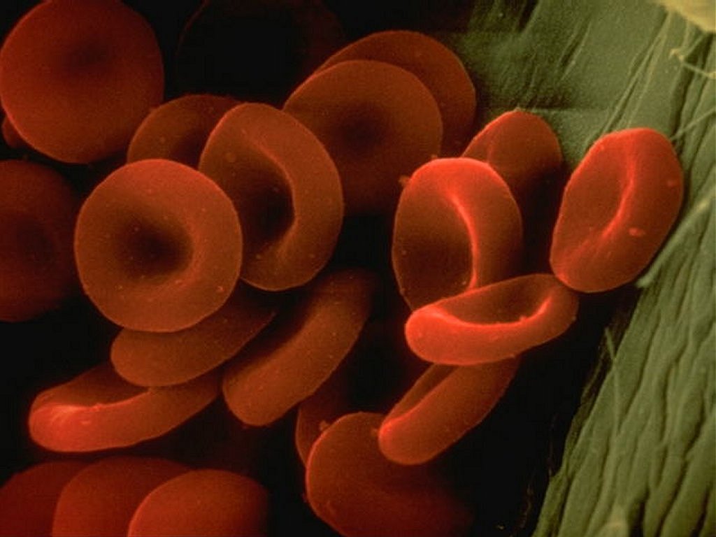
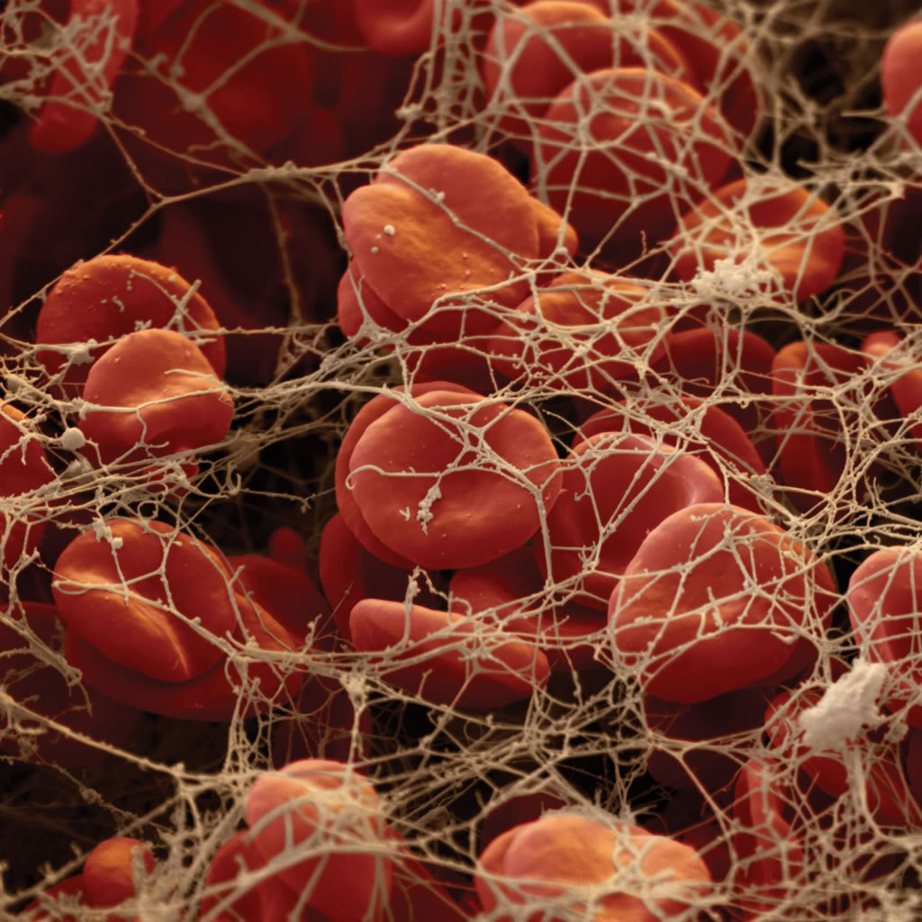
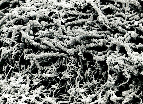
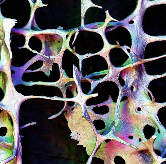
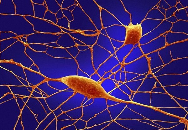
I moved as quickly as possible with this brief, because I have a lot of other work on at the same time and need to spread my attention evenly across the briefs. I was content with the idea of exploring microscopic imagery to represent this song, so I flicked through a great book I own which contains some really fascinating imagery. Once I had selected a range of different images, I scanned them and began digitally manipulating them using Photoshop. Below are a number of images I decided to experiment with. All of them represent a different part of the human body.


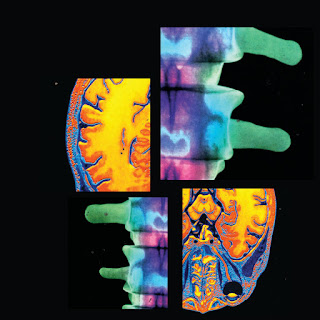
I then began manipulating them digitally, creating collages using the lasso and marque tools in Photoshop. I enjoyed placing very different, contrasting images together, creating patchwork collages of the different microscopic worlds. I really like these experiments, and they all could be entries in their own right. But I felt that they needed to be pushed further, so I continued experimenting in Photoshop looking at the blending tools to see if that would add an extra element of psychedelia and abstraction. 


Thursday 25 February 2016

OUGD503 - Brief 01 - Secret 7 - Initial Designs for 'Dream 3'

When I listened to this track for the first time, all I could think about was extremely abstract patterns and colours, because entering into a dream state is an incredibly abstract experience to me. I found some old photography from my foundation year and manipulated it beyond recognition, turning urban photography from London into psychedelic landscapes. 

I took these experiments into a crit session with some level 04 students. The feedback was mixed, and I was prepared for this. Most of them liked how outrageously abstract I had been in my approach, but others thought I had gone a little too far, saying that the busy designs detract from the pureness and simplicity of the track itself. This was very valid and constructive feedback which I listened to closely and applied to my design treatment. I think I was just trying to be as abstract and conceptual as I could rather than desperately attempted to weave some sort of narrative into my designs. The crit put this into perspective for me, prompting some much needed change. 


Wednesday 24 February 2016

OUGD503 - Brief 02 - Saucy Fish Co - Sleeve Experimentation

We used our fourth session together to get a definitive idea of what we wanted the packaging to look like. We came together and decided to do a few more sketches of packaging possibilities. This was so we had a rnage of concepts to choose from. Experimenting further was beneficial as it meant that we didn't just run with our initial ideas generated a couple of weeks ago. Generating further designs was quite challenging, as we found from research and experimenting with nets that simplicity is key. It was difficult to not just draw out designs that looked similar to the ideas we had already got down on paper. 

We started sketching out the most obvious solutions which helped clear our mind. In earlier brain storms, I came up with the idea of having a large cut out section of the sleeve in the shape of the logo of the Saucy Fish Co. This was a strategic design decision. Aesthetically it will looks beautiful but it also answers the part of the brief that asks us to showcase the fish at all times. This was a simple yet effective initial idea which was developed in this session by myself and my team mates. Amy came up with the idea of 'wrapping' the logo round the sleeve and still having it cut out to reveal the product beneath. This concept is interesting because it incorporates the existing branding in a playful, inventive way and retains functionality. 

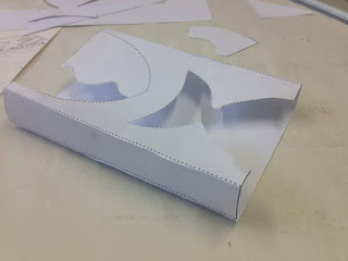
After sketching out the ideas, we mocked up the most successful design on Illustrator into a basic net. We printed out the net, folded and glued it, testing it to see if it would be sturdy enough to act as a sleeve and was if it was aesthetically successful at the same time. We discovered that we could fit the net onto an A3 sheet in Illustrator, which is positive in terms of materials, efficiency and sustainability. It would reduce stock and printing costs too, which is an added benefit. We also thought it would be a nice touch to incorporate the 'wave' of the logo somewhere. We came up with the idea of printing the coloured wave onto the cellophane tear away, adding an subtle extra dimension to the overall packaging, so would be cheaper to print off and would save more paper (something that saucy fish would approve on). 

We have been making excellent progress as a group and I am pleased with the work we have produced so far and the research undertaken. Now it is just a case of finalising the nets for the three different products and making design treatment decisions including stock, type choices, colours, hierarchy of content and composition of the patterns/imagery. 


OUGD503- Brief 02 - Mark Making Experiments

After establishing a packaging solution, we thought it would be an interesting task to take some rubbing's of interesting surfaces in order to represent the crispiness of the fish products. These new products are going to be coated in crispy bread crumbs, nuts and seeds, so we thought that finding textures in our surrounding environment which emulate the hypothetical textures of the fish would be interesting. We aim to apply the textures somehow, incorporating them into the overall packaging design to make it intriguing to the eye. 

We explored the college campus to collect the marks, it was a successful use of time. We would easily be able to digitally manipulate the textures using Photoshop, they would make a great personalised brush which we could create nice patterns from. It adds an element of authenticity and creativity to the packaging, something I think a younger target audience would most likely appreciate

<insert images of rubbings/textures>

OUGD503 - Brief 02 - The Product

After our experimentation session with paper nets, we decided to think more seriously about the packaging solution that we will definitely use for this brief. We noticed from primary research that a lot of products of a similar nature use thin plastic trays to hold the fish, usually covered by a thin transparent plastic film, which is in turn encased by a cardboard sleeve. We agreed as a team that this would probably be the best structural, functional packaging solution. Having a fairly deep plastic tray made from the sustainable plant based plastic where the fish would be placed. The packaging would be protected with a thin cellophane layer which would tear away. The plastic tray is oven safe and could then be placed in the oven. If we were wanting to be very minimal and even more environmentally sustainable, we would not feature any more packaging. However, this would not be practical for a number of reasons. There would be no where for the printed information to go and the cellophane would not be able to hold much weight if more boxes were stacked on top of it. We will include a cardboard sleeve, but it would be more sophisticated that ones we have seen on existing packaging. The sleeve would be more of a box surrounding the tray with shapes cut out of it to reveal the product underneath. Below is a rough sketch:


After we had established a rough packaging solution, we got to work on thinking about the information and content that will appear on the sleeve. There was one problem that needed assessing straight away. The brief was extremely non-descript about the new products themselves. It gave us no information about the new crispy fish products at all, so we interpreted this as them asking us to invent our own recipes, ingredients and products. We decided to create a mind map of what usually goes onto food packaging, in the hope that this would inspire us to come up with three very distinct fish recipes/combinations. Here is what we all agreed must be on the packaging:

Logo
Name of product
Image/illustration of the product
Product description
Ingredients list
Nutritional information
Allergens advice
Sustainability information
Serving suggestions
Cooking instructions
Further information: website etc
Recycling information 

We then came up with three fish products, based on our own tastes, inspiration from the existing Saucy Fish product range and guidance from recipes and serving suggestions found on the internet. It was really fun inventing fish products, and seen as this is not something we do on a regular basis, I think we did well. Inventing the products has made the design process a lot easier already. Here are our new products, with colours associated with the fish (this is for design purposes only):

Crispy Thai Cod w/ Herb & Lemongrass butter sauce – orange, yellows, green, white
Crispy Sea bream w/ Tomato and Coriander filling - reds, white Crispy Salmon filled with Feta, Spinach & Ricotta – pinks, creams, greens

OUGD503 - Brief 02 - Packaging Experimentation

In our third group meeting we experimented with pre-made packaging nets found in a useful source book in the LCA library. We printed our the nets on plain printing paper and got to work cutting and scoring them, folding and then sealing with glue. The process was very useful as it gave us an idea of what sort of structural, functional packaging would work best for this brief. We deliberately chose nets that we thought would be pretty straightforward to construct yet still looked interesting and unique. 

We discovered through folding and cutting that the nets were actually pretty difficult to construct. The folds were complicated and very fiddly. Some of the nets produced boxes which looked strange from the side, and would probably pose a stacking issue on the refrigerator shelves in the supermarkets. The most functional packaging is usually rectangular in nature, lightweight and not too big. These types of packaging stack effortlessly. Regardless, this experimentation was relevant and worthwhile, it gave us insight and doing it by hand was useful primary research. We came to the conclusion that none of the nets we experimented with would be suitable for this brief, so we continued researching and generating ideas. 


OUGD503 - Brief 02 - Material Research

This brief is asking us to be environmentally aware and sustainable. In order to reduce the carbon footprint of the packaging, we would ideally need to use recycled plastic that would either bio-degrade or could be recycled. Cardboard is recyclable, so that wouldn't be too much of an issue. We would need to use inks that have little environmental impact as well. 

We established in the first group session that plastic would be the best option to hold and protect the product. The brief is also asking us to create packaging that can be transferred into the oven easily, so as the consumer doesn't actually need to touch the fish. It's all about efficiency and functionality. As far as I am aware, there are plastics out there that are strong, durable, oven safe and recyclable. We aim to use these materials, or materials of a similar nature. 

Amy did some research into sustainable materials. She discovered that  there are plastics made from plants (PSM and sugar bagasse) which are also heat resistant. These plastics answer the problems of the brief perfectly. Ideally we are looking for a material that you can put straight into the oven which can also be recycled, leaving a minimal eco footprint. There is limited information regarding the actual carbon footprint associated with these plastics, however they are already far more environmentally friendly when compared to oil based materials, as they naturally decompose. 
This research was sourced from the London biopackaging website which is a reliable source. 

We would also look to use recycled card and plastic film made from plant starch to compliment the recycled plastic tray. Soy based inks would also be a wonderful solutions to this brief. Soy ink is a kind of ink made from soy beans. As opposed to traditional petroleum-based inksoy-based ink is more environmentally friendly, might provide more accurate colours, and makes it easier to recycle paper, all of these factors would make our packaging sustainable and environmentally considerate. 

Responsive - Brief 02 - Decoding the Brief

I have read the brief several times now because it is so open, I needed to really unpick and decode the brief to understand exactly what it is they are asking us to produce, and what they aren't. My collaborative group all agreed that it would be interesting and beneficial to think about what else we could produce aside from the packaging. Producing collateral for this brief could give us an extra competitive edge in terms of the competition.

We decided it would be useful to produce a small booklet explaining the new products to the consumer. This booklet would contain serving suggestions, information about the nutritional content and the health benefits of eating fish and do on. The booklet would appear on a POS (point of sale) stand in the store, that would ideally be placed next to the chilled fish counter. We also thought it would be a good idea to produce fridge magnets to add an aspect of novelty to the launch of the brand new products.

Point of Sale displays could give the new products an eye catching edge and appeal to a younger target market. We would make it bold, fresh and exciting in order to attract a wider range of customers. This is the main problem being asked in the brief.

OUGD503 - Brief 02 - Magnet Development

The bare minimum that we must produce for this brief is a structural packaging solution. As a group we all recognised and agreed that this wouldn't be enough to impress the judging panel. We agreed that we needed to produce a range of other supporting materials/collateral to support the new packaging designs, including fridge magnets. 

We thought it would be a fun idea to produce magnets that represent the new products through the presence of the existing logo, various colours and slogans. Magnets are a bit of a novelty item and we thought that they would appear to a younger target market, especially if they are slightly cheeky and comical. We decided to use the shape of the logo for the main magnets, and use a similar typeface for the slogan magnets to extend the existing branding/identity which we feel is already very strong and successful.

Our magnets will be 4 x 7 cm in size and will be made from strong card. We will laminate the prototypes to reinforce them and make them look authentic. They can obviously be attached to anything magnetic but will function well on the fridge of the consumer of the new Saucy Fish Co. product. 


OUGD503 - Brief 02 - Colour Guidelines & Experimentation

The brief was very short and open. It was asking us to design packaging for new products, but they didn't give us any information about what the products would be like other than the fact that they will be fish, filled with sauce coated in a crispy coating of some description. We took it upon ourselves to make up some new products as we thought this would make designing the packaging a whole lot easier. It didn't take us long to come up with three tasty sounding products, thanks to internet based research and collective knowledge about ingredients and complimenting flavours. 

We finalised the recipes for the products and then turned our attention to colour. We had the idea to take colour inspiration from the fish themselves and the ingredients found in the saucy fillings to use throughout the various structural packaging resolutions. We decided to keep the colour to a minimum on the packaging, settling on three colours plus stock. This way the packagaing won't be too visually overwhelming and will retain a sense of premium quality.
  • Crispy Thai Cod w/ Herb & Lemongrass butter sauce – orange, yellows, green, white
  • Crispy Sea bream w/ Tomato and Coriander filling  - reds, white
  • Crispy Salmon filled with Feta, Spinach & Ricotta – pinks, creams, greens
Below are a range of colour wheels that contain colours we think would suit the packaging.. We used Adobe Kuler to seek out interesting contrasting and complementary colours. We are going to select a range to use on the various packagings. 


Tuesday 23 February 2016

OUGD503 - Brief 01 - Secret 7 - Inspiration For Dream 3

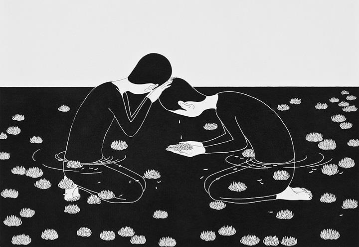
Daehyun Kim Illustrations: This series of drawings entitled 'Moonassi' have influenced and inspired my design treatment for this album cover design. I have admired this illustrator for some time now, and there are several things that I really like about this illustrators style, mostly the incredible attention to detail, beautiful use of line and form and the monochromatic colour schemes. When I look at these drawings, they remind me greatly of sleep, dream states and calm places, which is also what the track reminds me of. Occasionally, his illustrations take a darker tone, which is what tends to happen in dreams. These artworks have inspired me to produce a minimalistic design for this track which takes inspiration from the symbolism, line and form and colour aesthetic. 


Martin Wollertam Illustrations: This artist does a lot of work for Fabric in London, one of my favourite nightclubs. His illustrations are psychedelic, abstract and also remind me of dream like states. When you are clubbing you can often experience feelings of euphoria, confused, enlightenment and so on, all feelings that can be associated with dreaming. I really like the way he de-constructs the human form and enlarges certain parts of the body such as the face. His thick, confident lines contrast well to the illustrations of Daehyun, this inspires me a lot. I also appreciate the fact that he usually tends to work in monochrome. 


Saturday 20 February 2016

OUGD503 - Brief 01 - Secret 7 - Visual Inspiration

I tried to think as conceptually as I could with this brief, so when I listened to Imagine By John Lennon, I thought it would be an interesting concept to explore microscopic imagery of the human body, as this song is ultimately about the human experience. The lyrics may be about society, emotions, loneliness and so on, but I didn't want to try and represent the lyrics. I wanted to represent what was at the very core of the song. 

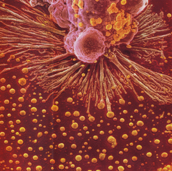
I looked online at some amazing imagery of parts of the human body under a microscope. Some of the imagery literally looks like abstract pieces of artwork in their own right. I was really inspired by the fantastic natural forms and colours produced from the microscopic imaging process. I know that these colours aren't natural, but they are vibrant and eye catching and I think would work perfectly in a digital collage. I have a great book titled 'Heaven and Earth' which is packed full of high quality microscopic imagery. I am going to scan in some of the best, most unusual images and manipulate them digitally. 


This is what bone marrow making blood looks like.

These are adrenaline crystals.

These are insulin crystals.