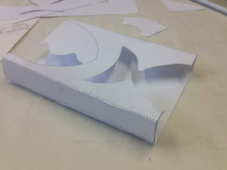
We used our fourth session together to get a definitive idea of what we wanted the packaging to look like. We came together and decided to do a few more sketches of packaging possibilities. This was so we had a rnage of concepts to choose from. Experimenting further was beneficial as it meant that we didn't just run with our initial ideas generated a couple of weeks ago. Generating further designs was quite challenging, as we found from research and experimenting with nets that simplicity is key. It was difficult to not just draw out designs that looked similar to the ideas we had already got down on paper.
We started sketching out the most obvious solutions which helped clear our mind. In earlier brain storms, I came up with the idea of having a large cut out section of the sleeve in the shape of the logo of the Saucy Fish Co. This was a strategic design decision. Aesthetically it will looks beautiful but it also answers the part of the brief that asks us to showcase the fish at all times. This was a simple yet effective initial idea which was developed in this session by myself and my team mates. Amy came up with the idea of 'wrapping' the logo round the sleeve and still having it cut out to reveal the product beneath. This concept is interesting because it incorporates the existing branding in a playful, inventive way and retains functionality.
After sketching out the ideas, we mocked up the most successful design on Illustrator into a basic net. We printed out the net, folded and glued it, testing it to see if it would be sturdy enough to act as a sleeve and was if it was aesthetically successful at the same time. We discovered that we could fit the net onto an A3 sheet in Illustrator, which is positive in terms of materials, efficiency and sustainability. It would reduce stock and printing costs too, which is an added benefit. We also thought it would be a nice touch to incorporate the 'wave' of the logo somewhere. We came up with the idea of printing the coloured wave onto the cellophane tear away, adding an subtle extra dimension to the overall packaging, so would be cheaper to print off and would save more paper (something that saucy fish would approve on).
We have been making excellent progress as a group and I am pleased with the work we have produced so far and the research undertaken. Now it is just a case of finalising the nets for the three different products and making design treatment decisions including stock, type choices, colours, hierarchy of content and composition of the patterns/imagery.


No comments:
Post a Comment