Thursday 31 March 2016

OUGD505 - Brief 01 - Initial Experimentation

I began by sketching out my initial ideas surrounding the theme of Dante's Inferno using Illustrator. I decided to use this software because I knew that I wanted the final designs to feature clean, vectorised illustrations and type. I did consider sketching out the designs by hand, but realised that this sort of aesthetic was not what I was aiming to achieve. I knew from the start that I wanted the designs to be aesthetically pleasing, visually appealing, gorgeous and lust-worthy, to make a direct reference to the initial quote which sparked my imagination. 

I began by trying to depict the idea of Dante's Inferno with the nine separate descending circles of hell. I wanted to represent them in a minimal, contemporary way, so I played around a lot with pure lines and simplistic, thin circles. These patterns were also partly inspired by some of the ornate patterns I have observed on a range of traditional bank note designs. In context, these patterns act to protect the design from being easily copied or faked. They are basically beautiful security features, which are subtle and almost unnoticeable to an untrained eye. I am unsure at the moment whether or not to focus on developing these patterns, because I am not sure if I want my designs to feel that traditional or reminiscent of past designs. 


I moved quickly away from trying to represent the nine circles in a 3D way, and started to experiment with more 2D, geometric patterns. I began to see what the circles would look like in a repeat pattern and the results were pleasing. These repeat patterns could form the background of the designs and could also double up as 'security patterns'. I think using circles to represent the idea of 'hell' is a subtle way of making a comment on money being the driving force of much evil. I don't want to simply plonk an image of the devil on the banknotes, because that would be too obvious to me. 


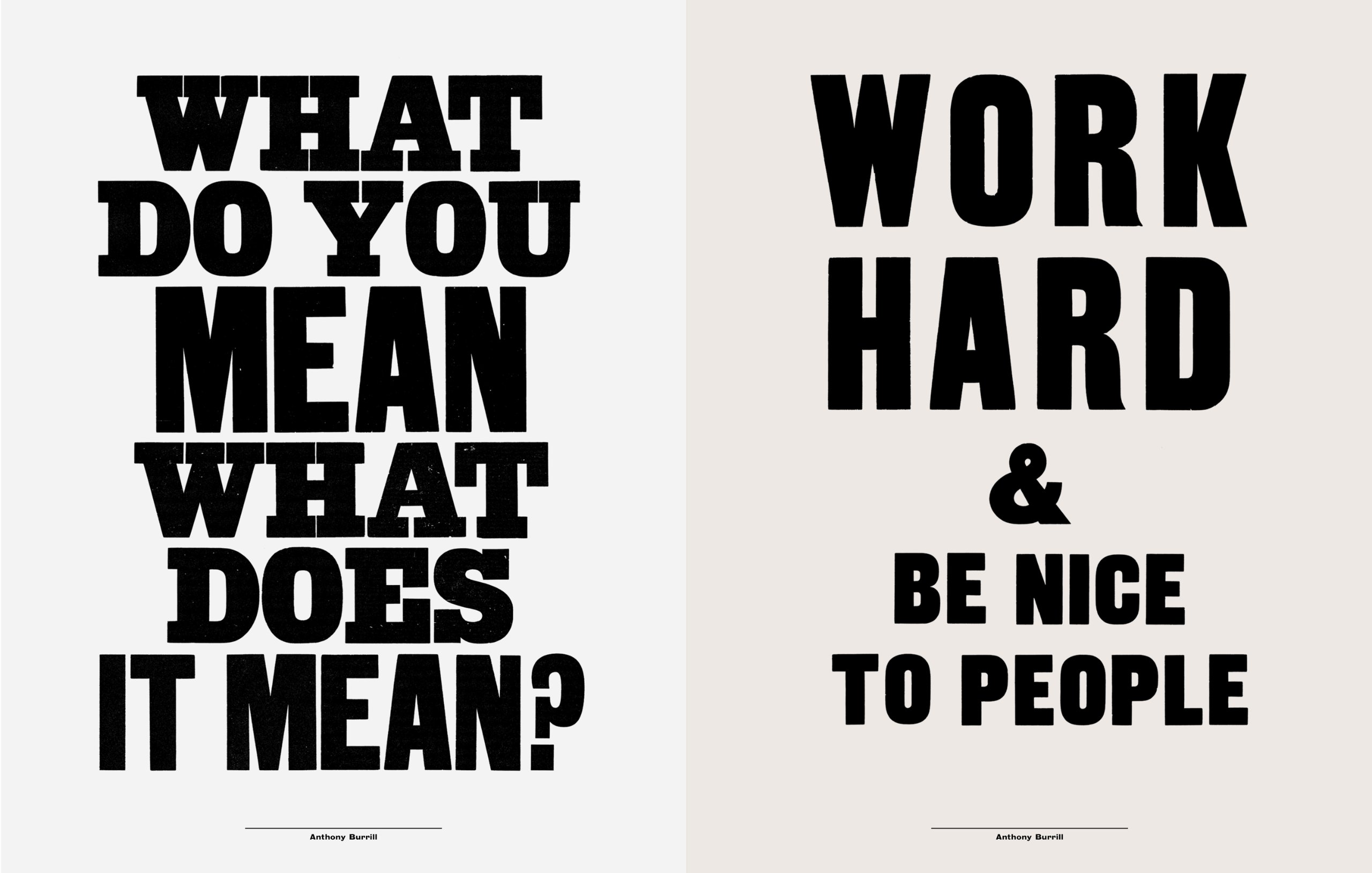
I then began to assess some typography choices. From my common knowledge, I already have an idea of what sorts of typefaces are synonymous with bank note designs. Traditional notes form this country usually feature very ornate, hand drawn serif fonts. This is to keep in line with traditional aesthetics. I could go down this route, but I want my notes to feel of the time. Therefore, a contemporary sans serif would be more suitable in my eyes. I experimented with a number of serif, sans serif and black letter typefaces, and at the moment, Harbour Bold is looking to be my favoured typefaces because it feels highly contemporary but still makes references to classic Germanic black letter design. I like the idea of creating a hybrid between contemporary and traditional aesthetics. 


OUGD503 - Brief 01 - Monotype - Stickers

As an additional touchpoint, I designed some very simple stickers which would give the campaign a 'guerilla' edge. People who want to support the campaign would easily be able to spread the word of the cause by ordering a set of stickers from the website and distributing them everywhere and anywhere they see fit. The stickers encourage social media interaction through the presence of hashtags. This will be key in gathering support from a younger, technologically engaged audience. Below are a range of images of the stickers in context in an urban environment. 


Tuesday 29 March 2016

OUGD503 - Brief 01 - Secret 7 - Bad News

received an email a day ago letting me know that my entries to Secret 7 were again unsuccessful. I didn't get selected last year which was disappointing because that was the first ever graphic design competition that I had ever entered. I genuinely felt a lot more confident with my submissions this year. I felt that they were far more conceptual and realised compared to what I entered the previous year. I got really positive feedback from my peers and tutors as well, which made me feel as if I was in with a good chance of getting selected this time around. Unfortunately, my designs were just not what the judges were looking for. I will definitely enter again next year, perhaps it will be third time lucky. This has made me upset but it hasn't knocked my confidence completely. I won't let it stop me from entering more competitions and trying even harder.  The email is as follows:

We're really sorry to have to tell you that your artwork hasn't made it into this year's exhibition.

Thank you for getting involved in our project. We always have and always will have an enormous amount of respect for the effort and enthusiasm people like yourself show our Secret 7". We hope that you'll continue to follow and support us.


With each year it’s becoming much harder to make our selections for the 700 sleeves in the show. This year we had almost 7,000 submissions on the website, smashing our previous record. Coupled with that, the overall quality is improving massively year on year.
Sorry again. Delivering this news is the least enjoyable part of the project for us.


I entered several designs this year, and this may well have been my downfall. I think I need to get more selective with my entries to competitions of this nature. However, below are mockup's of my favourite pieces I entered to Secret 7:


OUGD503 - Brief 01 - Blank Poster Entries

A Blank Poster has a lot of potential
—which is why every week we create posters based on a randomly generated word. The word works as the only common guideline for all participants and there are no judges so everyone is free to interpret the brief in their own way. The goal is to have a nice break from busy things and to be able to exercise creativity without restrictions.
We would love to have you with us so send us your poster design featuring the word of the week or if you’d like you can create a poster based on an old word which you can find an overview of in the filter function. The posters are made in a 5×7 ratio and submitted in a 1400 x 1960px size.

A friend on the course showed me this website a few weeks ago, I was instantly intrigued and thought it would be a worthwhile use of my time entering designs to this as regularly as I can. The word changes each week, which is a nice concept. The word that I chose to enter was SEARCH.

The first thing that came to mind was searching for paradise. I feel that this is something a lot of people do a lot of the time, because they are fed up of their life at home. I have been fortunate enough to travel to some pretty exotic locations, which were paradise to me at the time. I took a lot of photographs on my travels, and I saw this brief as a great way of manipulating and using my travel photography. Palm trees are synonymous with 'paradise' so I converted a section of an image into a brush in Photoshop and created vibrant, neon compositions with the brush. The results were pleasing, so I emailed them into Blank Poster. 


Another thing that I think about when the word SEARCH comes up is the concept of having a tribe in life. I believe that there is a tribe of like minded people waiting out there for everyone, should they feel they need to go and find them. Personally, I don't feel that I have found a solid tribe of people that I can truly relate to on a creative level, so I am still searching and seeking for them at this moment in time. I thought it would be a nice concept to create a poster around this theme of searching or like minded people. I wanted the design to make an impact, so I used a bold contemporary typeface paired with a simplistic image of a wild cat. The image of the cat conceptually ties into the theme of tribes. I think the poster is successful as it draws inspiration and influence from fan zines which are something I associate with gangs, tribes and followings. It was a fun exercise responding to this very open brief. I create all of the designs in under an hour, which was challenging. Working quickly is something I am good at, but have been trying to avoid recently. However, working quickly for this project was beneficial. I look forward to entering designs to BlankPoster regularly over the coming weeks. 


OUGD503 - Responsive - Brief 01 - Unsuccessful Competition Enteries

Over the summer of 2015, I decided it would be a good use of my time to enter a number of design competitions to keep my practice fresh and relevant. Summer is a long break from being in the college environment and I didn't want to become lazy or unproductive. 

When I saw that Channel 4 were calling out to creative's to produce a conceptual poster for the upcoming release of This Is England 90', I got really excited and become really confident in my design abilities. The brief was pretty straight forward: design a fictional poster promoting a acid house rave in early 90's Britain. Design from this era really interests me, I really love the aesthetics, DIY feel and all the patterns and mixed use of type. I got stuck in, sketching and messing around with scans on Photoshop. I pushed my designs around a lot and asked for feedback from my course mates and friends who all seemed really positive about my ideas. I submitted my designs and checked out the competition online at TalentHouse.com. I was feeling confident, but unfortunately my design was not selected by the Channel 4 judges. 

The winning entry was decent but I felt that it looked far too digital and didn't capture the essence of the make shift, DIY approach of those early rave promoters. I was a little disappointed, but it didn't knock my confidence too much. 


I entered another poster design competition: Design Breda - What Do You Do?
This competition was all about graphic designers and how they define their individual practice and their insightful views on the creative industries. As I had barely been studying graphic design for a year and certainly didn't want to label myself as a graphic designer instantly, I thought it would be an interesting exercise to enter this competition. I looked to incorporate my portrait into the work, as well as experiment with colour, mixed typography and subtle use of language. The underlying message of the design was staying true to myself as a creative person. I think that this is incredibly important in everything I do. I believe graphic design should be representational of the designer. I should be able to express my personality and character through my visual output. That was the message I was aiming to communicate. Again, I submitted my work feeling very confident but I unfortunately didn't get selected to feature in the exhibition. It didn't stop me from being ambitious, infact, it only made me more determined to refine my practice and up my game. 


Monday 28 March 2016

OUGD505 - Brief 02 - Research - Food Inc.


Similarly to Cowspiracy, this underground documentary aims to enlighten people to the very real problems associated with modern day agriculture and food production methods. It is not a preachy, radical film, rather it exists to merely enlighten people to the negative implications of our modern lifestyles. Themes of sustainability, environmental damage, climate change and food insecurity run throughout the show, and all of these themes are highly relevant to this design project. I didn't think that this documentary was as effective as Cowspiracy, but it was still worth watching. I learnt a lot from it and it motivated and inspired me to adopt a certain tone of voice in my practical design work. I find watching videos like this very useful and beneficial to the development of my design process and certainly learn a lot more from visuals than from certain types of contextual research found in text form. I am glad that I took the time to watch it. 

OUGD505 - Brief 02 - Research - Cowspiracy


Cowspiracy: The Sustainability Secret is a groundbreaking feature-length environmental documentary following intrepid filmmaker Kip Andersen as he uncovers the most destructive industry facing the planet today – and investigates why the world’s leading environmental organizations are too afraid to talk about it.
Animal agriculture is the leading cause of deforestation, water consumption and pollution, is responsible for more greenhouse gases than the transportation industry, and is a primary driver of rainforest destruction, species extinction, habitat loss, topsoil erosion, ocean “dead zones,” and virtually every other environmental ill. Yet it goes on, almost entirely unchallenged.

As Andersen approaches leaders in the environmental movement, he increasingly uncovers what appears to be an intentional refusal to discuss the issue of animal agriculture, while industry whistleblowers and watchdogs warn him of the risks to his freedom and even his life if he dares to persist.

As eye-opening as Blackfish and as inspiring as An Inconvenient Truth, this shocking yet humorous documentary reveals the absolutely devastating environmental impact large-scale factory farming has on our planet, and offers a path to global sustainability for a growing population.

I had been meaning to watch this documentary for some time, so saw this as the perfect opportunity to make an excuse to watch a film as part of my broad research for this brief. The issues in the film don't necessarily directly link to the concerns I am exploring in my practical work, however, the large overarching theme of sustainability and food security does link and tie in perfectly with the issues I am interrogating. I was already aware of the majority of the facts, stats and information revealed in the film and it didn't really shock me. If anything, watching it made me more determined to produce some amazing work for this brief to try and instigate real, positive social, environmental and political change through graphic design. I really appreiciated the brutal honesty of the film and how much exposure it has created on these previously unexplored areas. It's definitely worth a watch if you haven't seen it. 

Friday 25 March 2016

OUGD503 - Brief 01 - Monotype - Aesthetic Inspiration - Anthony Burrill

Anthony Burrill is very famous for his mixed use of letter-forms, primarily working with letterpress and analogue printing methods. I think his work is brilliant because it is clear that he really understands composition and the value of simplicity. This is something that I want to convey in my campaign: diversity and simplicity. 

His messages are always to the point, which is something that I am going to have to achieve through my designs. Successful campaign posters, banner etc are usually short, snappy and have high impact, this is definitely the tone that I need to strike through my designs. 

His brilliant mixture of type and bold use of colour has massively inspired and influenced my design treatment for this brief so far and I am going to continue referring back to his extensive body of work for further inspiration.

I also really appreciate his passion for letterpress and other analogue printing techniques. I personally didn't see the need to screen print my final work for this brief, it would have been nice but too time consuming. I can try to emulate the style of his letterpress work digitally which might be interesting. 


Thursday 24 March 2016

OUGD503 - Brief 01 - Monotype - Additional Touchpoint Final Printed Mockup

For submission to D&AD, I decided to print one A5 mockup of my Unpin The Badge zine on high quality bright blue stock from the college library. I used the digital print resource at LCA to print the mockup out. I decided to print out one copy to save money, I didn't see the need to print our five different copies on five different coloured stocks. I am really proud of the final outcome for this aspect of the brief, I feel it looks highly professional and I believe it would easily appeal to a very wide range of people including young teenagers right the way through to 30 year old adults. 

The booklet would be distributed far and wide, appearing anywhere, especially in work places, offices, schools, colleges and universities and in cafe's and bars. The booklet would be free and can be ordered online via the campaigns website. Because the booklets use only black inks, the printing costs would be in theory, very low, meaning they could be printed and produced in large batches and distributed across the UK. 


Tuesday 22 March 2016

OUGD503 - Brief 01 - Monotype - Additional Touchpoint Finalisation

After presenting my developed zine design to a crit group and a couple of my tutors, I made some adjustments to the overall look and feel. People said that they would like to see the zine with a fresher background, suggesting I made the background of all the spreads white, in order to allow the rest of the content to stand out on the page. This was definitely a valid piece of feedback which I took on boards. They also said that the body copy should be easier to read, suggesting I use a sans serif such as Franklin Gothic which is slightly more legible than Apercu. I made this alteration and it improved the overall reading quality of the content. People also suggested that I should consider making the content entirely monochrome and print onto vibrant coloured stock. This piece of feedback was unexpected but I took in on board and tried it out. The results were brilliant and made the finished printed booklet look highly professional and consistent with the rest of my campaigns collateral.


Monday 21 March 2016

OUGD503 - Brief 01 - Monotype - Additional Touchpoint Development

I worked very quickly to develop the zine's aesthetic. It was simply a case of formatting all of the appropriate words and phrases into a consistent layout. The booklet follows a simple formula. It first introduces the cause, spelling out to the reader the exact dangers and wider issues associated with labelling and stereotyping within society. It then goes onto describe the various types of labelling that are present in society and how to keep an eye out for them. Finally, the zine offers the reader a list of tips and pieces of useful advice on how to metaphorically 'unpin the badges'.

Aesthetically, I chose to use a range of five different colours which I directly sampled from an image of a collection of retro feminist badges. I really like the colours as a combination, they compliment each other beautifully and retain a retro quality whilst still feeling quite contemporary. The typefaces used are all authentic and represent a retro aesthetic. I chose to use a lot of black mainly in the background to add depth and further contrast. Perhaps there is a little bit too much black, I am going to take these experiments to a crit to get their opinion on the aesthetic choices. I am pleased with the layout of the content and the tone of voice of the body copy that I wrote myself, all that needs to be refined is the composition of the layouts and the colour choices.