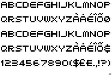
The aim of today's task was to get us thinking about typography three dimensionally rather than two dimensionally. In preparation we were asked to bring in some cardboard for the task. Cardboard is a great material to mess around with and I had a lot of fun during today's activity. We chose a typeface to base our experimentation on. We went for 'Airlock', which is a typeface based on pixels. The upper case letter forms are 5 pixels high. We were interested in investigating depth and perception, we wanted to de-construct the letter X and look at using pieces of cardboard to represent the individual pixels.
We decided to construct our three dimensional letter form underneath a table. creating a box like installation. We were inspired by concepts of tunnels and vanishing points, almost like the pixels are disappearing and going into hyperspace. We chose to use an orange piece of card as a backdrop for our design as we thought it would make it stand out nicely and provide some much needed contrast with the brown cardboard.

We installed a view finder made from a box and hung it at an appropriate distance away from the suspended letter form. This way viewers can see our design without the table legs etc being in the way. It depends on which angle the views looks at it which makes the experience of observing the letter form interactive. We did have some issues when trying to align the cardboard squares uniformly but we got around this by making the string more tense with cellotape. We discussed rounding the edges of pieces of suspended cardboard but if we had done that it would not represent 'Airlock' very successfully.

I found today's task enjoyable and it did allow us to think three-dimensionally more creatively. Typography obviously isn't always two dimensional . Typography is found everywhere and creating it three-dimensionally was challenging but really fun and interesting. It was great to working in a group and was brilliant combining collective ideas. I look forward to doing some more practical work of this nature soon. Below is the final outcome:

We chose to print the letter 'X' on the central piece of cardboard to create a visual vanishing point. In hindsight this probably wasn't the best creative decision but it does add to the effect of vanishing light etc. It creates something for the eye to focus on which is important, but it doesn't relate to the theme of pixillation and geometry which lets the design down slightly.
No comments:
Post a Comment