I began by looking at some very boring designs offered by various supermarkets including Asda, Sainsbury's and Tesco. I also looked at some quite basic frames from Ikea. What I noticed about all of the designs is that the use of colour is fairly basic. There isn't much of a variation in tone etc. They also like to use very basic imagery. Perhaps because the frames them self are relatively cheap, the printing costs were forced to be kept to a minimum, which I can understand. The frames I first looked at had a rough price range of £1.50 to £10.
There are't really any concepts going on in these designs. The most obvious concept would be that the frames are perfect for displaying family moments, as imagery of children is used in four of the designs below. In the other designs type is the dominating force.
Another issue that sprung to mind is the fact that photo frames have become a bit of a novelty item, well certainly to me and probably a large percentage of people my age and from my generation. We are the digital generation, obsessed with 'selfies' and uploading as many images we can from our lives to social networks and personal blogs, so photo frames could potentially become redundant to us. It's rare for me at least to see my personal photographs in frames. I would love to frame some of my photography, but I just never get round to it. Hopefully at some point I will get round to actually printing some off and framing them.
Framing an image gives it context. Frames are reserved for only the most meaningful images. In this brief I want to play off the idea that frames are important and still relevant as objects. We should revert back printing out our imagery. Memories last longer in frames. I need to make my designs vibrant and eye catching to make them stand out amongst the wide range of frames that are on offer.
 |


I continued to research on the internet, in search of more quirky designs. Designs that use maxims and short statements. Designs that are aimed a lot more at my generation and age demographic. The designs used by the supermarkets are simple, they fulfil their purpose but they are dull. I think this is because they are aimed at a predominately older target market. I don't want to fall into that category of being dull.
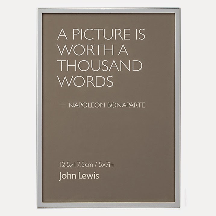
I went to the John Lewis website and instantly found several frames with really interesting and engaging backing paper designs on them. They all use typography and no imagery, but they inspired me and I found them a lot more aesthetically pleasing compared to the cheaper frames. The messages in these designs are thoroughly considered and have great connections with photography in general.


I also looked at Urban Outfitters, a clothing and accessories store who's target market is anyone under the age of 40. The designs for the backing paper of their photo frames is the most exciting and vibrant out of the frames I have researched so far. It is clear that they are aimed at a much younger target market. They also have a much more feminine feel to them. Stereotypically feminine colours have been used, which is interesting. Perhaps photo frames appeal more to girls than boys. I would say that the designs for the John Lewis are fairly gender neutral through their use of colour and typography.

'This 3D photo frame features a suspended sequin display to take any photo from not to hot within seconds' taken from the Urban Outfitters website. I think it's fun and playful, and the image they have used in the background has connections with the internet and meme imagery, which is popular amongst the younger generations.
Urban Outfitters promote youth culture, this is clear in the photo frame designs below. They have embraced the concept of selfies and have used that a concept for selling photo frames. They have included a funny photograph of a dog, instead of a boring portrait of someone you don't know or a random scene from a place you've never been.

Further examples of vibrant and much more exciting designs used by Urban Outfitters. 


Paperchase is a stationary shop that also sells objects such as photo frames. They have some interesting designs on their website. These designs primarily use type rather than image which I quite like. The choice of type is nice, it makes them feel a little bit hand crafted and more personal than a clean cut Sans Serif.

I came across this very simplistic design for Oliver Bonas, a bespoke online department store. What I enjoy about this design is its simple but effective use of pattern and it's minimal use of type. The dimensions are simple put as '4 x 6"' underneath the brand name. This sort of backing would appeal to a lot of people because it is not overly complicated. It's classy and relatively gender neutral.
Below are a selection of frames designed with Charles Rennie Mackintosh in mind. The backing papers for these frames are highly stylized. Art Nouveau work is highly geometric in appearance, plenty of bold shapes are used as well as a lot of very clean lines and blocks of colour. The designs are simplistic which is what I like. They are sophisticated but can appeal to a wide target audience. People who appreciate this art movement will be drawn more to these frames as they are have a strong appearance. To me these frames are not necessarily aimed directly at women, although the imagery of a rose could suggest a feminine stance. I have notice throughout my research that the designs for these backing papers usually have a feminine quality to them. I could play on this in my own work.


No comments:
Post a Comment