Today we did a workshop focusing on concepts within graphic design. A body of work, project or idea doesn't necessarily have to have a concept behind it, but concepts usually make a piece of design much more unique, considered and brilliant. A concept can be defined in many ways, for example a concept could be seen as an abstract idea, or a plan or intention, or an idea or invention to help sell or publicize a commodity. Concepts can be the doorway to great outcomes. Concepts can underpin the development of an entire brief/project, that's why they are important. In art and design, especially fine art, a conceptual idea is an interesting thing. It is the idea or concept presented by the artist that is considered more important than the finished product, if any such exists
.
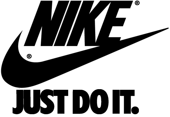
In design successful concepts can run for many years. For example, hugely successful multinational brands and companies such as Nike have and continue to use the same concept in their branding and advertising. 'Just Do It' is a trademark of Nike, and one of the core components of Nike's brand. The slogan was coined in 1988 at an advertising agency meeting. The concept behind the slogan is highly successful. The campaign allowed Nike to further increase its share of the North American domestic sport-shoe business from 18% to 43%, (from $877 million to $9.2 billion in worldwide sales) from 1988 to 1998
Other examples of successful concepts that underpin brand identity:


We were put into small groups and allocated a brand. The aim of the task was to improve on the existing brand identity, by coming up with a strong concept. We started out by looking at the existing website for the company. Our thoughts were similar. We thought that it looked very outdated, very dull and quite basic. So we wanted to bring into 2014 with a strong new identity backed by a strong concept. Burflex is essentially a scaffolding company that was founded in 2003, and by the looks if it they haven't really put much effort or time into developing a strong brand identity in the 11 years that they have been around. On their 'About Us' section on their website, they state: 'There is virtually no cap on the size of a project or the location that we are able to take on. We believe all of our customers’ needs are important, so we are constantly improving our on-going training, qualifications and achievements to fulfil our clients' needs.We currently have contracts with a number of the largest building and commercial companies in England, but we still carry out a great deal of one-off, small-scale projects for building firms in the public and private sectors' From this we could see that this company is obviously flexible in the way it operates, and this is something we felt we wanted to communicate in our re-design. Scaffolding is obviously not flexible, but we saw this as an opportunity to challenge any preconceptions surrounding construction.


We chose to redesign the company's logo. We felt that their existing logo is too dull and boring. We decided to use the colours warm yellow and grey to fit in to the context of construction.
The yellow chosen representing safety; there are strong connotations with hard hats and signs for example. We chose to use a medium shade of grey as it links in nicely with the metal poles used to construct the scaffolding itself. In other experimentations we were inspired by the
original logo which the company employ and its use of layers convey various floors that could make-up a building.
Our new slogan that we came up with was 'Working Around You'. In order to visually communicate this we placed the capital B for Burflex in the centre of the new logo. The abstract shapes that surround the letter-form can represent a number of things. To me I see the logo as a map, or an aerial view of a city. The white lines are the streets and the grey blocks represent buildings all 'built' around the large B in the centre. The feedback on this logo was generally positive although a few people said it could potentially be mistaken for a football, or an animal's skin, maybe crocodile or Giraffe. I can see why they would say that, but the concept for us is strong enough to justify our design decisions.

We then mocked up an invoice that the company would send out to its clientèle. We used the same colour scheme throughout to give the brand a clear identity. For me the use of yellow makes the overall tone happier and way less dull compared to the original feel.


No comments:
Post a Comment