After experimenting with various ideas, I decided to push my concept of creating faces from places further and develop it into a set of final designs. I did further research this time looking at specific artists rather than product research. I already had a few names in mind when thinking about faces and places.
One of the biggest influences for me in this particular brief was the collage work of John Stezaker. This brilliant collage artist has inspired me for a long time and provided me with a lot of excitement for this project. John Stezaker’s work re-examines the various relationships to the photographic image: as documentation of truth, purveyor of memory, and symbol of modern culture. In his collages, Stezaker appropriates images found in books, magazines, and postcards and uses them as ‘readymades’. Through his elegant juxtapositions, Stezaker adopts the content and contexts of the original images to convey his own witty and poignant meanings.
In his Marriage series, Stezaker focuses on the concept of portraiture, both as art historical genre and public identity. Using publicity shots of classic film stars, Stezaker splices and overlaps famous faces, creating hybrid ‘icons’ that dissociate the familiar to create sensations of the uncanny. Coupling male and female identity into unified characters, Stezaker points to a disjointed harmony, where the irreconciliation of difference both complements and detracts from the whole. In his correlated images, personalities (and our idealisations of them) become ancillary and empty, rendered abject through their magnified flaws and struggle for visual dominance.
In using stylistic images from Hollywood’s golden era, Stezaker both temporally and conceptually engages with his interest in Surrealism. Placed in contemporary context, his portraits retain their aura of glamour, whilst simultaneously operating as exotic ‘artefacts’ of an obsolete culture. Similar to the photos of ‘primitivism’ published in George Bataille’s Documents, Stezaker’s portraits celebrate the grotesque, rendering the romance with modernism equally compelling and perverse.

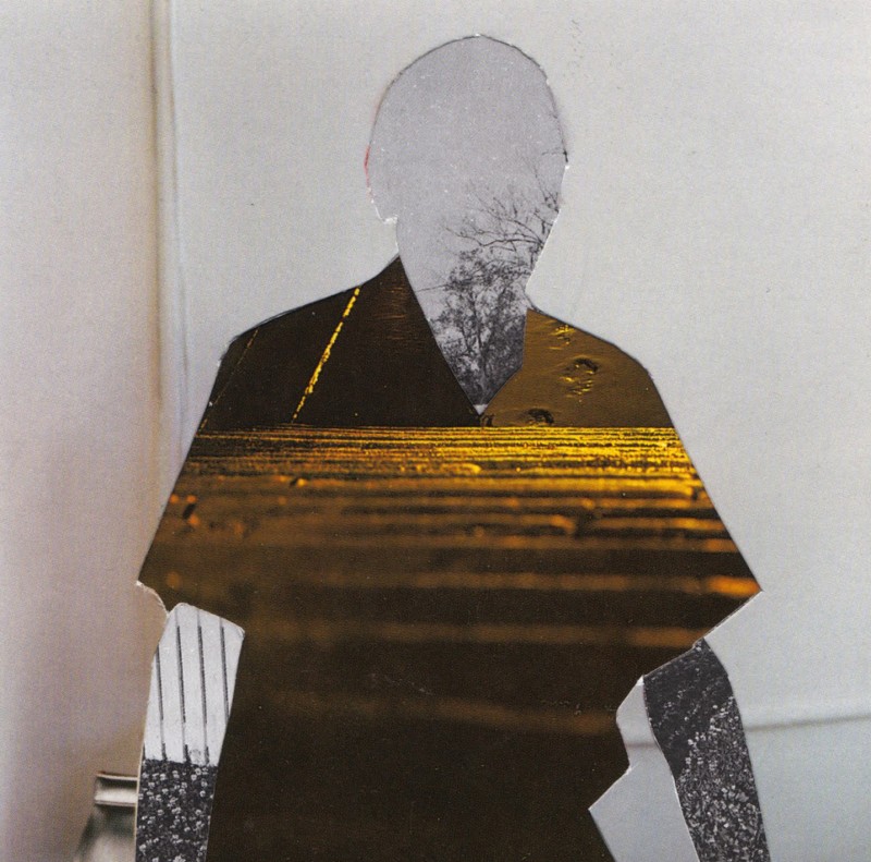
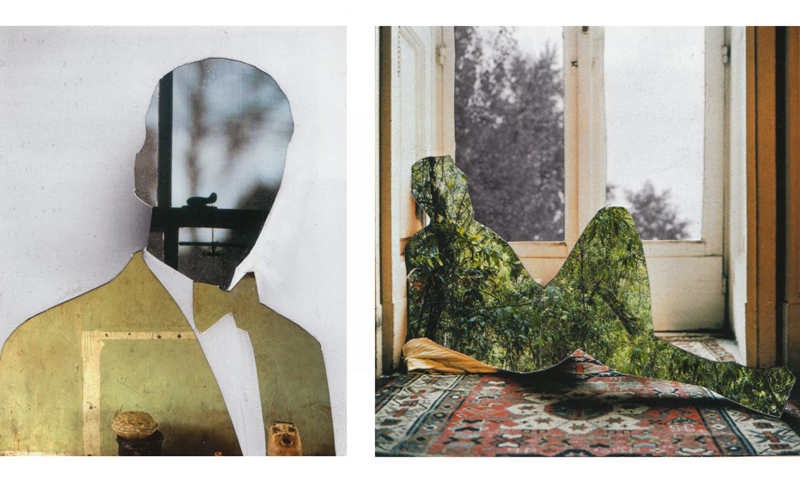
The series of work that inspired me to create faces from places was Stezakers 'The Masks' series.
Initiated around 1980, the series of Mask collages developed from the Film Still collages, such as The Trial, The Oath and Insert (1978-9). 'The Masks' all follow a similar and deceptively simple format: a film publicity portrait of a star whose face is covered by a postcard – ostensibly a mask – which opens a window into another space, paradoxically suggesting a view behind the mask constituted by the actor’s face. Initially the postcards were images of bridges and caves which in some instances united two or more protagonists. Over the years Stezaker has extended his range of imagery to include tunnels, caverns, rock formations such as stalactites and stalagmites, railway tracks, historic ruins and monuments, woodland clearings and paths, as well as streams, waterfalls, lakes and the sea. Stezaker began collecting film stills in 1973 but was not able to afford photographic portraits of film stars until the early 1980s when their price dropped. The first portraits the artist used were damaged or of forgotten film actors, unnamed and anonymous. He has commented:
"The Masks were inspired by reading Elias Canetti’s essay on masks and unmasking in his wonderful book Crowds and Power which inspired so much of my work at this time ... I was also teaching a course on Bataille and the origins of art which focused on the mask as the origin and point of convergence of all the arts. Canetti’s idea of the mask as a covering of absence and, in its fixity, as a revelation of death, alongside my discovery of Blanchot’s Space of Literature, was an important turning point in my thinking and in my approach to my work. I usually think of the key dates being 1979 and 1980 as marking a yielding to pure image-fascination and as a release from any function societal or transgressive in the work. The Masks were a response in practice to the Canetti/Blanchot idea of the ‘death’s space’ of the image and consolidated the sense of pure fascination and the desire for ‘exile from life in the world of images’, an ideal I saw in the practice of Joseph Cornel."


His Masks series directly influenced the final development of my design process. Where as Stezaker's work is quite bold and brutal in terms of composition, I think that my work has a more subtle quality to it. It requires a bit more thought and attention to actually distinguish a face within my work, which I am really pleased about.
Linda Sterling
A radical feminist and a well-known figure of the Manchester punk and post-punk scene, Sterling was known for her montages, which often combined images taken from pornographic magazines with images from women's fashion and domestic magazines, particularly those of domestic appliances, making a point about the cultural expectations of women and the treatment of female body as a commodity. Many of her works were published in the punk collage fanzine Secret Public, which she co-founded with Jon Savage. The key feature that inspired me when researching her work was her love of huge feminine lips. She deliberately enlarges the lips to make a statement.
A radical feminist and a well-known figure of the Manchester punk and post-punk scene, Sterling was known for her montages, which often combined images taken from pornographic magazines with images from women's fashion and domestic magazines, particularly those of domestic appliances, making a point about the cultural expectations of women and the treatment of female body as a commodity. Many of her works were published in the punk collage fanzine Secret Public, which she co-founded with Jon Savage. The key feature that inspired me when researching her work was her love of huge feminine lips. She deliberately enlarges the lips to make a statement.


Melinda Gibson
Melinda Gibson was born 1985 in Aldershot, UK and currently lives and works in London. She studied for a BA in Photography at the London College of Communication and has plans to complete an MA in the next few years. After graduating Melinda Gibson assisted various photographers, notably Martin Parr and Wolfgang Tillmans, while still continuing to develop her photographic practice. Her photo-montage work really catches my eye. Similarly to Stezekar, she creates identities from places. She re-appropriates photography of buildings and landscapes and creates people from them, something I find very interesting and unique. Gibson's work involves the use of a lot of colour, something that I haven't really done in my design development. I tend to favour monochrome imagery but I really like Gibson's use of colour and contrast.


No comments:
Post a Comment