Today was the final crit for brief four. We were put into small groups and asked to scribe each others crit feedback. This was incredibly useful as I didn't have to worry about listening and scribbling down notes at the same time, because someone else was already doing it for me.
I explained briefly the concept behind the book.I said that I wanted to produce something that was very personal to me, something that the freshers wouldn't necessarily throw away. I want the guide book to be a reference point for the whole of their first year, something they can refer back to and hopefully make them feel a little better about being on the course.
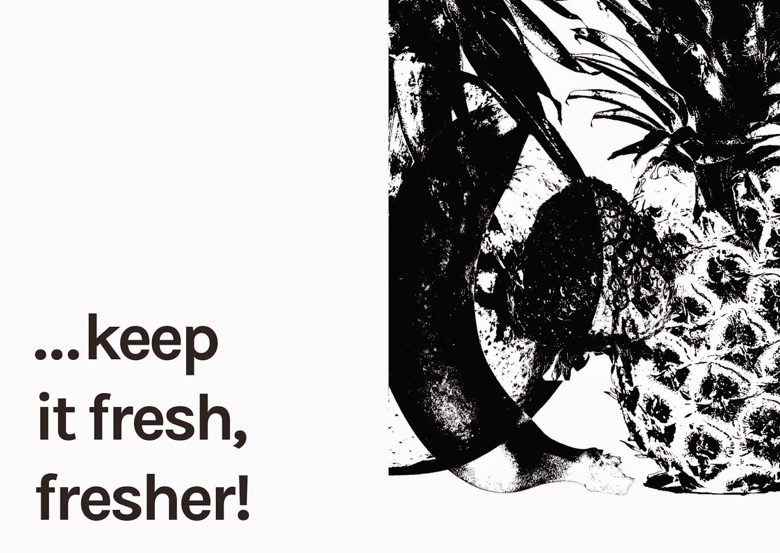
I wanted to present do's and don't's but do it in a witty way. So instead of starting with the do's I start with the don't's. People thought that this was a good idea, and everyone seemed to like my tag line which is 'keep it fresh, fresher'. Feedback in today's crit was really constructive and people really engaged with my work which was great. They said that they thought that printing the booklet A5 is a good idea, but printing it A6 could be more interesting. It would then become more like a pocket guide which could make it more appealing to freshers. People said that the nature of the layout and design makes the book easily reproducible and efficient, low cost. I could easily photocopy or simply print the book monochrome to distribute it across the first year in September.
People also really loved my more vibrant poster designs and said they want to see more of it. So, in the crit, I discussed the idea of having a set of A3 posters which would be put up in the studio to accompany the pocket guide. I was already thinking of doing this but the crit cemented the idea for me. The book will have a very bold, simplistic and minimal feel to it in order to make the most impact, and the posters will be more dynamic in colour and pattern in order to build interest and intrigue. Posters have the licence to be slightly more abstract, where as the guide needs to be functional and communicate the information effectively.
People said I should consider experimenting with various coloured stocks for the booklet which I definitely agree with. They said to look for vibrant and fresh colours that connote fresh fruit. They also said to consider printing with coloured inks instead of black. Just a thought. They said that they liked the fact that I had included only five tips as this conceptually links to the Governments campaign to eat five portions of fruit and veg a day. They said this increased the witty tone of voice.
On a more detailed level, people said I need to revisit the typesetting and margins to make sure the content fits well within the page and to avoid cropping.
Overall I was really happy with the feedback received.


No comments:
Post a Comment