
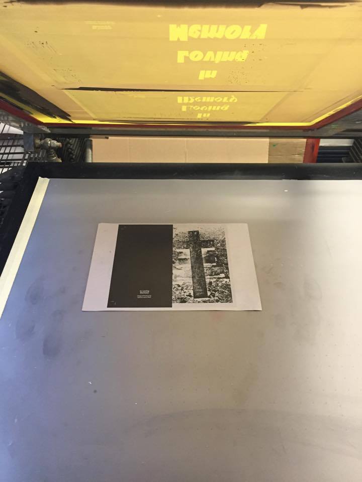

I am really pleased with how my screen printed cover designs turned out. It isn't that obvious, but I did have a few problems with the screens its self. I very slightly overexposed my screen, which meant that ink was seeping through in placing that I didn't want or need it to be. This produced a less polished effect. I did envision the screen prints being very clean and purely typographic, but what I am left with is a more rough and ready effect. The technicians in the print room actually thought that effects were intentional, which I thought was nice. It actually works pretty well in my opinion, giving the cover a weathered aesthetic, which reflects the content of the publication. I'm just running with this rather successful error.
I printed on a range of monochrome stock, from the premium offerings of GF Smith through the thick card and sugar paper from the college shop. For me, the black on black prints are the most striking and aesthetically pleasing, but the prints on the leather embossed stock will have the potential to tie the whole publication together. I chose the leather stock because it reminded me of bibles, something closely associated with the content of the book. I am going to get some feedback on the prints and ask others which one they think would suit the cover the most.


No comments:
Post a Comment