This brief is asking us to represent our chosen artist through a temporary website, it is a completely digital brief. I thought it would be a good idea to look at existing artist websites whom I am interested in, to take direct visual inspiration from. I looked at artists who produce music that has a similar sound and feel to Grace Jones, because I thought their aesthetics may be slightly similar.


I really like how minimalistic and eye catching Jamie XX's website is. All the necessary information is available without the need for overly busy or complicated visuals. This is something to consider when designing my campaign site.


Again, I found Tood Terje's website inspiring because of its simplicity and extensive use of vibrant, punchy colours. These are specific artist websites and aren't intended to create hype over a specific album release date. However there is a lot to be taken away in terms of layout, hierarchy of content and general design treatment.


FKA Twigs. Another highly minimal and sophisticated design with strong visual impact. I think the central image of the artist is important in defining it. I like the grungy type choice, it is representative of her edgy aesthetic.


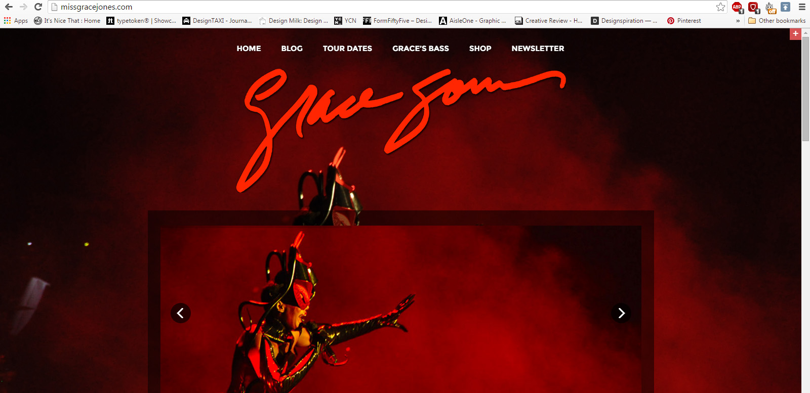
I decided to have a look at Grace Jones's existing 'official website', to take reference. What I found didn't impress me or overwhelm me at all. I felt that this website just doesn't do her justice as the iconic artist that she is. It feels cheap, rushed and doesn't really say anything about who she is as a performer. It also felt like it hadn't been updated or redesigned in a while, this will not attract younger audiences. Grace Jones is someone who developed and refined her celebrity image and overall aesthetic herself and has been doing so for over 40 years. Someone with such a unique visual identity should really have a stand out and highly original web presence to do them justice. Seeing this website and the level of work that has clearly not gone into it has inspired me to produce something really interesting and refined.
Main points I dislike:
- The cheesy animations of the slide reel of images on the home page
- The same image used as background on every single page
- Red, I don't think this colour relates to her very successfully
- Type choices on the body copy and point size doesn't work for me
- Her signature would be a nice feature if it was perhaps a little smaller and a different colour
- There is barely any interactivity, it doesn't feel user inclusive
- I find it pretty dull overall


No comments:
Post a Comment