For studio brief 3, we must design a publication with a minimum of five double spread page layouts. When I first received this brief, I had fairly limited knowledge of the conventions of publication layouts and how I would go about creating a layout for a book, magazine etc.
After having an InDesign induction on Thursday, I now have quite a basic understanding of how to set up documents for publication in Adobe InDesign. I know about bleeding and slugs, columns, guides, inserting imagery and position and experimenting with type. The induction was really beneficial for me in relation to this brief.
I did some internet based research into layout for publication to help me understand the rules, conventions and trends in contemporary publication design. I knew from the start of this brief that I wanted my research to be presented in a quirky, quite post-modern way. I appreciate minimal, simplistic layout design but I want my publication to be exciting and evolving. What I have noticed through research is that layout design is exciting and there are very few creative limitations, in the sense that you can pretty much do whatever you want visually as long as it fits within the restrictions of the physical printed page.


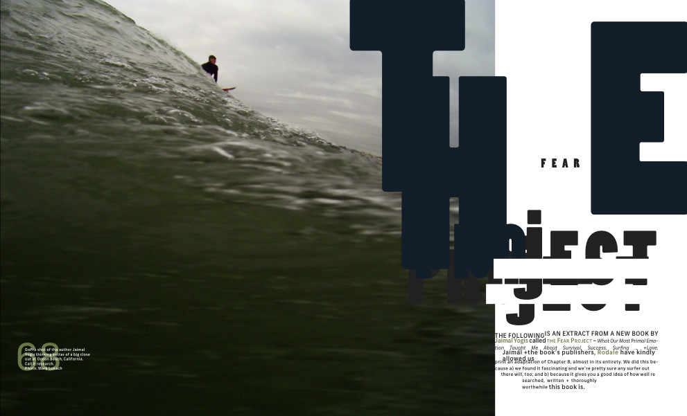
Editorial Layouts by Designer/Illustrator Brian Mitchell from USA. Mitchell is a universal designer fusing his illustration background with graphic design. This powerful combination results in well thought-out design that is both effective and functional. His work is a perfect balance of highly conceptual ideas and minimalist design qualities. I really like his consistent use of colour and the full bleed imagery that dominates the second double page spread. I think his use of type is effective, very clean crisp and modernist. Although I enjoy these designs I do feel they are slightly safe and a bit too modernist for my liking. The information is communicated effectively but it lacks excitement. The layout as a whole is successful and aesthetically pleasing. I enjoy the combinations of photography, type and illustrations and I think the large use of white space is effective.

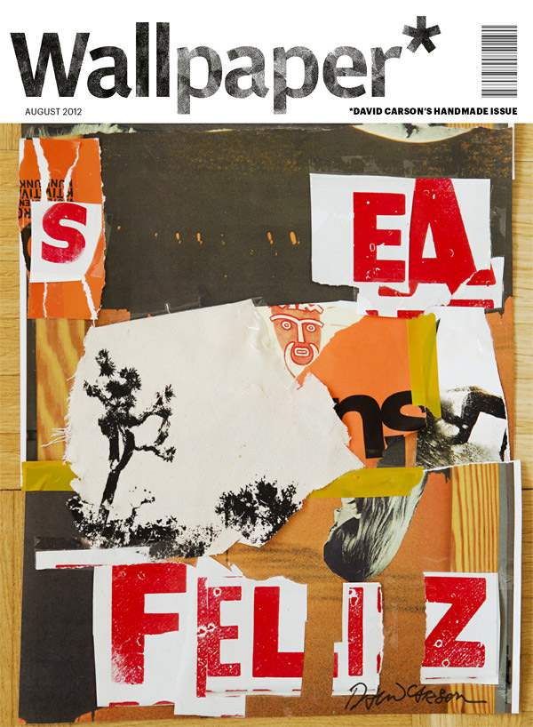
Cover designed by designer Danny Nathan


'CMYK Magazine' front spread layouts: These punchy cover designs really catch my eye. The quiky layouts and brilliant and varies illustrations used make me want to read the magazine. It would definitely stand out to me on a magazine stand. The example of a double page spread is interesting. The content actually covers both pages and unites them rather than spanning two separate pages. There is a flow of visual content which is nice. This type of layout design is quite post-modern, some would probably describe it as chaotic and confusing but I really like it. The information is still legible it has just been presented in an unusual layout.


Layout Design for 'Un/Limited: A Poster Project'. Multiple designers
This publication represents a contemporary attitude within the applied arts. Assuming ones function as craftman while questioning its traditional principles, working on a cross-disciplinary level, questioning the function as well as the meaning of an approach, or challenging the boundaries between various media, the graphic designer does not only settle for visually shaping information, but is even ready to accept a certain authorship. This book is fantastically designed. Simplistic, minimal yet engaging and intriguing.
The fact that a Museum of Fine Arts is interested in a medium like poster design, deciding to carry out a project like ‘Un/limited’, paradoxically maintains hope that the poster will not only be confined to white walls of museums and galleries in the future, but will retain its place on the streets, where it was born and to which it belongs, for an hopefully unlimited time. The layout of this publication celebrates the poster and an art form. The images dominate the pages and draw in the readers eye. The type is laid out nicely and varies in size and weight, guiding the readers eye across the page and covering both text and visual information. The cover design pays homage to contemporary poster design which is a great touch.

Creative magazine layout by J3Concepts - I like the dominating illustrations and the bold use of Sans Serif type. The information is not dismissed by slightly overshadowed by the imagery. The simplistic colour palette used is effective, nice levels of contrast. A very simple grid system is in place which works well.
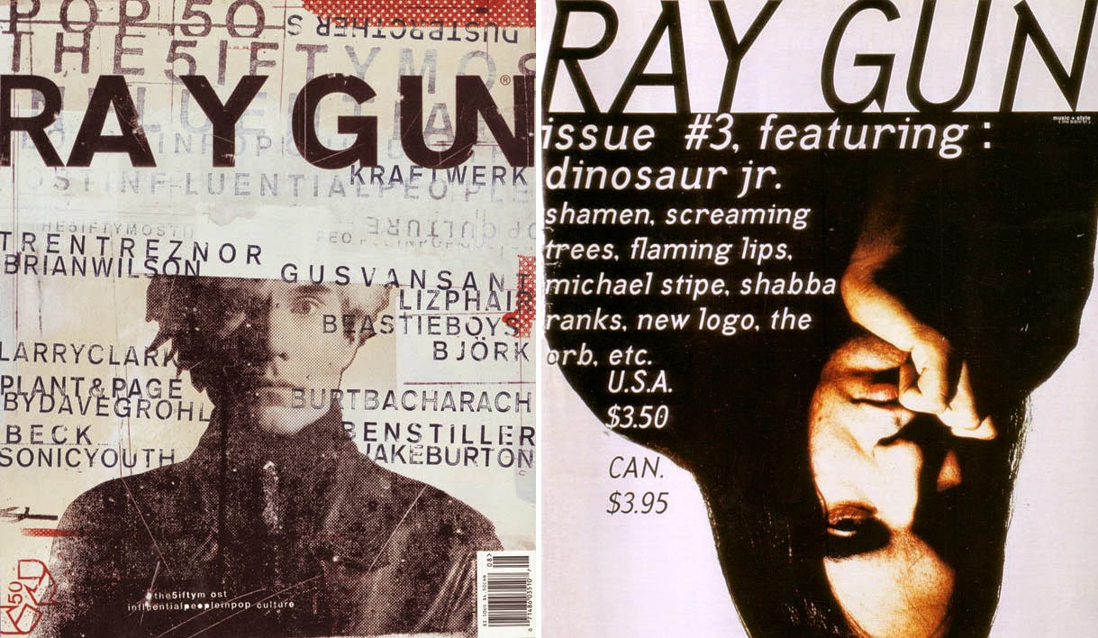
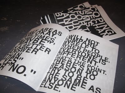
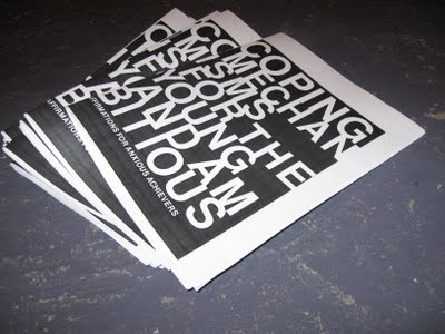
A designer who I admire and take a lot of inspiration from is David Carson. He created the world famous publication 'Ray Gun' which is admired by artists as being one of the best examples of postmodern design/influence in the field. Ray Gun is unapologetically messy and chaotic but still communicates its message successfully.


![[casron-002.jpg]](https://blogger.googleusercontent.com/img/b/R29vZ2xl/AVvXsEhcPHUd88x2ufvRSGvNnqQJeqW10UL7yduttD-Mlk888rYhN745PvD0qgTz8cLslCKu-n7Dc0UcwPLFQdTKpXn_eby89H230t9g0rGy1HE8dN5gASYUax3R36H2PGozv0ctxjyJswt9zEM/s400/casron-002.jpg)

Magazine layout inspiration:
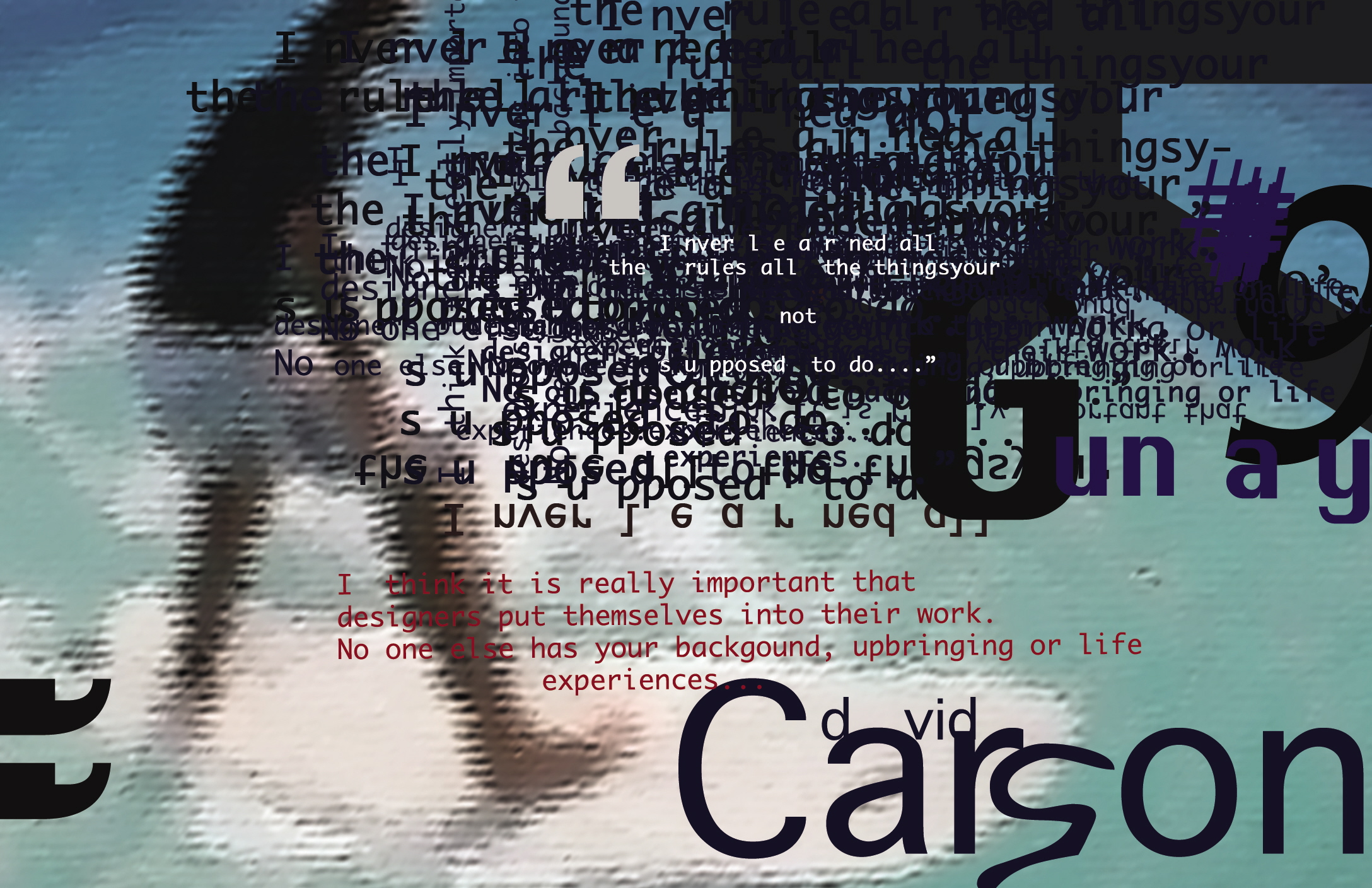
A designer who I admire and take a lot of inspiration from is David Carson. He created the world famous publication 'Ray Gun' which is admired by artists as being one of the best examples of postmodern design/influence in the field. Ray Gun is unapologetically messy and chaotic but still communicates its message successfully.
Magazine layout inspiration:

http://cityonfire.us/portfolio-magazines.html - the layouts below are less 'conventional' but still very inspiring - they utilise the double page spreads in very creative ways which I enjoy.


Zines as inspiration:
Palette of zines by designer Damien Correll

Catalogue London layout design

http://adaptstudio.ca/blog/labels/zines.html
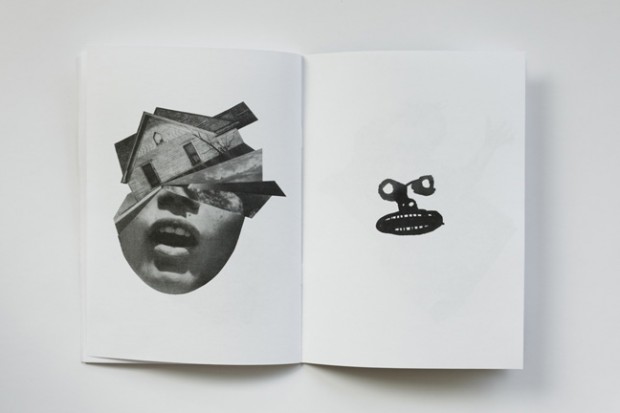
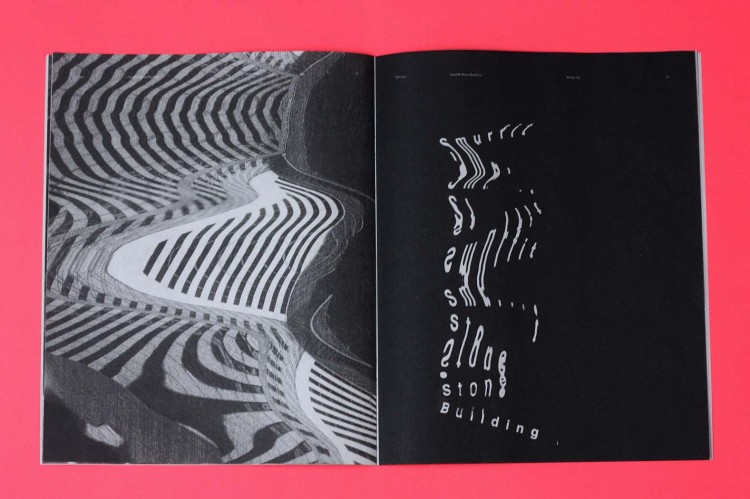
Double page spreads by designer Jesse Draxler
http://thebookdesignblog.com/zine-design-inspiration/jesse-draxler-zine


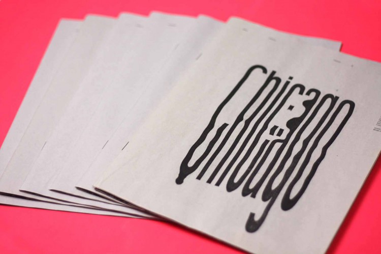
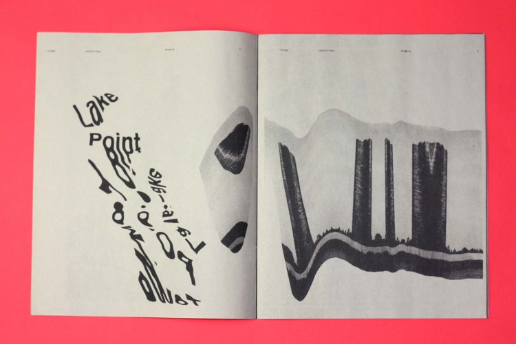
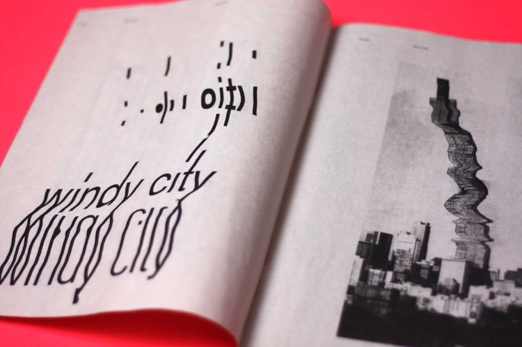
The Chicago Zine by designer Sofia Clausse:
Cover design inspiration:
FUKT Magazine


http://thebookdesignblog.com/magazine-design-inspiration/lab-periodical
Sources used:
http://inspirationhut.net/inspiration/36-stunning-magazine-and-publication-layouts-for-your-inspiration/
http://designspiration.net/search/layout/
No comments:
Post a Comment