I wanted my flyers to be square, so I selected areas of the scans that I thought looked the most visually exciting and abstract and inserted that onto a 5 inch x 5 inch canvas and got to work formatting the information into an appropriate layout. I stuck with Arial as the font for the leaflets to keep in line with the other promotion for the event. I included the Photographers' Gallery logo in the bottom of the leaflet to add authenticity.


I initially experimented with the designs used in the posters, but then realized that this wouldn't really work because it was just recycling the existing designs and I wanted to create something unique for the flyers. I looked at the different colours I could use, but quickly moved on from these ideas.


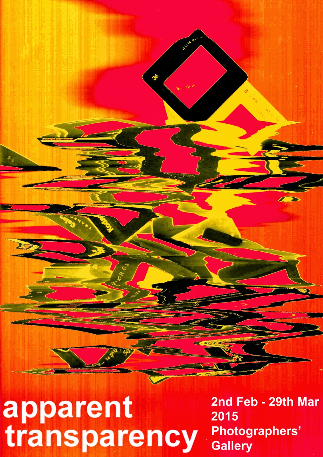
Here are some of the first designs I produced using the scans of the slides. For me they work really well. I really like the colours and how abstracted the slides have become, The flyers don't reveal too much about what the exhibition has to offer which I like. There is a certain level of mystery and that's what flyers are there to do, create intrigue.


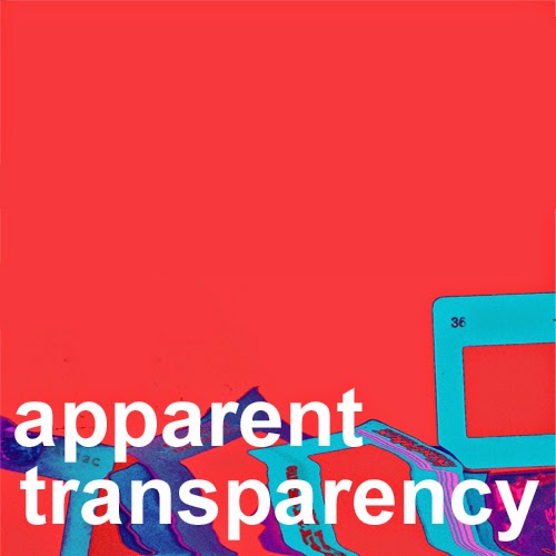
Final designs for the flyers: The final three front designs work well as a three. When placed together side by side the slides seem to run across and look like liquid.


Carou-sell - I came up with the title 'Carou-sell' for one of the supporting events as I wanted to use some word play in this project. Traditionally 35mm slides were projected using specially designed carousel device, and seen as this event is all about selling and exchanging I saw this as a good opportunity to get witty. I searched on-line for good quality images of carousels and then manipulated some in Photoshop to use for the set of three flyers. I wanted these to make a lot of impact, so kept the backgrounds all black and the type white. The images were se tin high contrast with lots of bright popping colours.


The final set of three flyers promote a lecture on analogue photography. The photographer Ellen Rodgers would be leading the lecture so I used her own photography on these designs which I feel worked really well. I inverted her photography to keep in-line with the theme of film photography.


No comments:
Post a Comment