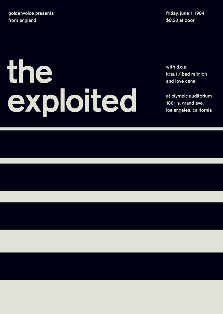
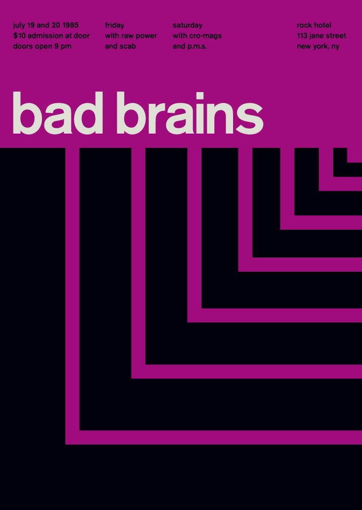
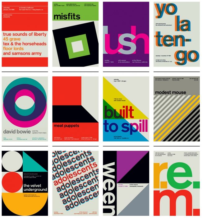
Concert promotion in the form of minimalist posters, by Graphic Designer Mike Joyce:
Joyce has a very clean and crisp style. It's minimal but highly effective and makes a massive impact. His limited use of colour and brilliant use of geometric pattern and shape really catches your eye. What I take away really from his design is his use of type. The sans serif is beautiful and makes the information really easy to digest and understand from a distance. This is something I want to happen in my poster designs.
Joyce has a very clean and crisp style. It's minimal but highly effective and makes a massive impact. His limited use of colour and brilliant use of geometric pattern and shape really catches your eye. What I take away really from his design is his use of type. The sans serif is beautiful and makes the information really easy to digest and understand from a distance. This is something I want to happen in my poster designs.


No comments:
Post a Comment