Visual Artist & Designer Jesse Draxler - she inspired me when it came to the cut outs and collaging together various sections of the 35mm slides.


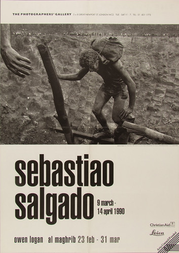
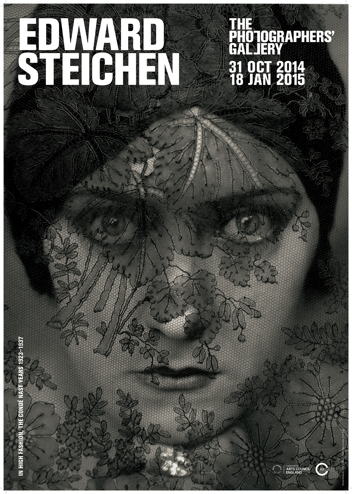
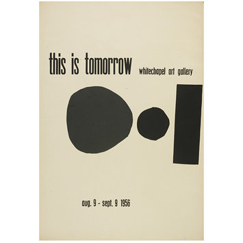
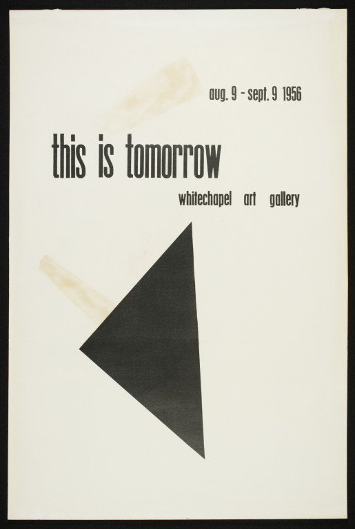
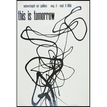
Exhibition poster research: I did a lot of secondary research as well as primary. I looked on the internet to find inspiration for my design process. I looked specifically for examples of eye catching and interesting poster design for photography & art exhibitions. In my personalized brief I specified that this exhibition would be shown at the world famous Photographers’ Gallery in London, so I looked in detail at their past exhibition poster designs, which provided me with great inspiration.
A few things that stood out/are consistent in art exhibition poster design:
The use of all sans serif typefaces to communicate the information. The titles of the exhibitions were usually set in heavy weighted bold fonts and the words set in all caps. The body text describing the show is usually also set in sans serif. It adds beautfiul consistency to the design
Block colours are often used and are off set with high-res crop-
ed imagery representing the work at the show. This is effective
Simple colours are used, complimentary colours. Abstract and
geometric shapes are employed too which is aesthetically
interesting. There is also heavy use of white space on the
majority of the posters I looked at


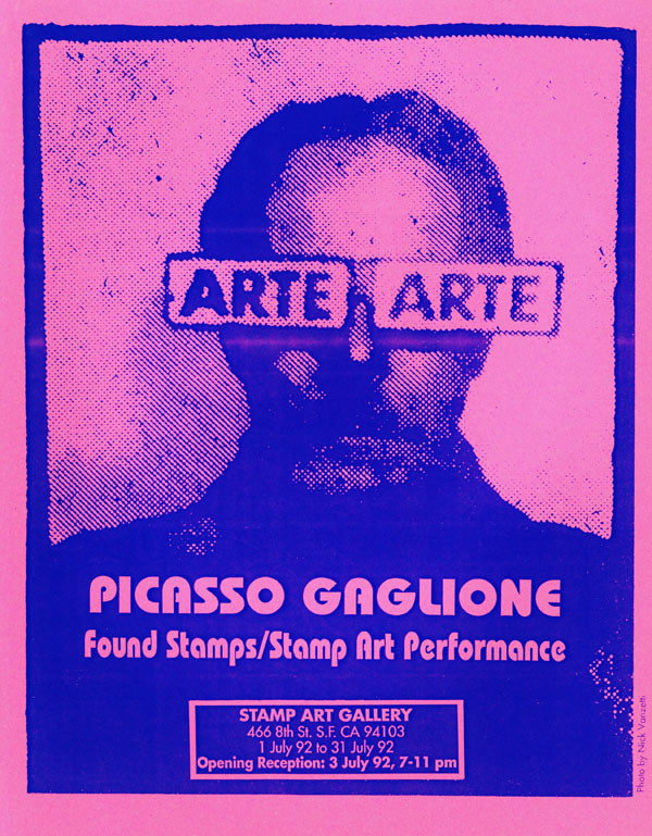


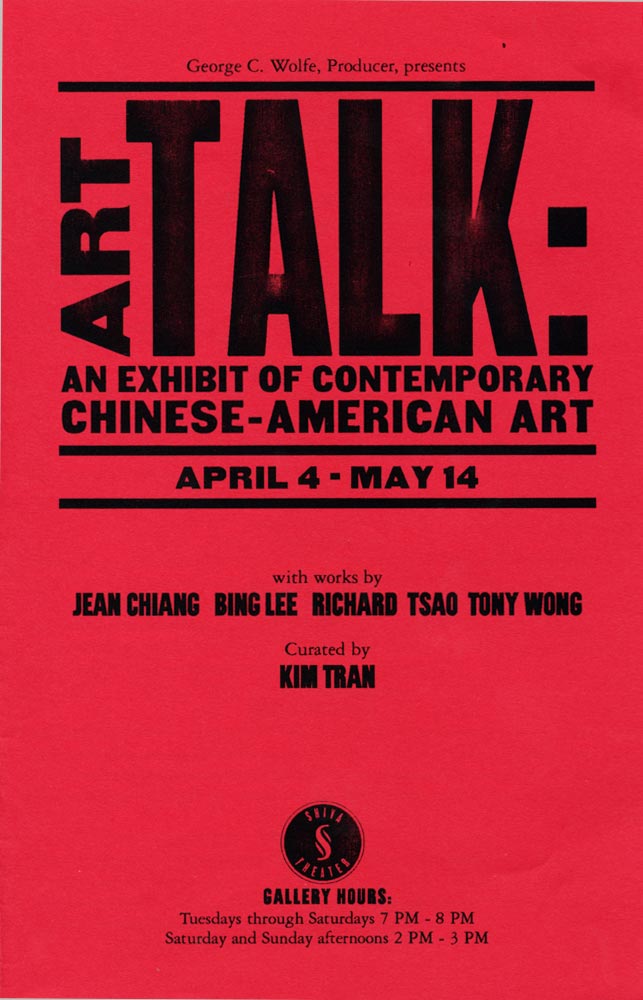
Flyer research:
Flyers are similar to posters, but usually contain mire text based information. They have room to communicate more through language where as posters rely on visuals. Similarly to the posters, colour, image, type and white space play huge parts in making the flyers successful. I looked at a few examples from art galleries in London and found that they shared many characteristics.


No comments:
Post a Comment