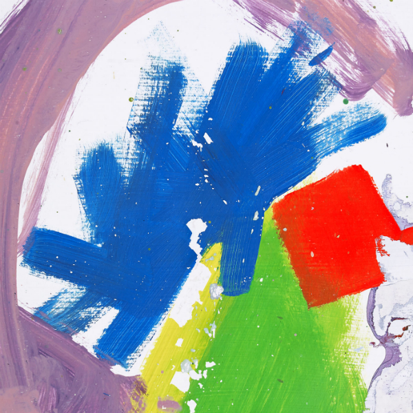
I began my researching by looking through last years most successful designs that were included in the Secret 7 Exhibition. What I instantly noticed was how varied and abstract the winning designers were. I found it difficult in some cases to actually work out which songs the designs were for, but I suppose this is a good thing, as the exhibition celebrates artistic flare, uniqueness and individuality.
I also found that similar colours were used from design to design almost like a running theme that had subconsciously emerged in 2014. Researching these past designs allowed me to realise the potential for creativity in this brief, you can more or less run with whatever idea or concept you may have as long as it fits the specifications of the brief.
I also noticed that a lot of materials and media's had been used across the designs. People had avoided using completely digital methods. A lot of traditional methods such as painting, ink drawing, collage and photography had been used in the winning designs. This inspired me to look into using mixed media for my design development.


Jake Bugg - Secret 7


I then did some visual research into album art that really excites me outside of the Secret 7 competition. Todd Terje is a Nordic DJ who specializes in upbeat Nu Disco and Electronic Funk music. His album entitled 'It's Album Time's is one of my favourite records of the past few years and the album art is outstanding. All of Terje's album art is designed by Bendik Kaltenborn, a Norwegian Illustrator, Artist and Designer. His work is vibrant, illustrative and has a distinct style which really captures my imagination. I am drawn to his style and use of colour as well as quirky use of type. For me, his design really matches Terje's style of music, the two compliment each other and create a strong identity for the record.


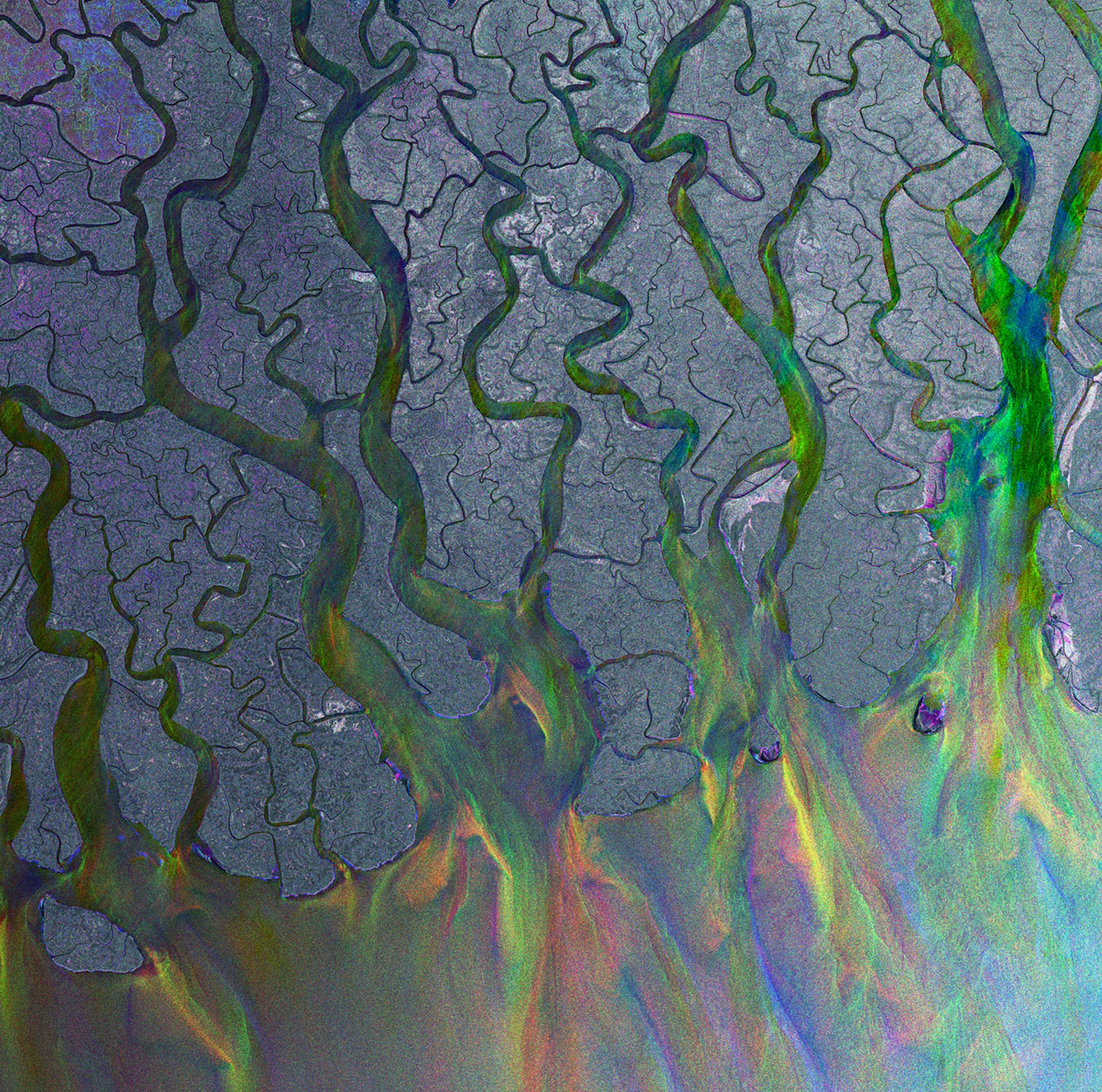
Alt-J are another favourite of mine, their music is unique and their album art is always visually enticing and unique. 'An Awesome Wave' features a satellite image of the Ganges River in Bangladesh and is in my opinion perfect for the album. I really like the way the image has been manipulated to have a metallic quality to it. Explaining how the band chose their album artwork, they said they were up against a deadline so they resorted to googling ‘delta’ for inspiration around the symbol of their name.
The band’s keyboard player Gus Unger-Hamilton said, “Instead of the delta symbol, it was coming up with satellite images of geographical deltas, which looked kind of amazing. So we thought perhaps we could use one of these images for the artwork, creating a visual pun on the idea of a delta.”
Fitting the artwork to the band's sound, Gus said, “The image is quite psychedelic, which is a term we definitely don’t mind having applied to our songs. Also, the abstract and indeterminate nature of the image – most people can’t figure out what it is – somehow fits with the hard-to-pin-down aspect of our music and its genre (or lack of).”
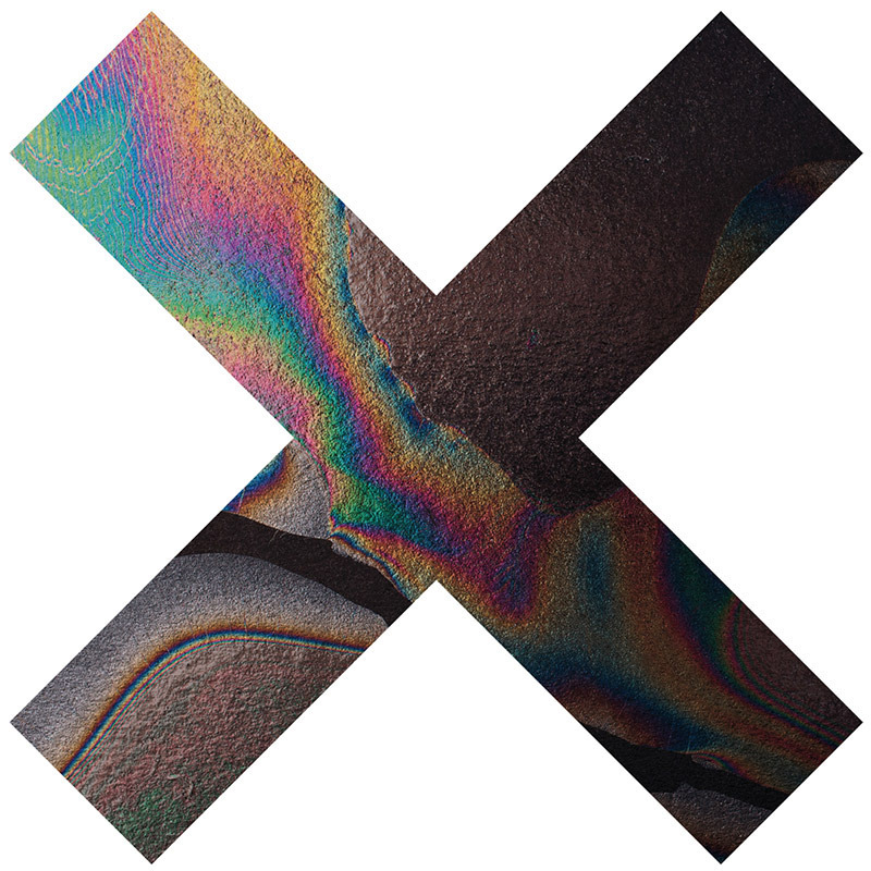
The XX - Similarly to Alt-J, the XX always have very strong album artwork for their records. I like how minimal and simplistic their designs are. They have an instantly recognisable identity as a band and sound. I like the metallic oil slick design the most, the colours are psychedelic and remind me of abstract sounds and visuals.

Florence + the Machine's artwork is classic. Its use of custom typography and beautiful photograph is very effective and again suits the tone of the album well.

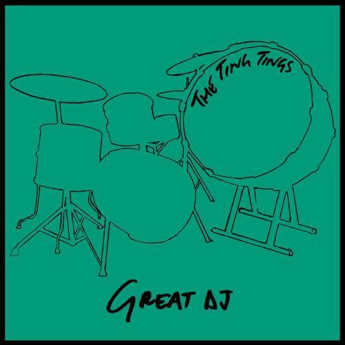
The Ting Tings have very bold album covers and use collage and quite tongue and cheek approaches to their designs. I really like the block colours used contrasted with the monochrome imagery.
Similarly to the main album cover, the single covers for this record have a similar hand rendered feel to them and I really appreciate this. The Ting Ting's sound is rather rough around the edges and is edgy and I feel that these designs really suit the feel of the music its self.
Classic album art work, the colours here and the illustrations really inspire me. In the 1970's and 80's, album artwork was an essential part of a record. It gave the music a strong visual identity and made the artists recognisable. Album sleeve design was big business back then and hours and hours of work went into producing them.


http://leifpodhajsky.com/METALS
http://designspiration.net/image/3143556521094/
http://designspiration.net/image/3143556521094/
No comments:
Post a Comment