After sketching out my initial ideas in thumbnail form, I moved straight onto working with imagery and type in Photo Shop and Illustrator. Time was very tight in this brief and I needed to work as efficiently as I could. I looked for initial inspiration in the form of the artists' existing album artwork, which is very minimalist and is dominated by a portrait of the singer. I enjoy the use of very simplistic geometric type and I like the colours used in the composition, but I do feel it is a bit too simple and not that much thought has actually gone into generating the content. It doesn't really say much about the actual music, or the messages held within the record and that is something I must achieve in my design treatment.
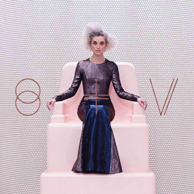
The existing artwork for St. Vincent is plain and obvious in my opinion. It has become a trend nowadays for the artist to be featured on the album cover. This is just lazy in my opinion, and not conceptual in any way. I wanted to get far away from this in my design development, I didn't want to focus on the artists appearance in any way, so I thought outside of the box right from the start. Some good examples of where the design is just plain boring include:


My initial designs looked at some of the significant lyrics from the songs, and I used my own photography and illustrations to generate designs with strong visual meaning and semiotics. I experimented with typography and simplistic imagery to begin with and then asked some of my peers for feedback. They said they liked the use of vibrant contrasting colours that represent neon lights and pixels. They said they liked the imagery of the lone figure standing in what looks like a void vacuum space, this was successful. They commented that the typography wasn't really necessary, and writing the song's lyrics is kind of cheap and not needed. The imagery should speak for its self and the use of the lyrics detracts from the aesthetics. They liked the fact that I was attempting to represent the lyrics through imagery of screens and monitors, they said the repeated patterns added to a sense of detachment and unease, just like the lyrics.


Typographic experiments:


No comments:
Post a Comment