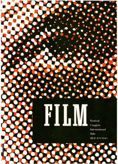
My vision from this brief was to create a contemporary poster, to promote a contemporary film festival. I flicked through a number of previous winning designs on the competition website and noticed a few interesting things. Firstly, I saw that pretty much all of the winning designs appeared to feature some sort of hand rendered artwork, whether that be an illustration, painting, collage or hand drawn type/lettering. This was a common feature that I appreciated. I also noticed a lot of clichés, such as skulls representing the Mexican day of the dead, old fashioned film cameras and film reels and other paraphernalia associated with film. Again I thought these were nice touches, but couldn't help but think of them as being obvious and safe.
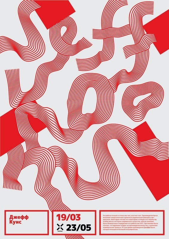
This made me determined to depart from the stereotypical. It inspired me to create clean cut, fresh, contemporary designs which use sans serif type and bold block colours. I already have an idea of how I want my posters to look aesthetically, but I needed some fresh reference points. I needed to look around me to see what other designers are doing in the now. I looked on a number of my favourite inspiration sites and design blogs and came across some really playful poster designs.
I noticed a lot of playful typography and colour in the posters I found. This directly influenced my design treatment for this brief.


I also came across a couple of really nice poster designs from the 70s and 80s. It's always on my agenda to look to the past for inspiration, because I feel there is a lot to take away from movements and trends in design from these eras.


No comments:
Post a Comment