After taking people's feedback into consideration I made some final adjustments to the designs. Below are four very different final designs that I submitted to the competition.
With this design, I made sure the type was legible and the hierarchy of the information was correct. I feel this design is one of the most successful of the four, because it feels functional and logical. It is not overly complicated and doesn't attempt to merge too many visual elements together. I feel pretty confident about this design.
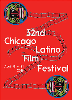
This design is probably my favourite on a conceptual level. In the background, I used the film reel illustration to spell out the letters 32 to remind people that this is the 32nd film festival. I was trying to be playful and inventive here and I think it is successful. I was playful with the placement of the type as well, making sure it was easily legible and readable from a distance. I chose to use red because it bold and eye catching and contrasts well with the rest of the artwork. Red is also a colour I strongly associate with Latino culture.
In this design, I was aiming for maximum impact. The mask dominates the design, and the type supports the artwork. I tried to make everything balanced and have a sense of harmony, The bright yellow background is intended to stand out and grab the audiences attention, The thick black lines and the bold use of flat colour give the poster a highly contemporary feel which I am proud of.
Lastly, I chose to include another design which blends the themes of culture with film paraphernalia. Here I have used Harbour Bold and paired it with a simple, striking depiction of a mask mimicking an old fashioned film reel. The background contrasts beautifully with the bold colour and nature of the chosen typeface. I am feeling pretty confident about all of the designs I am entering to this competition.


No comments:
Post a Comment