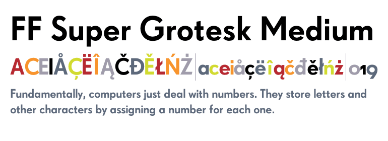
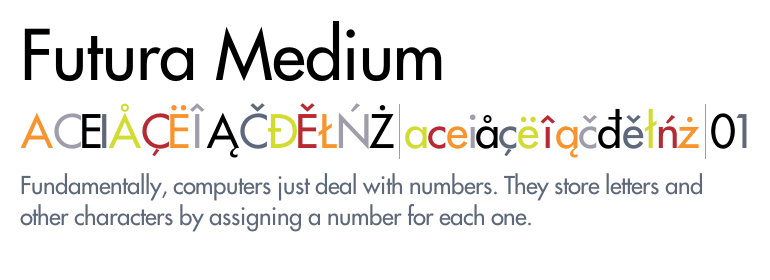
After receiving feedback at several points throughout the design process, I finally settled on the font combination of FF Super Grotesk Medium paired with the timeless Futura Medium. I feel that these two typefaces compliment the simplistic illustration and monochrome colour palette of my designs at this stage in the project. Futura has been used for the title of the book and the smaller body copy, whereas Super Grotesk has been used for pieces of information I felt needed highlighting. The subtle contrasts in stroke weights/heaviness of the type adds a touch of sophistication to the cover design.
I experimented with grey backgrounds and pure black and whites to see how it would affect the rest of the composition. I think the grey backgrounds make the designs look slightly boring and wouldn't necessarily allow the designs to jump off of the shelves, something that was outlined in the brief itself.
I struggled quite a lot with the layout of the content on the back of the cover design as well as dealing with hierarchy issues. I was finding it difficult placing the type to make it fit in line with the rest of the design and to avoid it looking list like and boring. At this stage, I was content with having the illustration of the woman spanning the front and back of the cover, I thought this would add an element of intrigue when the book is fully open. I got positive feedback on this concept and was happy with it but slowly moved away from it as I refined the design even further.


No comments:
Post a Comment