I began experimenting using contemporary sans serif fonts. I have noticed that there is trend in poster design at the moment to use big, bold sans serifs such as SuperGrotesk or Modern Sans and even Futura repeatedly. I also looked to use some quirky, trendy fonts including Harbour Bold and Bluu Next which take inspiration from Germanic blackletter fonts. I realise that these typefaces don't instantly link to the context of Latin America, but I wanted to be on trend with my work for this brief rather than playing to conventions/clichés.
In this design, I sampled colours directly from an image of a Mexican cloth from the internet. I then turned the colours into columns and abstracted them using the Colour Halftone filter on Photoshop. I liked the results. The lines of colour could symbolise rolls of film or could simply be a reference to the bold, vibrant colours associated with Mexican culture. I then overlaid the type in a simplistic way.

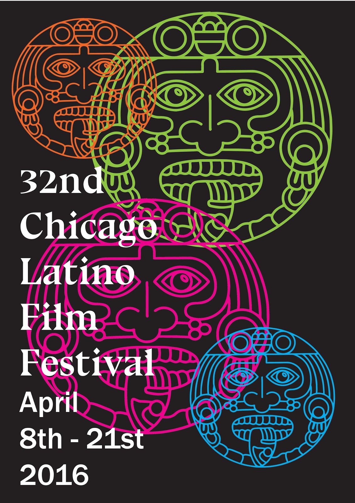
I then moved on, looking at symbols associated with the ancient cultures of the Mayans, Icans and Mexicans. I found a really lovely free vector illustration of an Incan mask online and experimented with using it in my designs, This bold symbol makes a statement as it dominates much of the poster. It is obviously a cultural relic, but it's shape also lends its self to the film industry. The old fashioned, circular film reels can be incorporated with the shape of the masks, something I am going to experiment with later on.
I went onto experiment with the masks further, changing the colours and placement of the type. I think these initial experiments have a lot of potential and definitely give the film festival a confident, contemporary feel and aesthetic.


No comments:
Post a Comment