After researching typography found on pin badges from the 1970s and 80s and getting lots of inspiration, I looked on a number of free font banks online to find typefaces that emulate those from that specific era. It was very important for me to find typefaces that are bold, legible and have a high impact. It was also important to consider how they would translate into print, digital and web outputs.
I came across a number of appropriate typefaces and decided to narrow them down to six to use throughout the campaign. The typeface which I felt was most appropriate to use on the large posters, badges and banners was Anton. This typeface makes a massive impact because it is so bold and condensed. It reminds me of the typeface used on the 'Get Over It' campaign by Stonewall. It is the most legible of all the fonts I chose to use in my campaign.

Anton

Akka: A fantastically vibrant typeface that has connotations of discos and night-life from the 70s. This sort of geometric, graphic font would also typically feature on pin badges, perhaps promoting less serious messages. I was drawn to it because it feels distinctively vintage and thought it would integrate well with the other typefaces in the campaign. It softens the message of the campaign slightly, whilst linking very strongly to the conceptual underlying theme.

Frankfurt: I chose to use this typeface as it reminds me of the shape and appearance of a badge. It also feels very retro, evoking essences of typography seen a lot in the 80s. It is one of the more legible fonts I chose to use, but it doesn't feel overly serious of imposing. It's circular aesthetic contrasts well with the more rigid sans serifs used throughout.
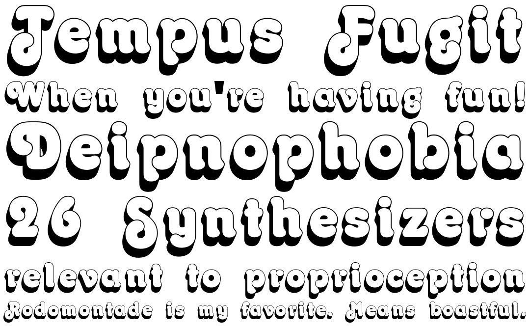
Octopuss: One of the more retro feeling fonts. It's a very playful font which again lowers the seriousness of the message. This font is perfect for this campaign, because ultimately I am aiming to spread a positive social and cultural message but in a way that is witty, conceptual and playful. I am not trying to preach or condescend, so a typeface of this nature is perfect.

Cooper Black: A typeface synonymous with the 70s. It is legible and has high impact, carrying the campaigns message successfully.

Chrome: Another typeface which visually reminds me of the shape and appearance of a retro pin badge. This was a fun choice to make. Again, it is bold and legible and links perfectly to the concept of the campaign.

Franklin Gothic: This typeface was created in the early 1900s, but became favoured and popular amongst graphic designers in the 70s. It is a timeless sans serif that is highly legible and sophisticated, whilst also being pretty gender neutral in its appearance. I have chosen to use this typeface for body copy throughout my campaign. It will appear on the leaflets, in the booklet and throughout the campaign website.
No comments:
Post a Comment