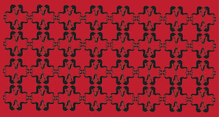
Once I was happy with the repeat ram skull pattern, I began to incorporate it into the banknote design. I chose to set up the dimensions of the design to be the exact same size as a £20 note, because this is my favourite note. I find it the most visually appealing and comfortable in physical size, and I want all of my notes to feel pleasing to the touch and the eye. I chose to go for black, white and red in terms of colour because I feel these complement each other well and represent stereotypical themes of evil in a visually appealing way. Each denomination will represent one of the nine circles of Dante's Inferno. For the exhibition, I am designing the highest denomination which is 1,000,000,000. This is a ridiculous amount, I realise, but my concept is ridiculous in its self, so why not go all the way? I have decided to call the bank 'The eternal bank' because this ties in nicely to the concept of an afterlife. I am keeping everything very harmonious, balanced and refined in terms of content and layout. I want the designs to feel considered and uncomplicated. I am going to evaluate other colour options but for now, I feel that everything is working together nicely. I am unsure of what to include on the reverse side of the design, perhaps another animal associated with the devil or a depiction of the Satan himself. I will ask for informal feedback to gage peoples opinions.


No comments:
Post a Comment