Travis Purkington statement for the project:
'Adhesive Warning Labels for
Existing Banknote Systems'
"A process exploration during my banknote thesis in 2011, this concept played with ways to re-trigger or re-contextualize a monetary design that has lost visual cognizance with its subscribers through time and appears to have no significant landmark action to revive it in near sight. It takes its cue from the obvious channel of warning label marketing in the quintessential "undesigned" tobacco package style, but in the form of adhesive stickers one would apply to the notes themselves.
The goal was to implement phrases indicative of such labels, but gear it towards the highlighting of common problems created by the misuse of currency rather than the ires of smoking. The language attempts to use concise, profound sometimes biting guidance, but tries not to lean on irony, esotericism, or humor too brashly to achieve its goals though elements of each are involved throughout.
It was well received as a viable means to an end during the thesis process, but was ultimately left as a footnote in the process book. I decided to exhibit it here to show it some daylight and reinforce similar goals embedded within the USD proposal for added brevity.
The final result is however, a somewhat depressing critique to problems that might be more appropriately addressed in a more sophisticated and less aggressive manner. (AKA I figured it was best to just continue redesigning the money itself)"
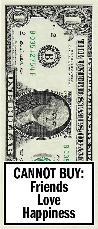
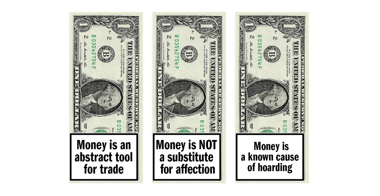
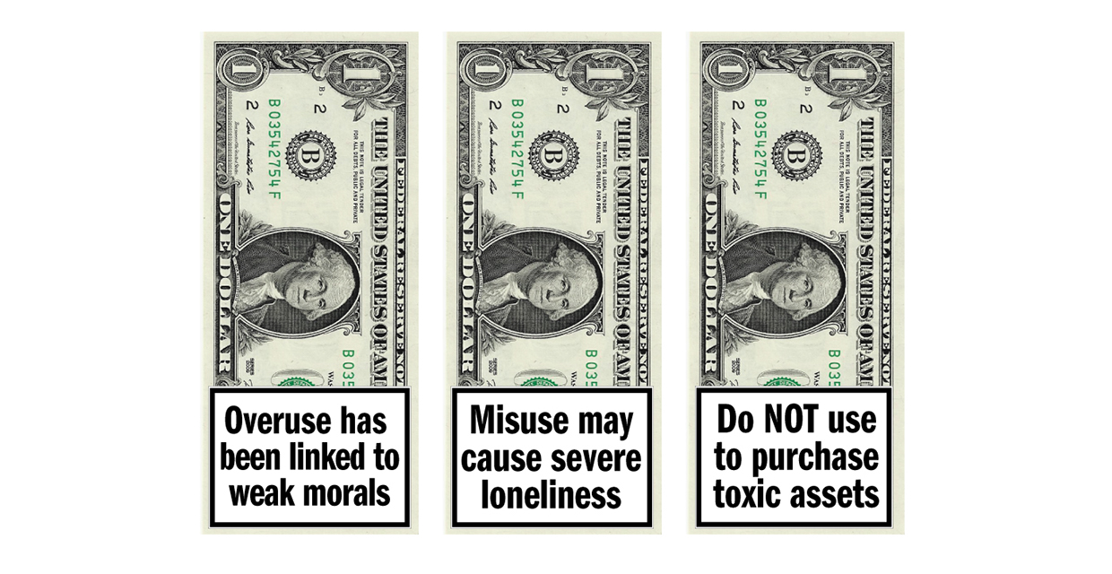
I don't really like this work that much, I think it's a bit obvious and clichéd, mainly down to the use of language and layout of the typography. I value it conceptually but I think that the artist could have been slightly more subtle, witty and playful with his language choice. On the whole it has provided me with some food for thought in regards to this brief.
No comments:
Post a Comment