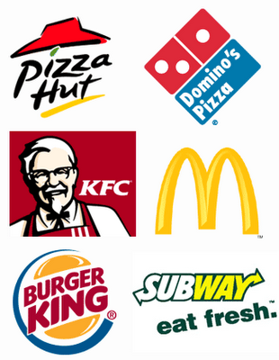
I did some visual research into logos associated with fast food on a global scale. These brands are firmly cemented in the collective consciousness of our consumer society and are instantly recognisable either purely through their typographic aesthetic or just their colours. I wanted to pay close attention to the colour combinations used and extend this into my logo designs, for conceptual and contextual reasons. I noticed that a large proportion of fast food logos feature red, yellow green and blue, so I thought I would play around with these colour combinations in my designs.
I was also closely examining the typographic choices, noticing a district preference to use sans serif fonts. These typefaces are bold and define the brand, and I needed to apply this to my design thinking and process.


No comments:
Post a Comment