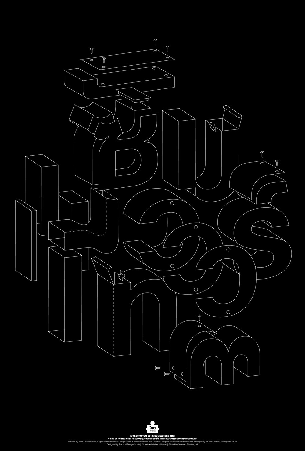
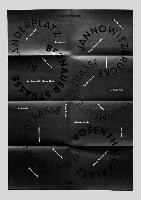
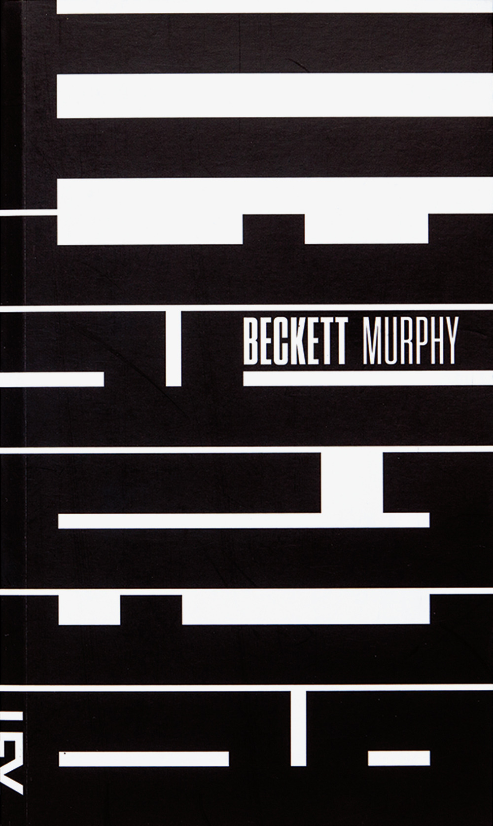
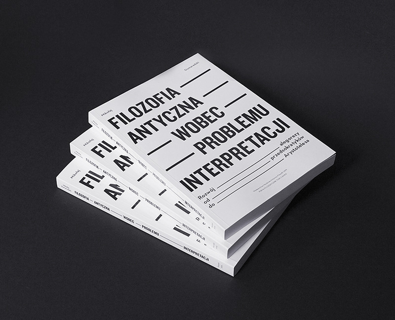
You can’t design without type. Well you could but
it would result in something that wouldn't really fall into the category of
'graphic design' as such. Yon
can however, use only type (or mostly only type) to create breath-taking
designs. In fact, many graphic designers and artists take exactly this route to
communicate their ideas through their works. The results are sometimes crazy,
sometimes artsy, sometimes beautiful, but often just different from things
we’re used to. Thus designers explore new horizons and we explore new viewing
perspectives, which is what inspiration is all about. Type only design can be
extremely exciting, as the designer ever increasingly forced to find innovative
ways of communicating ideas solely through type. I decided to do some visual
secondary research into typographic poster and leaflet design, as at this point
in the brief, I have realised that I want my leaflet to be purely typographic. Here are some great examples of where pure typography speaks entirely for itself:

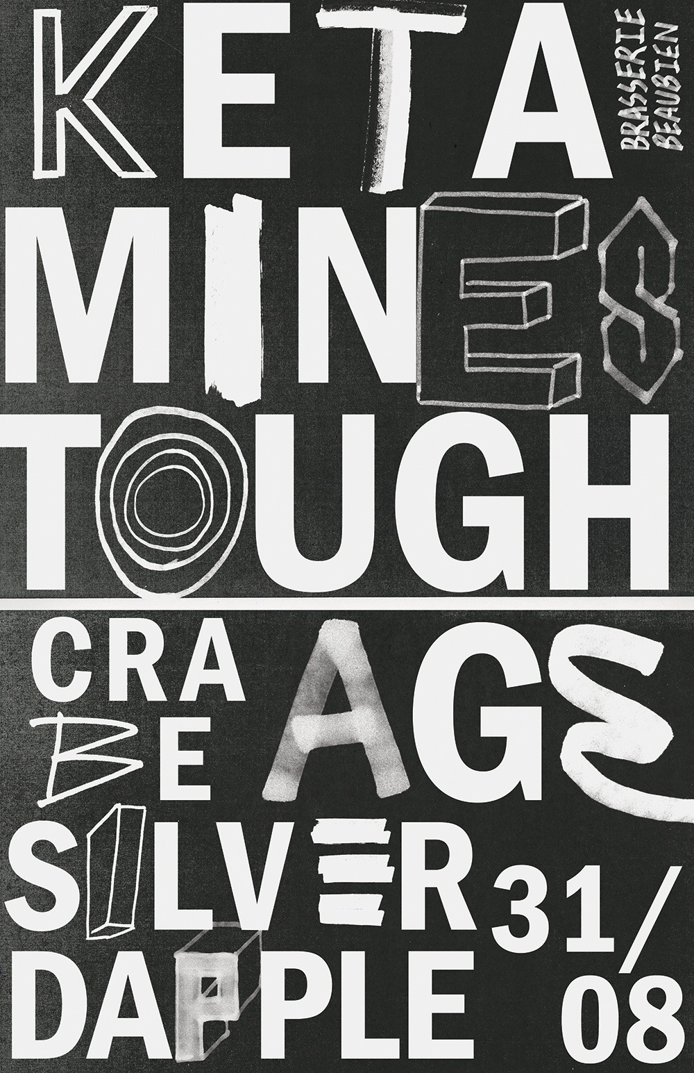


Creativity can flourish within limitations, someone probably once said. Dublin-based designer Gianni Clifford certainly found that at least, having been tasked with creating a new poster pretty much every week for a year for the same client, using only black and white. Said client is Hidden Agenda, a group of Irish club promoters. The emphasis is on typography, which enables variety within the monochrome boundaries and also gave consistency with the brand’s existing logo. “The project was amazing to do: creating artwork for musicians that you are a fan of is a joy,” says Gianni. “The fact that every poster needed to be black and white made for a really interesting challenge, ‘how do I make this stand out more than the last poster yet still using the simple palette of black and white?’ In a funny way when I went to do artwork with an unlimited swatch I was jolted with my unlimited choice.” Taken from ItsNiceThat.com


No comments:
Post a Comment