Print Finishes:
The selection and inclusion of print finishes can elevate your design aesthetically and improve
its potential for retention. However, the selection must be appropriate for the concept and
content of the design.
The inclusion of print finishes also adds a number of financial, production and preparation concerns
to the design process. Your task for today is to explore a range of print finishes (at least 8) with the
following considerations:
Can you source and photograph (for your blog) an example of each finishing method?
The first place i went to to find some interesting print finishes was the college library. I went straight to the magazine and journal section, as I figured that this would probably be the best place to find some premium finishes. The publishing industry is currently experiencing a revolutionary boom, and fancy/complex printing finishes are really being revitalised. The first example of a bespoke print finish I came across was on the front cover of the Tate. Etc Magazine, a quarterly art and culture publication distributed by the Tate galleries of London. The finish featured here is known as Spot Varnishing. Used for highlighting and texture, spot varnishing is a special effect applied to specific areas of a printed piece. It is most commonly used on business cards, envelopes and folders. In this context, spot varnishing has been used to highlight the neon green areas of the artwork. This finish adds interesting texture to the cover design, making it tactile and peculiar to the touch. It is a subtle way of making the publication a lot more interactive and unique. |


I came across a number of other examples of spot varnishing. However, in these cases the varnish was transparent and in some cases not as brightly coloured. The transparent varnishing was used purely to add texture and tactility. It is a nice effect in my opinion.


The transparent spot varnishing:


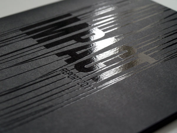
Spot UV varnishes are paper varnishes applied to the printing surface and is cured or hardened by UV light during the printing process. The final results are not dissimilar to spot varnished finishes, but I would say that the results are a little bit more subtle and sleek. Using UV varnishing results in a glossy coating on the surface of your print, as shown below:

The cover of Wallpaper magazine used two print finishes. The first was subtle embossing on the black lines. They also appeared to be very simply spot varnished, I liked these subtle details. The pink shapes were actually areas that had been cut out. I suspect that die cutting techniques were probably used to achieve these cut out shapes. Die cutting is a manufacturing process used to generate large numbers of the same shape from a material such as wood, plastic, metal, or fabric. Sharp specially shaped blades are used in die cutting. The blade is bent into the desired shape and mounted to a strong backing. The result is known as a die. The material being cut is placed on a flat surface with a supportive backing, and the die is pressed onto the material to cut it. Depending on what is being made, a single die might cut one piece of material, or it might be designed to slice through multiple layers, generating a stack of blanks. In the context of magazine production, die cutting makes sense as it can be used thousands of times to create the same shapes repeatedly.


More examples of foiling in various colours and shapes:


Another nice example of embossing/debossing:

The possibilities with print finishes are limitless especially if you find the right printer to help you finish a particular project. However, many print finishes (especially the really good ones) aren’t exactly cheap and so having a budget in mind is always helpful when deciding what to use on a certain project. They do add a certain sense of premium quality when used appropriately. Indeed, print finishes are great for giving a design that extra push to go from good to absolutely great. A good print finish can sometimes make or break a good design. The challenge, therefore, is finding the right applications and the perfect balance of their use. And really, that’s where print finishing becomes an art in and of itself.
Today's study task was incredibly helpful in expanding my horizons. It has provided me with some great food for thought in relation to this fairly extended/open brief. I am definitely going to investigate some of the finishes further and consider using a number of them in my publication design to give it an added sense of authenticity and luxury.
Today's study task was incredibly helpful in expanding my horizons. It has provided me with some great food for thought in relation to this fairly extended/open brief. I am definitely going to investigate some of the finishes further and consider using a number of them in my publication design to give it an added sense of authenticity and luxury.
No comments:
Post a Comment