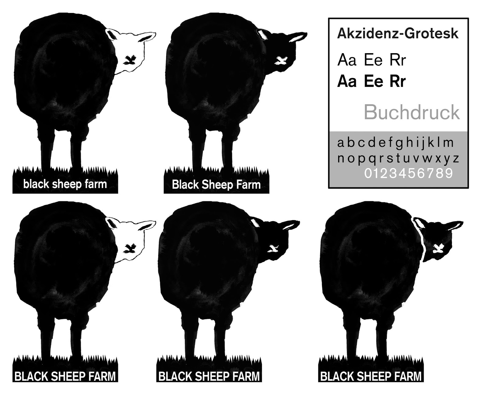
After acting upon feedback given in the crit and listening to the requirements of the client, I decided to refine my design even further. I am still experimenting with typeface decisions at this current time. In these experiments I opted for Akzidenz - Grotesk purely because it is such a classic modernist sans serif. It is purely functional and I think it actually integrates really well with my illustrative centre piece of the design. I also decided to subtly separate the head from the body with a think white line, which adds an extra sense of depth to the image and also uses the idea of positive and negative space to create the illusion of dimension. I am going to show these designs to my peers and the client to get further feedback.

Refined and balanced final design idea:

A selection of various hand rendered web fonts that I thought were appropriate and complimented the illustration well. Mt favourite is SwistInk I really like the ornate curvature and the flares on the serifs:


I am continuing with the development aspect. I want to get the clients opinion and feedback in order to push the design further. However, for module hand in, I think the design above is more or less completed and I am really pleased with my efforts.
No comments:
Post a Comment